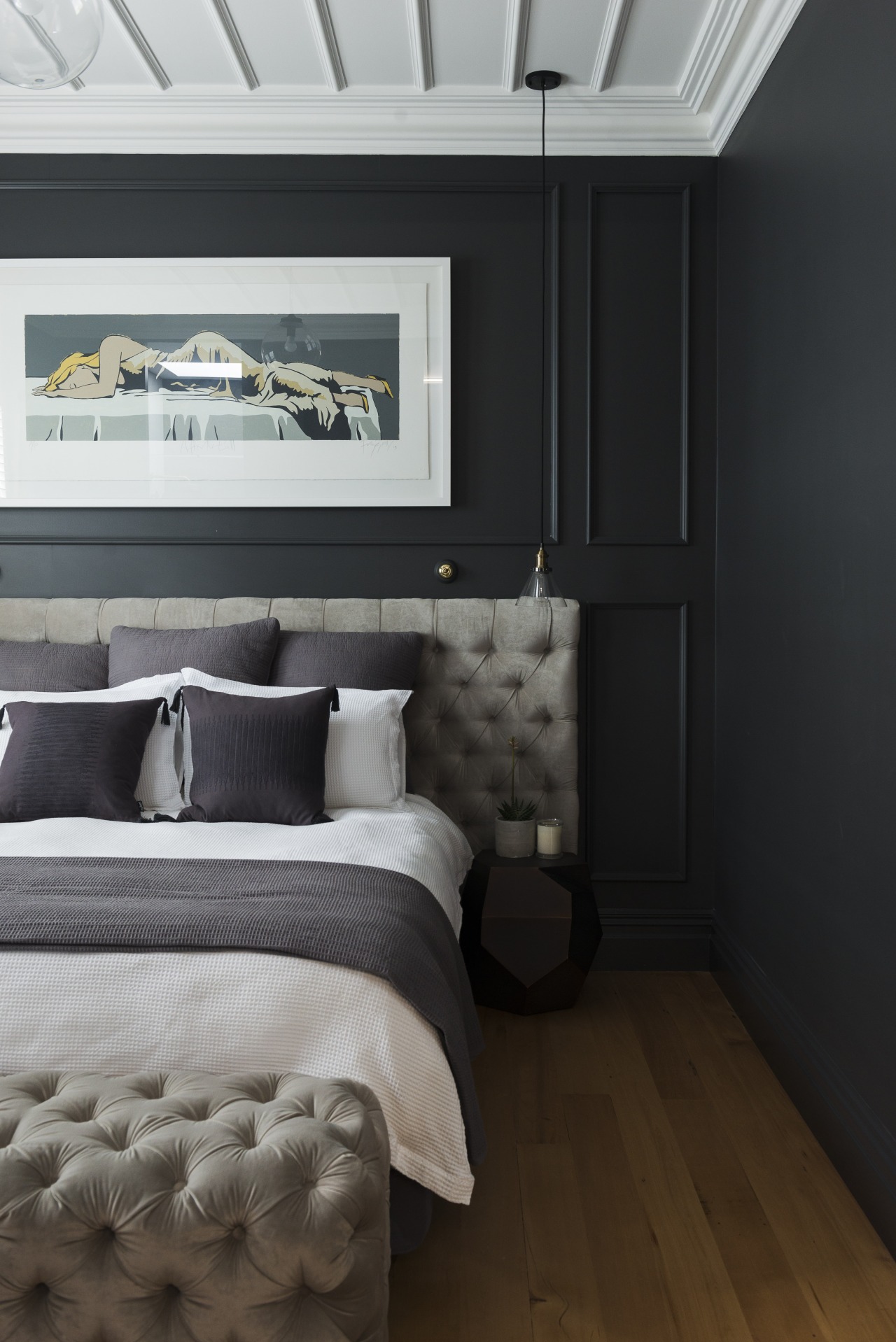
Master suite combines traditional and contemporary features to winning effect
This master ensuite connects to its villa surroundings through panelled joinery while adding a semi-industrial accent with tone and fittings

How do you introduce a light industrial feel to the master suite in a classic villa yet stay true to the home's style? Designer Katie Scott took this tricky brief of design opposites and ran with it blending the styles while keeping a visible contrast.
"The owner likes moody spaces so for the master bedroom I designed traditional panels for all the walls, painted a deep grey," she says. "The custom bedhead and bedend are in a soft, smokey velvet softening the dark grey walls."

Scott included floor-to-ceiling sliding panel doors to conceal the ensuite entry and adjacent wardrobe when closed. A television on the same wall can also be hidden with the slide of a panel.
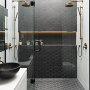
"For the ensuite, existing windows had to be removed so I added a skylight to emphasise the room's height. This went hand in hand with the high black feature wall in the shower as it adds a beautiful light, drawing the eye upward."

The designer made a point that there be no chrome in this design and all fixtures and hardware are in aged or antique brass.
"Heated towel rails and the flush panel were electroplated to match the tapware. The rich-look metal contrasts with the semi-industrial concrete and black tiles, to add charm and warmth."
Story by: Charles Moxham
Photography by: Helen Bankers
Home kitchen bathroom commercial design
Silver moons rising
Vibrant spiral stairs improve penthouse connections
With deep affection
Home Trends Vol. 33/6
Renovating a tired and dated kitchen will not only add to your enjoyment of cooking – it can also totally transform the ...
Read More


