Limited footprint, expansive response
This renovation makes most of a limited space, with the resulting three pavillion home a picture of contemporary, economical design and filtered natural light

Designed by Clinton Cole, CplusC Architectural Workshop
From the architect:
Description
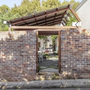
This is an alteration and addition project on a terrace-house located in the leafy suburban streets of Newtown. It occupies a narrow site that backs onto the Carriageworks cultural precinct. The heritage façade and front rooms were retained, an internal courtyard was introduced and the rear building was extended which effectively transformed the house into three holistic pavilions.
Spatial arrangement
The bedroom and bathroom front pavilion is made up of four modest bedrooms and two bathrooms and sits beneath the existing gable roof form of the home, with an extension to the first floor providing the spatial relief needed for the young family of five to be able to live comfortably.
An internal courtyard lush with vegetation separates the more traditional private part of the home from the shared living space pavilion, with a hallway connection providing access beside the courtyard.
The courtyard provides both natural light to the centre of the site as well as screening windows to the neighbour’s home through native vegetation.
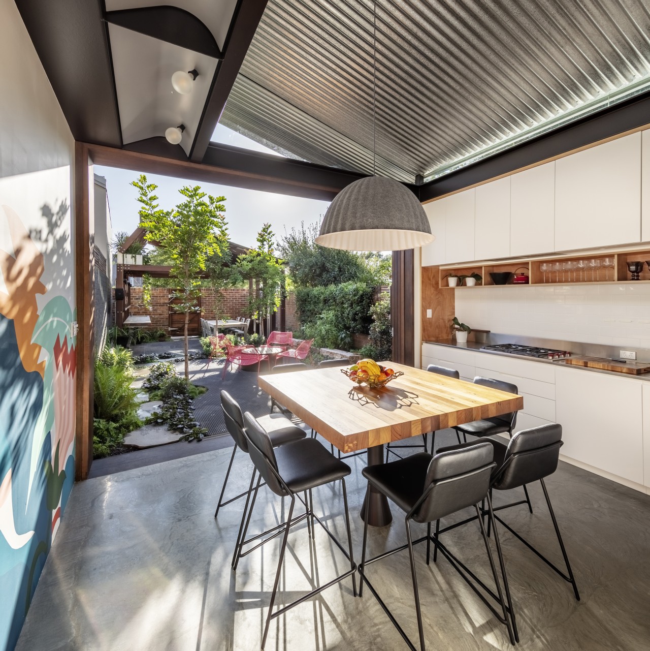
Living, dining and kitchen spaces are integrated to this central pavilion beneath the striking skillion roof, making efficient use of the tight floor space to provide all the comforts of an exceptional architectural space within a modest footprint.
The third pavilion stands alone at the rear of the site, but through form, material and proportion is inherently linked to the central living pavilion. Functioning as an open-air artists’ studio as well as a covered outdoor dining space, this 'Art Shed' becomes a conduit for both creativity and entertaining for the family.
Construction
Bespoke architectural details appear throughout the home, and with near-zero tolerance available, every square centimetre has been built to an exceptional standard.
The corrugated galvanised iron ceiling in the living pavilion butts up to frameless glazing all around, giving the illusion of a continuous sheet floating above, while providing ample natural lighting to the space below.
Louvred windows allow heat to escape the space in the summer, and a thermal mass concrete slab keeps the home both cool in summer and warm in winter.
The timber framed sliding door to the north facing courtyard of the home allows the kitchen/dining space to fully open to the outdoor space and Art Shed, providing an abundance of space to enjoy warm summer nights entertaining with family and friends.
Through carefully calculated engineering and precise manufacturing and installation, sliding doors meet at one corner of the internal courtyard and when both opened, they allow the living pavilion to further connect to the front of the house.
A custom-formed concrete step invites connection between the living space and hallway to the front of the house, in which recycled wide-format Kauri pine floorboards meet the spotted gum treads and risers of the new staircase.

Western red cedar shiplap cladding lines the external face of the building in the courtyard, as well as the internal wall of the new hallway extension, stained dark to provide a warm, honest material palette to the space as well as minimise maintenance.
From the front edge of the internal courtyard through to the rear of the home, a galvanised steel planter bed comprises the roof of the hallway, providing a green outlook upwards from the living pavilion, and spilling over into the courtyard.
From the upstairs bedroom, the roof planter provides a view of greenery in the foreground and the industrial Carriageworks beyond.
A stainless-steel mesh balustrade serves the staircase and upper hallway, allowing the skylight above to funnel natural light down the stairwell and into the hallway below.
A second internal skylight raked to match the external roof comprises half the ceiling of the ensuite bathroom, flooding what would otherwise be a dark internal bathroom with natural light.
The extremely tight floor space is exploited to its maximum potential in the bathrooms, with both shower spaces separated by a black-laminated glass wall, providing separation of the sensitive spaces where a typical wall would take up an unnecessary amount of room.
Built to the millimetre, the laundry joinery sits flush in the main bathroom, concealing washer and dryer within.
The joinery to the living pavilion sees a central unit with kitchen facilities facing the rear, and entertainment unit facing the internal courtyard, providing an internal division of the space to allow the children and adults to both entertain without disturbing each other.
Hardwood plywood encases the joinery, providing a robust and durable lining to withstand the wear-and-tear of a young family.
Trying to maximise the potential of the site while having to adhere to intense Council scrutiny resulted in several issues throughout the build that had to be carefully managed to be able to arrive at the exemplary finished home that stands today.
Coordination between CplusC building and architectural teams as well as through subcontractor relationships resulted in the project’s design intent being executed to the highest possible standard. The owners couldn’t be more thrilled with the result.
Credit list
Renovating architect
Kitchen designer
Cladding
Louvre system
Main flooring
Bathroom tiles
General heating
Dining table/chairs
Builder
Landscape
Roof
Paint
Kitchen feature lighting
Awards
Home kitchen bathroom commercial design
Light-hearted by the sea
In tune with the land
Surface attraction
Renovations
Renovating your home is an opportunity to refresh, expand and renew. Here's all the inspiration, ideas and information y...
Read More


