Light fantastic
Beams and columns on the exterior of this home deflect light and throw shadows to create interesting effects on both outside and interior walls
Most people who buy an older-style home with the expectation of remodeling it realize there are likely to be at least a few surprises along the way.
The property featured on these pages was once a low, ranch-style house hidden from the street behind shrubs. Its appeal to the new owners centered around the size of the lot three acres the large number of mature oak trees and the creek that meandered through it.
Designer Guy Courtney was asked to remodel the house to give it more street appeal.
"The owners also wanted a home that was modern in style, finished in white-painted stucco, and had lots of glass and light," says the architect.
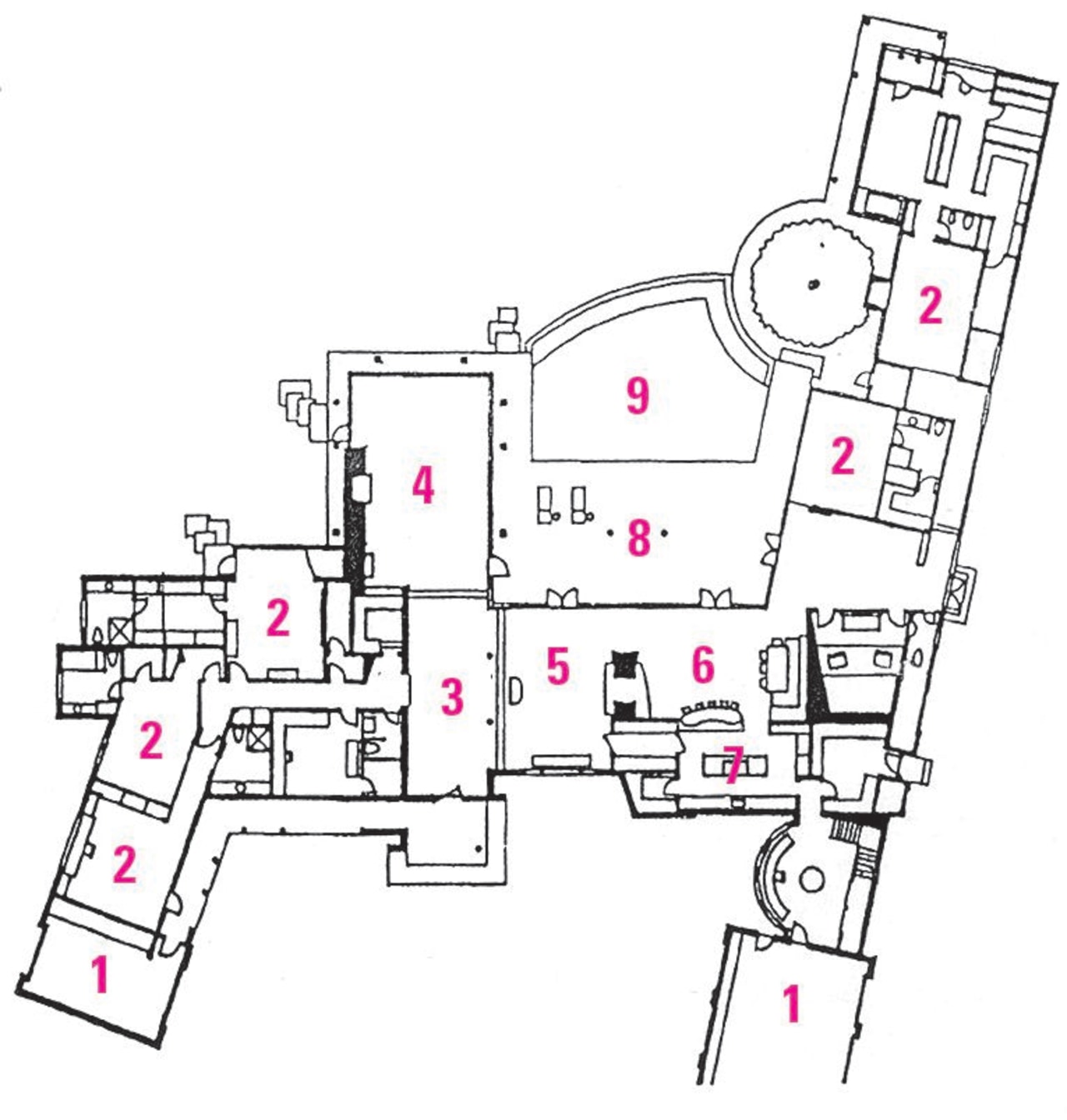
"We kept about 75% of the existing house, and reconfigured the layout. To open up the front of the house, we removed an awkwardly-angled wing containing the garage and guest bedroom. A new wing for the garage was added to the front of the house at a more pleasing angle."
This wing was extended out the back of the house to create a large master suite. A pool was built into the sheltered corner created between the new wing and the existing house.
To improve the street appeal of the house, the architect designed a series of false, horizontal beam elements along the fae§ade of the house. These beams are attached to the house about four feet from the front wall.
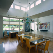
"At different times of the day, the shadows these beams cast create light effects in the dining room and add interest to the front of the house from the street," says Courtney.
Another feature is a two-story tower that acts as a hinge, connecting the new garage wing with the rest of the house. The turret contains exercise and hobby rooms and, with its clerestory windows, introduces more natural light into the house.
It wasn't until the project was underway that rotting beams in the roof were discovered. This opened up the opportunity to redraft the plans and raise the ceilings throughout the house. Ten-foot-high ceilings in the entry and other areas make the spaces appear more open, while sun streaming in clerestory windows in the dining room and turret creates interesting effects on the walls.
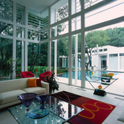
Because of the beauty of the back garden setting, another requirement was to connect the inside and outside of the house as closely as possible. Full-height glass windows rising straight up to a 20 ft-high ceiling in the living room achieve this with dramatic effect.
"From the living area, you see the pool and trees. In this hot climate, you feel as if you are by the pool, without actually being outside," says the designer.
To achieve this, the living area is glazed with large panes of glass set into steel frames, and there are no mullions or columns in the corners. Instead, the panes butt up to each other. To ensure the glass will withstand strong winds, steel columns stand two feet out from the windows, connected by steel plates at the tops of the columns.
Internally, the owners wanted the house to be neutral with the focus on the garden views. The neutrality also provided hanging space for their art, says interior designer Brenda Stephenson.
"They wanted their home to have a modern, clean and contemporary feel, but also to be inviting, family-friendly and yet sophisticated. They are a busy family and love to entertain," she says.
White predominates throughout the house, with white exterior and interior walls and a white limestone floor in the main living areas.
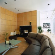
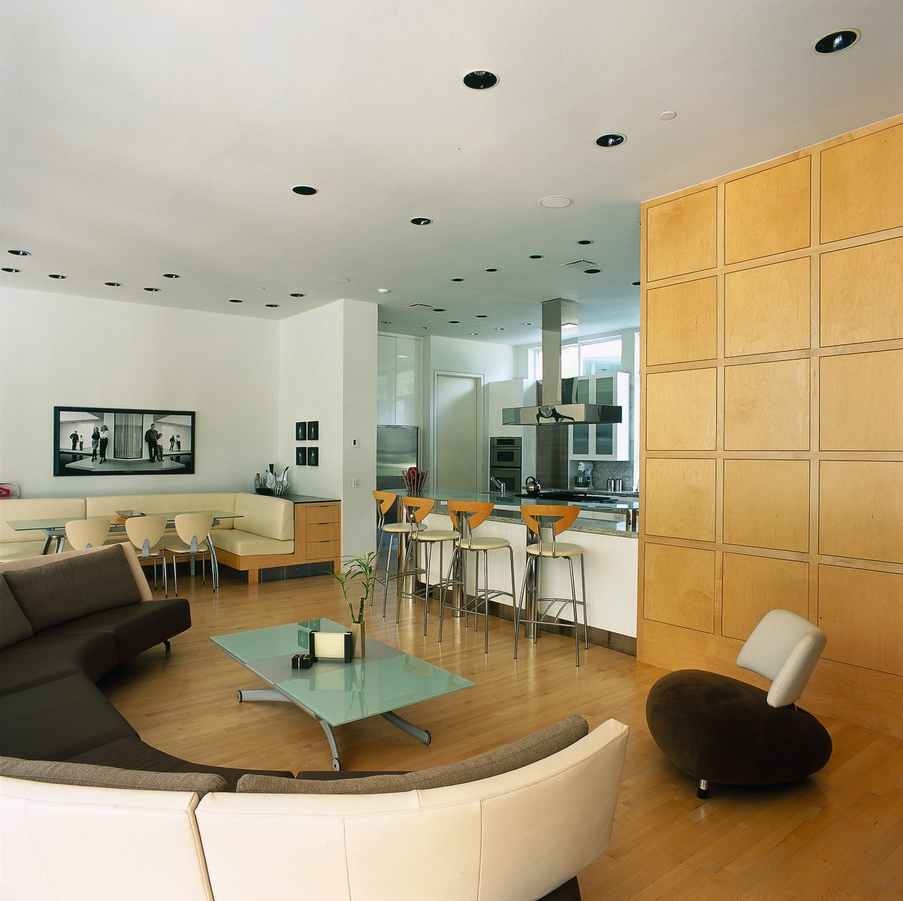
A cozier atmosphere is created in the family room, with banquette seating and warm maple wood floor and wall paneling. This paneling conceals the television and provides storage space. As in the main living area, one wall of the family room is glazed and overlooks the pool area. There are few solid walls in the house, and the glazing creates a visual pathway across the pool and between living areas.
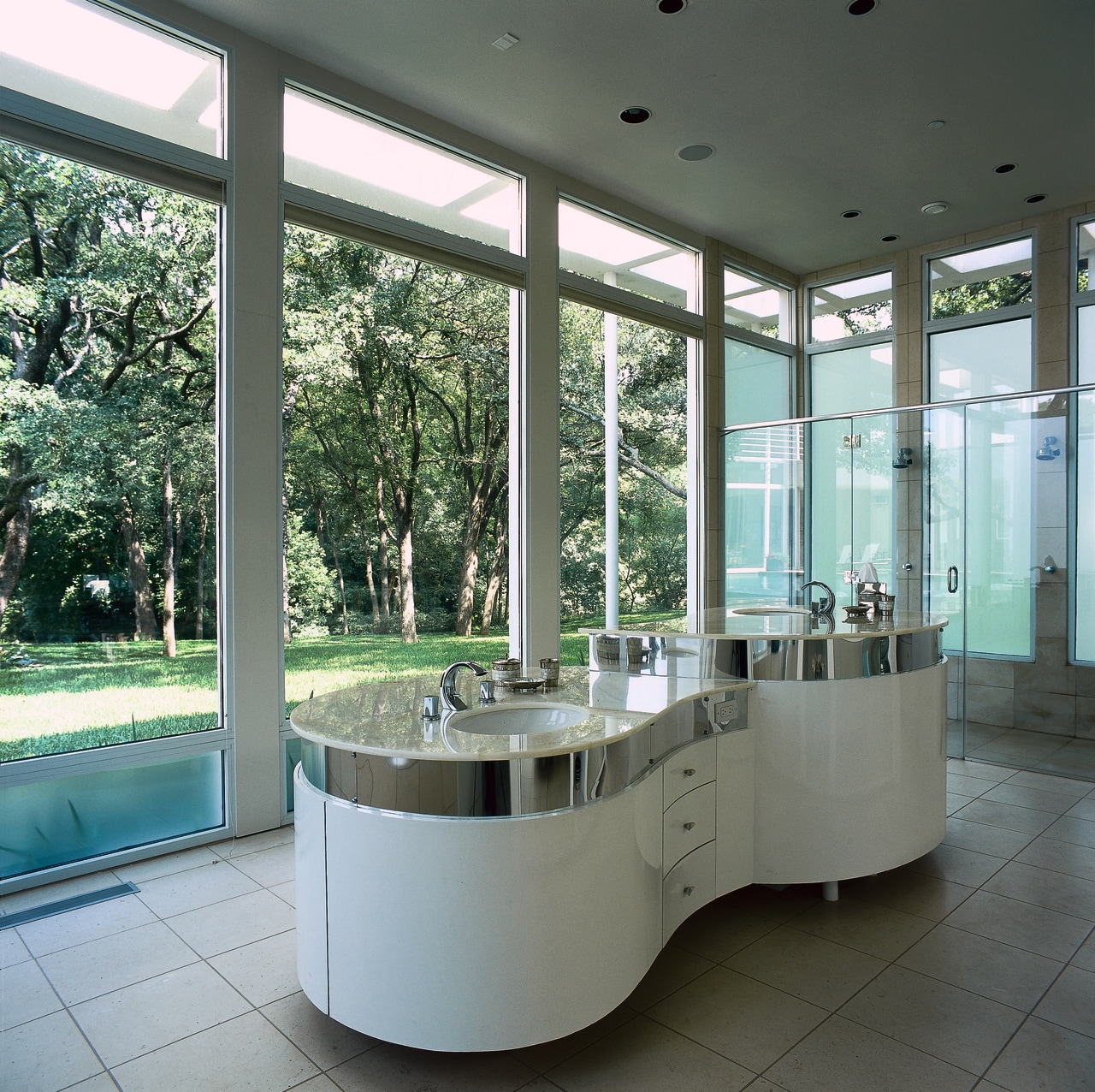
The master suite is on the opposite side of the pool to the living area. Past the bedroom, the master bath has one glazed wall overlooking the pool. On the opposite wall, mirrored glass cabinetry reflects the view. And, in the center of the room, a large, curved, Onyx-topped vanity is underlit to glow at night.
Credit list
Interior designer
Siding
Installation
Flooring
Exterior lighting
Heating
Home theater/audio
Countertops and backsplash
Faucets
Cooktop
Refrigerator
Bath
Bathroom flooring
Toilet
Security
Main contractor
Roof
Lighting installation
Furnishings consultant
Heating supplier
Kitchen manufacturer
Sink
Ventilation
Dishwasher
Shower
Tiles
Ventilation
Story by: Trendsideas
Home kitchen bathroom commercial design
Small space, big impact
Classic dovetails contemporary
Tranquil waters
