Jekyll and Hyde
Aloof and enclosed in one direction, expansive and openin the other this house enjoys a split personality
Opposites attract true in architecture, as well as personal relationships. In a design where simple, rugged surfaces hold sway, dramatic architectural flourishes will seem all the more powerful and effective.
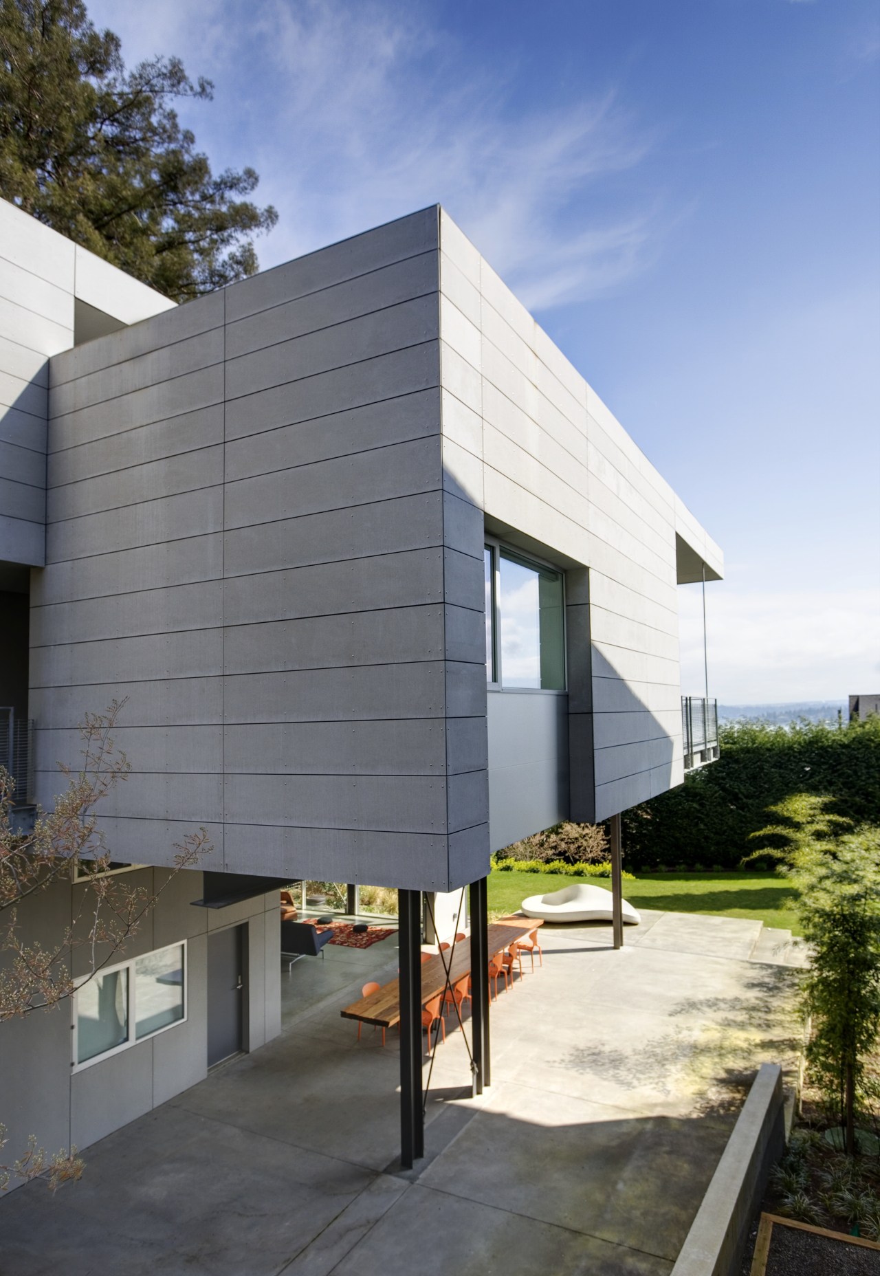
Designed by E Cobb Architects, with Josh Johns as project architect, this house offers a near-windowless facade to the street, but then literally opens up on the sides facing breath-taking lake views. Comprising three intersecting volumes, the residence has a monolithic appeal when seen from the curb a look that gives little indication of the openness enjoyed on the other side, says principal architect Eric Cobb.
"The owners have a love of semi-industrial, rugged surfaces so the clean-lined, three-level house is clad in concrete fiberboard. In addition, the interior features concrete walls and floors, along with other no-nonsense materials such as raw steel and glass."
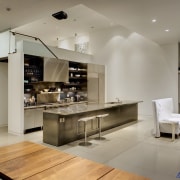
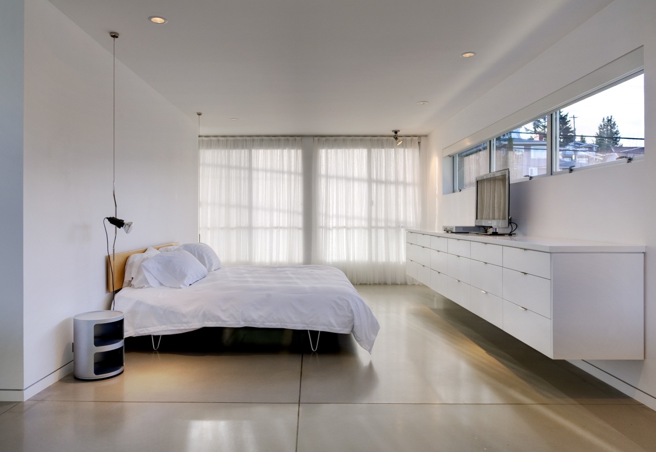
Entry to the house is via a bridge from the street across to the second story one of many architectural conceits in the house. The great room, kitchen and a guest bedroom are on this level, with a garage, media or living room and two bedrooms on the floor below. The master bedroom and bathroom are on the level above.
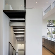
"In contrast to this uncomplicated material palette, there are some quite out-there elements in the design," says Cobb. "For example, the welded-steel circulation stair, created with stair rungs made from steel channels. This extends up the full height of the house."
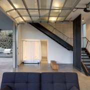
The ground-level media room and garage space is very much the domain of the children. To optimize use of the space, a garage door with glass panes was introduced when closed, this allows natural light to flood the open-plan space. In fine weather, the door can be rolled up, uniting the interior with the garden outside.
"Although there are four bedrooms, the owners wanted even more flexibility for sleeping arrangements. A prototype mobile bed was designed for the ground level, with two others planned for other areas of the house, including the master bedroom," says Cobb. "The resulting four-poster bed, complete with curtain screens, has an 8ft x 8ft frame and custom mattress, all set on castors."
Innovations take many forms. On the level above, a side deck is suspended from the roof, thus avoiding a cantilever off a cantilever.
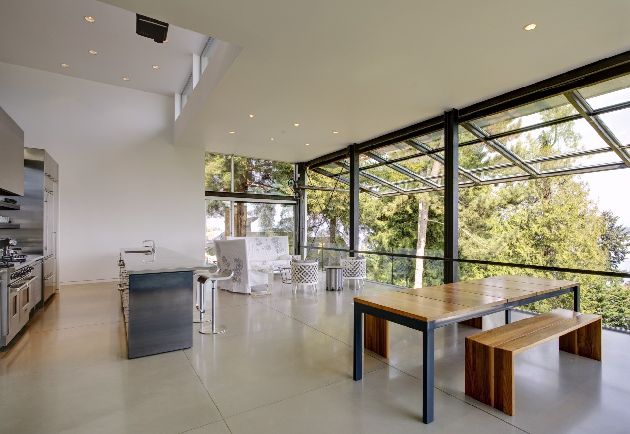
However, perhaps the most exciting feature of the house is a large operable wall that turns the mid-level living space into an outdoor room.
"Initially, a deck was considered for this area, but to make it a reasonable depth we would have had to decrease the size of the house itself. Instead, we installed an aircraft hangar door small by airport standards but huge in a domestic setting replacing the metal panels with glass panes to achieve the look required."
With a reassuring hiss of industrial-strength hydraulics, the entire wall lifts and tilts back. As well as opening the living, dining and kitchen areas to the open air, it also creates a weather shield when raised into place. The effect is suitably dramatic, in a setting designed as much for entertaining as family life.
"A sense of adventure goes right through the design," says the architect. "To complement the many artworks and sculpture in the house, images from projectors built into the floor play across the walls and ceiling contributing to the lively ambiance."
The house offers duality in several ways. Besides the contrast of open and closed facades, and industrial simplicity with architectural sophistication, it also plays a game of hide and seek with the viewer.
"Despite being constructed as three large masses, the ground-level build form cannot be seen from the street, while the master suite on the top level is out of sight from the lawn," says Cobb. "Even in the living space, there is little sense of the bedrooms and ensuite bathroom above, or the guest bedroom off to one side on the same level."
Created to surprise and stimulate, the house represents architecture as sculpture, and on the mid-level as kinetic sculpture.
Credit list
Kitchen design
Structural engineer
Roofing
Floors
Paints
Heating
Staircase
Kitchen sink
Ventilation
Basins
Bathroom flooring
Accessories
Builder and cabinet company
Siding
Door and windows
Wall coverings
Lighting
Blinds
Kitchen cabinetry
Oven
Vanities
Faucets
Shower enclosure
Story by: Charles Moxham
Home kitchen bathroom commercial design
