Heritage building reinvented as modern office premises
Iconic two-storey 1920s building is transformed into a modern office headquarters with a new upper facade that addresses heritage regulations in an inventive way

The initial idea for the new Xero Wellington headquarters seemed pretty straight forward – take a heritage building, gut it, add three floors with a new complementary upper facade and then build up a vertical campus on the interior. However, a few issues turned this into a more complex project that required smart thinking from building designers Inside.
The reinvented building was to consolidate Xero staff from three offices to this new address and with the proposed five levels there was plenty of space for all, says Inside’s project designer Neville Parker.
“However, to meet the strict council constraints for the 1920s building, the new addition would have had to be set back six metres from the existing street frontages. This in turn would have severely compromised the interior space available and left the building too small for Xero’s requirements.”
Luckily Parker had a lateral-thinking solution.
“We had the idea to introduce a Stamisol mesh screen over the new facade which was to be a pared down modulation of the historic facade below.”
The designer put it to the council that the mesh would downplay the upper facade by day – when the street front is activated and the heritage face is most noticeable. Then, at night, the building’s upper facade would be washed with LED lights set on the inside of the screen – thus giving the new face prominence when it’s dark and the street is quiet. A belt line introduced between the old and new would highlight the play between them.

In addition, large picture windows were to be introduced in the upper section to correspond to the scale of large openings in the facade below, from when the protected building had been a car showroom and garage.
This concept was approved by the city council, with no setback required. This netted a total of 6718m² of office space – room for all the Xero team.
Site access was another consideration. It was first intended a crane would be located outside the site with a boom long enough to reach all areas. However, when Xero confirmed they wanted an atrium stair at the heart of the building, it allowed Inside to position a smaller crane with a shorter boom in the intended atrium space.
Near the end of the project, this was removed by another crane outside the site. This second crane dropped the huge 20m steel tree structure for the stairs – the main column plus landing beams – into the atrium space.
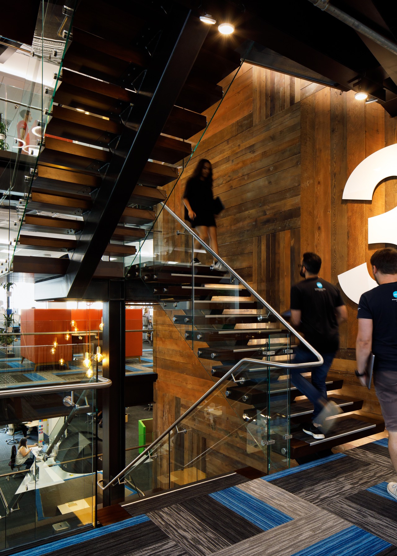
The high-profile staircase – with a large skylight overhead – connects all floors in a vertical campus style, with sightlines up and down to adjacent floors.

Designer Jeremy Smyth of 4Work accentuated the stair in his interior design for the fit-out.
“We created a feature wall alongside the stairs that rises the height of the building, made from the wood joists of the original structure.”
While the timber wall designed by Smyth speaks about the history of the building, the crisp, machined black treatment of the stairs reflects the modern nature of the fit-out. Stairs and wall together make for a perfect symbol of the wider project that so tastefully merges the historic with the brand new. The exposed cross bracing that supports the structure and existing facade is another reminder of the building’s transformation.
“Overall, my brief from Xero was for a truly beautiful fit-out. To this end there is plenty of understated, consistent negative detailing, elegant material finishes, subtle light washes and a custom carpet, predominantly in Xero’s brand colours.”
Generous social gathering spaces are positioned to correspond with the large picture windows, while the third floor reception includes a cafe. There is also a gym, bike facilities and changing rooms.
“The fit-out is also intended to reflect human passion and purpose, and wellbeing is obviously a key part of this,” says the interior designer.
Credit list
Project
Building designer
Resource consent consultants
Fit-out building services engineers
Civil engineer
Fire consultant
Cladding
Facade
Feature timber wall
Ceiling panels
Paints
Workstations
Reception desk
Developer
Interior design
Fit-out project managers
Construction
Mechanical and electrical engineer
Project manager
Roof
Lift service
Hardware
Floor tiling
Veneers/finishes
Lighting
Office chairs
Additional furniture
Story by: Charles Moxham
Photography by: Jason Mann
Home kitchen bathroom commercial design
Commercial Design Trends Vol. 34/3C
While apartment living has always been prevalent in some cities, there are others where it is still a developing accommo...
Read More


