Guest house built on small footprint is designed to optimise internal living spaces
Weathering timber clads this multi-level, semi-underground guest home with operable louvres to control sun and cross ventilation in the interiors
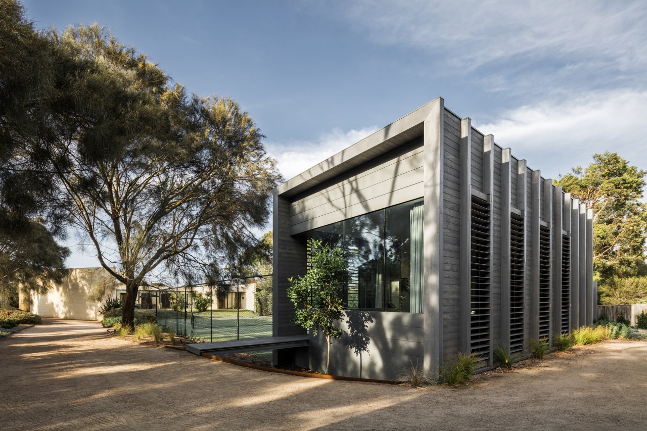
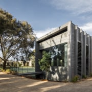
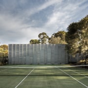
The term hiding in plain sight comes to mind with this surprising home designed by Matthew Murfett and sited at the end of a tennis court.
"The brief called for a guest house to accommodate the owners' visiting children and grandchildren," says Murfett. "It had to look different from the main home on the property, be some distance from the existing structure, and have an understated feel. With various constraints to consider such as setbacks and driveway location, we proposed creating a house at the end of the tennis court with the look of a landscape wall."
The resulting design is a simple rectilinear form from the outside with the Accoya treated timber cladding finished in a grey stain that will fade as natural weathering takes over.
Accoya acetylated timber is an eco-friendly process, not a species. The wood, in this case pine, is pickled to achieve moisture-prevention benefits similar to those gained with tanalised wood but without the heavy chemical input.
Greenery will grow up the facade over time, adding to its appearance as a landscape feature.

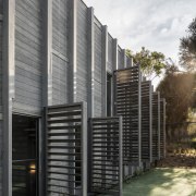
"The facade on both long sides of the building is animated by louvre screens that can be opened or closed to keep the interiors comfortable," says Murfett. "These reach to varying heights, corresponding to the interior spaces behind."
The raised vertical timber elements on the cladding work hard in the design. They serve to bed the shutter systems, provide protective ends for the cladding, and conceal the steel skeleton that give the multi-level building its strength.
The entry, located to the side of the home, negotiates an incline via a small ramp, while the zinc cladding here matches the greying wood and wider natural setting. Render was used as the cladding finish at the other, less public end. Both ends are inset slightly, bringing shelter, shade, and a sense of privacy. Part of the owners' brief was that the new house wasn't looking' at the main home. Elements like the wood shutters, and these inset end treatments help achieve this.
"The guest house presents as a single-storey landscape feature but actually incorporates five split levels of living spaces," says Murfett. "By careful configuration of these spaces we were able to include a large living and kitchen area, three bedrooms, two bathrooms, ample storage, and a roof deck within the 85m² footprint."
One way the architect gained space was by having circulation elements opening directly into the rooms rather than using up valuable square meterage with hallways and landings.

From the front door you step directly into the warm, light-filled living, dining and kitchen space. The home's feature interior finish echoes the look of the timber cladding. However, the treated pine wood used outside would not have been strong enough for flooring. So French oak in a Driftwood finish was chosen for the floors, stairs and joinery.
The balance of interior surfaces, including the kitchen cabinets, is in a complementary white.
The private master bedroom is half a flight down at the other end of the residence while most other bedrooms are on the bottom level of the home, which is underground.
"It was important to get natural light down to this bottom floor especially as it's mainly the children who will be using these bedrooms. To achieve this, we used the stairs as light wells," says Murfett. "Tall windows are positioned next to the stairs, directly corresponding to the louvre organisation on the exterior, and we chose riserless treads to further optimise light penetration."
Stairs leading up from the living room take you to another bedroom and the roof deck.
Story by: Charles Moxham
Photography by: Michael Kai
Home kitchen bathroom commercial design
Home Trends Vol. 33/2
The design of your home is the result of your style preference, your requirements – and the influences of your site. The...
Read More