Grand unveiling
Sophisticated modernism that hints of a more gracious era defines this flagship department store fitout
Entering a luxurious department store is like stepping into another world. The air of quiet restraint, the scent of expensive perfume and the glittering, jewel-like displays create a sensory experience unlike any other.
Over time, however, even the most upmarket department stores can become a little jaded and in need of a face-lift.
Such was the case with Holt Renfrew's flagship store in Bloor Street, Toronto. Diego Burdi, the creative partner of Burdifilek, the company commissioned to redesign the ground floor of the prestigious store, says this floor had not had a major refurbishment for more than 20 years.
"There had been several reincarnations of different spaces, but no single project to tie the space together."
Burdi says Holt Renfrew provided a very open brief the only stipulations were for a design that would endure and a look that could compete globally.
"Although the company is both very forward-thinking and design aware, it was not interested in the design language of the moment. There was a need for a more classical modern approach."
Burdi says devising such a design involved extensive analysis of the Holt Renfrew brand and customer profiles, and recognition of the store's reputation as a leader in high-end retailing.
"Understanding a client's brand is not only important, it's paramount," he says. "Retail design for a luxury store is a complex process. We needed to create an atmosphere that was an extension of Holt Renfrew's personality and prestige, and that embodied the essence of the store's iconic and design-driven history."
Burdi says the design team posed the question, "What speaks of luxury?" and determined that space and the way this was experienced within a store was pivotal in creating such an environment.
In keeping with this philosophy, the designers took an architectural approach to the space, creating linking volumes to accommodate the different departments.
"While each department has its own identity, we didn't want to compartmentalise the store, preferring instead to have customers moving through uninterrupted thresholds," says Burdi.
Similarly, sight lines were created to increase the sense of space and to encourage exploration.
The classically modern design rationale creates an architectural umbrella for the new cosmetics, fine jewellery, soft accessories, handbag and menswear departments. It introduces a material palette that embraces exotic woods, sensitive colours and custom artwork and finishes, says Burdi.
"Every colour and finish in the store, from the walls and flooring to the displays, has been customised to fit with the Holt Renfrew brand. The palette is very much about texture and tonality it's a subtle combination of textured surfaces and beautiful, high-gloss lacquer finishes reminiscent of Japanese Bento boxes."
Within this design envelope, each department has its own identity, determined by the architectural detailing.
"The cosmetics department, with its white finishes and opaque glass doors, breathes a kind of ethereal femininity and sets the stage for the main entrance to the store," says Burdi.
This department is even more remarkable for the uniformity of the white and skin-toned lacquer finishes, the white opal glass, antiqued bronze and pearlised leather. Creating such a consistent look for 18 separate cosmetic brands, each with its own strong corporate identity, was challenging, but essential, says Burdi.
"There are more than 500 labels on the ground floor, which could have been visually overwhelming. But the respective suppliers all accepted the concept that this was a different umbrella for them a prestigious store with an interior design that is appropriate for their brand."
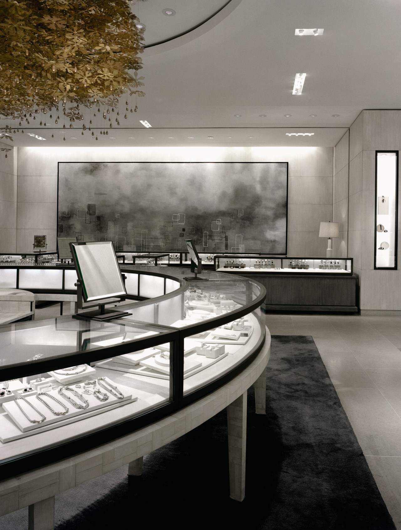
A sense of grandeur emerges at the jewellery department, where collectionsare displayed under Starfire glass on museum bases, amid a backdrop of custom birch bark and alabaster finishes. Highlights in this area are the large, glittering gold hanging, made from plumbing fixtures, and a large painting in soft, muted shades of grey.
"Soft accessories boasts an ultra feminine atmosphere," says Burdi. "Here, we have introduced rosewood, skin tones, chocolate glass and a transitional wall colour that evokes an ultra chic lifestyle."
Handbags are elevated on pedestals like treasured icons, or placed on perspex shelves with a painted floral backdrop.
Despite the classical modern look, and the display cases that hint of Art Deco, the fitout also merges contemporary design features. In the menswear department, distinguished classic and contemporary collections are shown against sculptural imbuya wood, Lucite panels and stone display tables. The fitting area is outfitted in macassar wood and includes a fireplace.
Lighting further evokes the right mood, creating highs and lows while still ensuring the product is firmly in the spotlight.
Credit list
Interior design
Lighting consultant
Artwork consultant
Audiovisual systems
Display case (glass jewellery)
Fabrics
Flooring
Furniture
Platform limestone (menswear)
Leatherwork
Recessed ceiling fixtures
Building architect
Special finishes consultant
General contractors
Wall panels (jewellery and handbags), millwork
Ceiling
Fixtures and signage
Custom rug in menswear
Acrylic partitioning (menswear)
Club chairs
Track lighting (menswear)
Story by: Trendsideas
Home kitchen bathroom commercial design


