Eye for detail Finely detailed kitchen by nu Haus
Finely detailed kitchen by nu Haus


There are several ways to connect an open-plan kitchen to its surroundings. A visual link between disparate spaces can be achieved by something as understated as repetition of fine detailing.
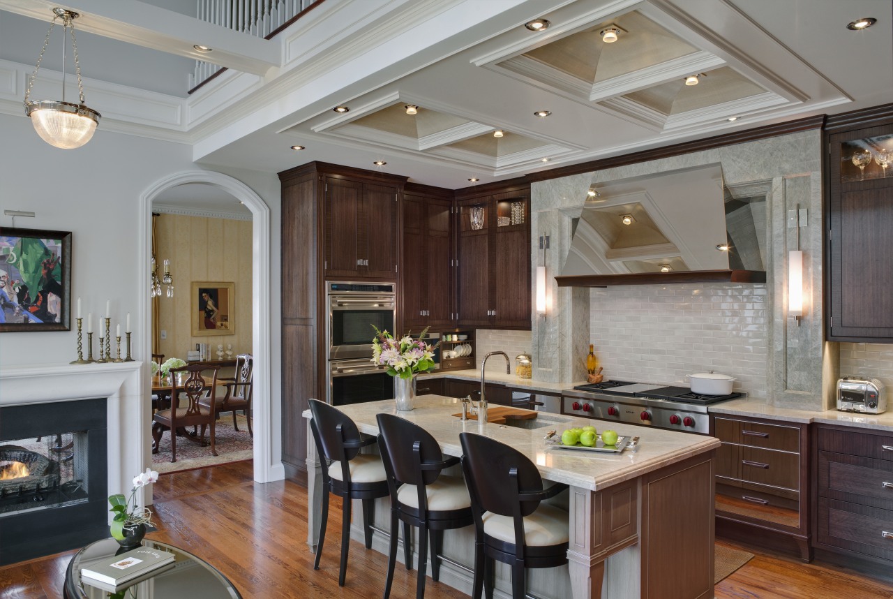
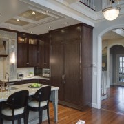
For this project, designer Doug Durbin was asked to replace a cramped workspace with a more open kitchen that would complement the home's classic architecture. To achieve this, the original layout was swapped around the range and hood were moved to the perimeter and the prep sink was brought out into the new island, says Durbin.
"This design includes important references to the existing architecture. The wall cabinets are in a rich stained walnut which connects to the hardwood floors and antiques dotted through the home. These floor-to-ceiling elements have a furniture-like appeal due to material treatment and detailing. We used figured, quartered walnut to create a refined, tailored look you would more typically see on a high-end furniture piece."
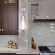
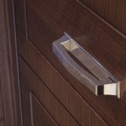
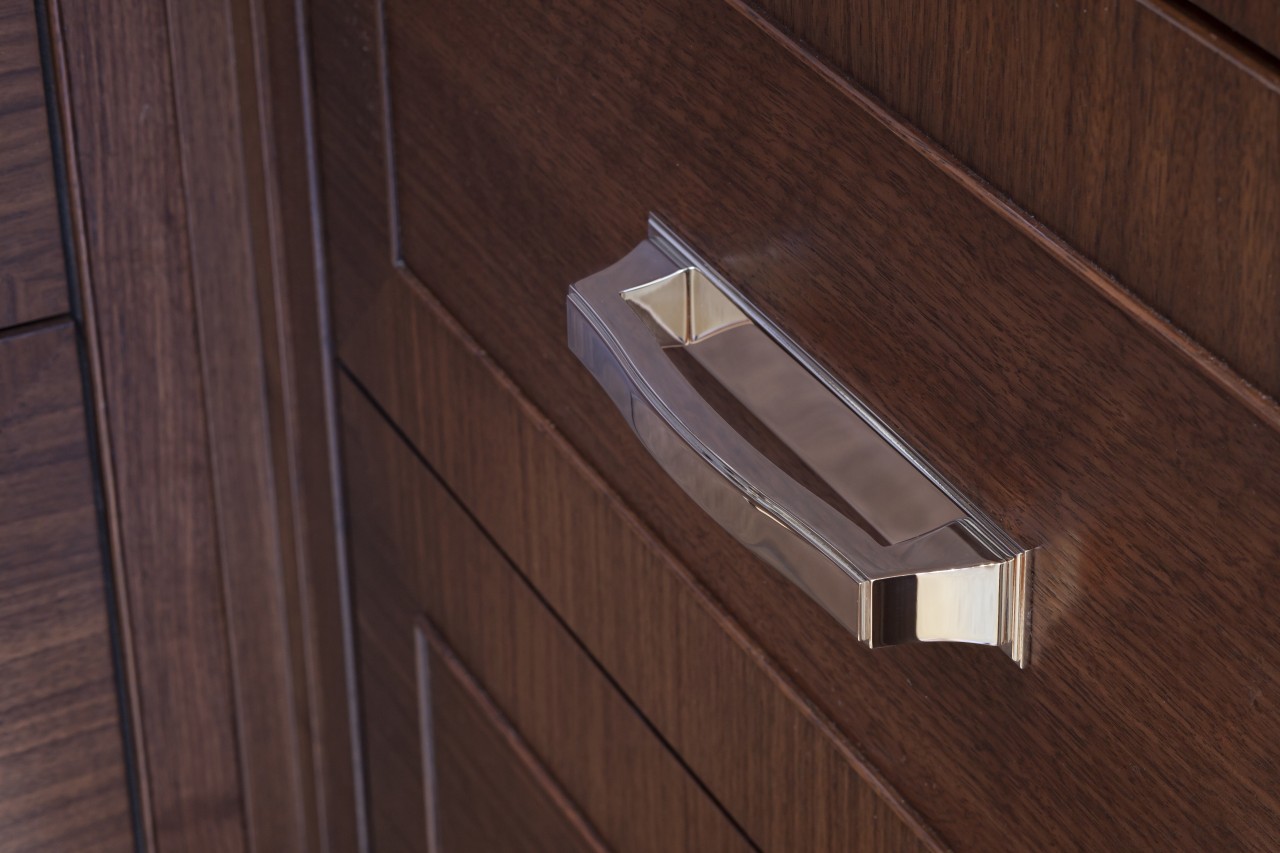
These rear cabinets are in a transitional style with door panels flush to the frame. Subtle bead detailing and custom minimalist nickel hinges and handles ensure nothing detracts from the finely crafted wood surfaces. This simple treatment forms an ideal complement to the modern material that stands at the heart of the design the mirror-finish stainless steel of the range hood and the drawer fronts below.
The modernity of the hood is softened by a walnut trim on the base, which repeats the bead detailing of the cabinet fronts. In addition, the metal drawer fronts have ogee-shaped handles in walnut creating a crossover of materials that helps draw the contrasting surfaces together.
Moving away from the cooking area, cabinetry treatments become progressively more traditional.
"The island has been given an understated, classic finish, with lightly turned legs. The bead detailing provides a link between the kitchen and the living space beyond."
In addition, Durbin had to devise a strategy to smooth the link between the kitchen space and the adjoining double-height living room, which also needed to be made more private from the street.

"To break up the volume of the living room, I designed classic ceiling beams to run around the perimeters and across the room at around 11ft high. This had the advantage of allowing for lower, more flattering lighting."
In front of the living room windows, Durbin used traditional raised-panel cabinetry, but with a difference.
"The upper cabinets have glass backs, and sheer curtains hang behind. This creates a soft, layered effect which lets natural light in, adds display space, and improves privacy from the street."
The diffuse light and view echoes the subtle color and texture of the granite surfaces in the kitchen area opposite. Sconces on either side of the sitting room windows are in a simple contemporary style, and are identical to those in the kitchen.
Credit list
Cabinetry company
Hardware
Backsplash
Faucets
Ventilation
Refrigeration
Lighting
Wallcoverings
Cabinetry
Countertops
Kitchen sink
Ovens, cooktop, warming drawer
Microwave
Coffee system
Flooring
Fireplace
Story by: Charles Moxham
Home kitchen bathroom commercial design