Supporting the arts
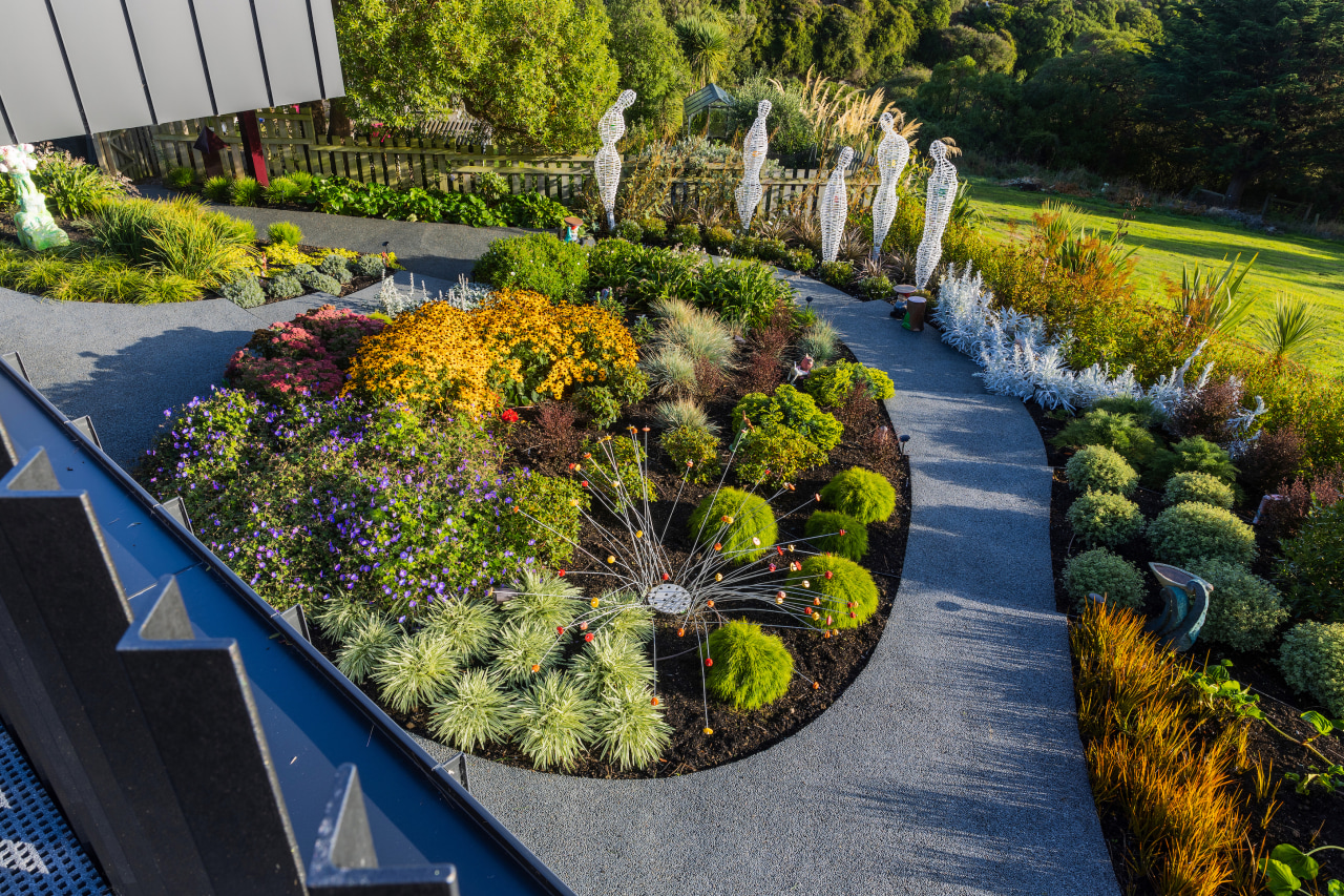
Simple and low maintenance, this garden underpins and celebrates all the sculptures on this property, including the architectural house itself
Designed by Christopher Braczek, Design and Garden Landscapes
From the landscape designer:
Brief
The design for this property was relatively simple with few requirements from the homeowner and many of the outdoor living spaces had already been allocated in the house design as balcony patios.
The owner's brief consisted of lots of texture and colour from the planting, a path leading from her daughters’ property next door, no lawn spaces and most importantly space for her pre-existing sculptures to be placed around the garden.
The homeowner essentially wanted a garden she could enjoy wandering through and admire – it didn’t need to be productive, it needed to be exciting and practical, an extension of the 'eclectic lux' nature of the interior but on the landscape.
Our scope was limited to the areas which hadn’t already been allocated to either the house or drive space, as designs for these had already been completed with the architect – the construction of these areas were to be carried out by the house builder.
Design inspiration
The design went through a couple of iterations before settling on the final plan.
Initially, we had a series of geometric tectonic pads placed along the more level section of the garden, mimicking the very angular nature of the overhangs on the house.
This was then translated into the sloping part of the section as contour steps and a snaking path to provide access down to the daughter’s property next door.
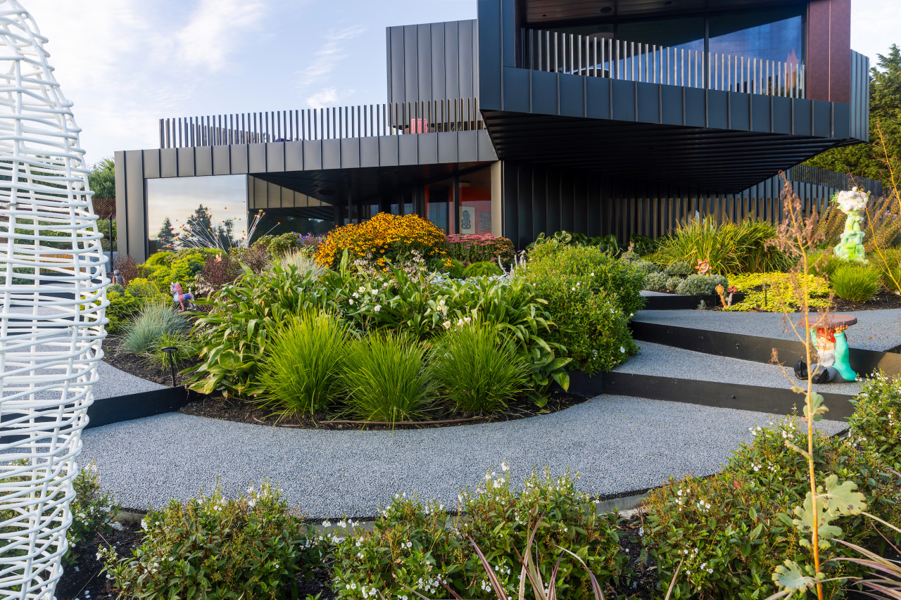
A series of steel plates would act as risers form angular contour lines across the slope, creating lines that will disappear into the surrounding planting, like contour lines on a map.
These steps were not only inspired by the angular nature of the house but also by a Chelsea flower show entry from 2014 where they had used similar shapes to form raised planters and stairs through the show garden.
My homeowner had loved this idea and wanted to run with this alone as opposed to the slab idea – thus evolving the design into what it is – a much simpler kind of juxtaposition of flowing curved paths and asymmetric stairs.
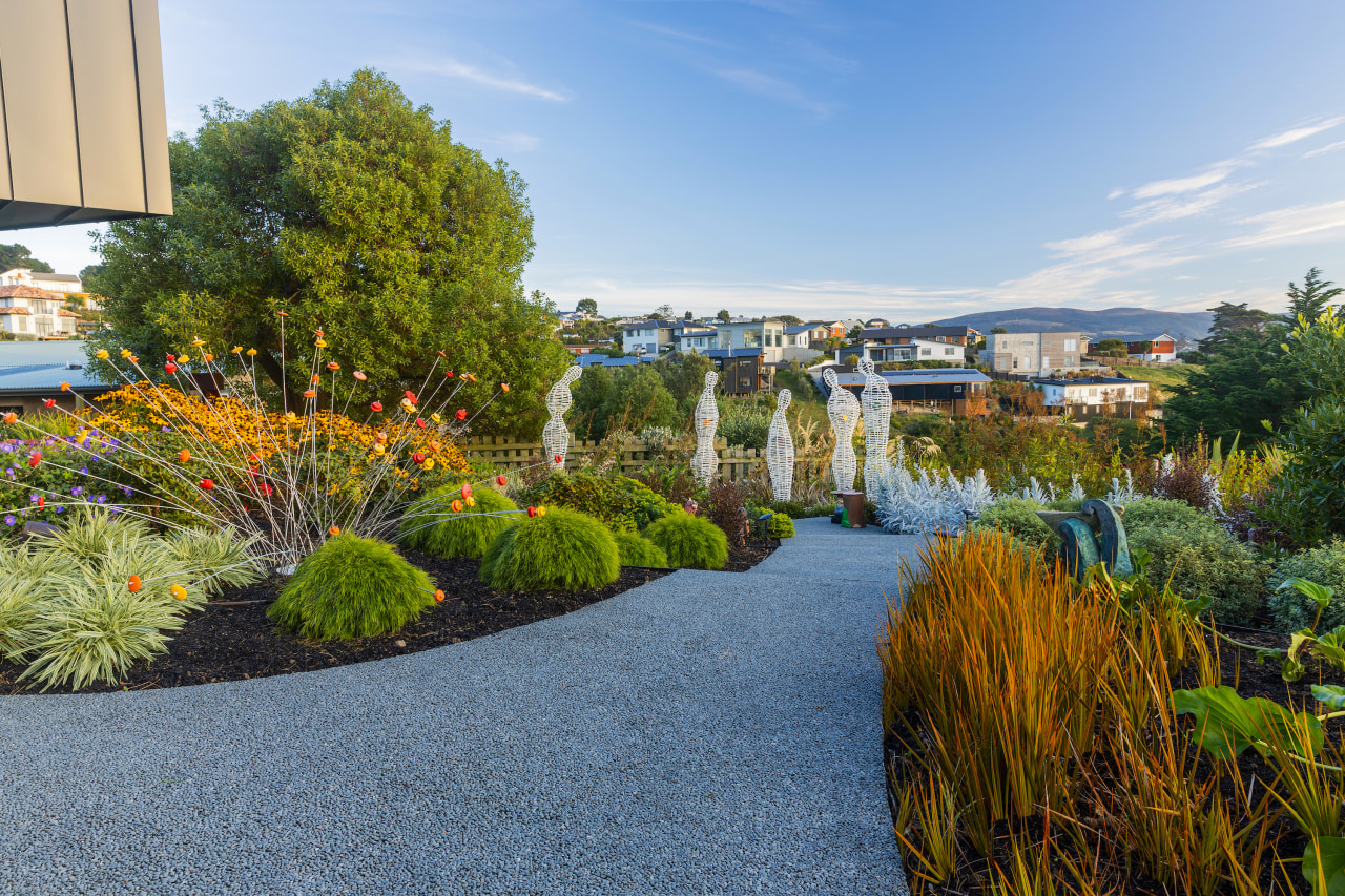
The garden includes many of the owners' existing art pieces from their old garden, so these needed to be the focal point amongst the planting while the paths and steps needed to be subtle, but sculptural in their own way.
Our homeowner was instrumental in their placement, with one or two pieces having the artist come to the site to position them.
Site analysis
When we first met the owner on-site it was simply a paddock sitting atop the hills above St Clair Beach Dunedin.
The house was to be pushed up against the existing bank, building the lower level into the land, and the rest of the site gradually fell away from the building platform.
With this slope, it meant we had dimension to play with as it wasn’t a flat site, and there was an opportunity for us to do something with the access down to the daughter’s property.
The garden area sits on the North corner of the site pulling all day sun, and it is tucked down just below the brow of the hill where it is relatively sheltered, but it is still open to weather coming down the harbour, and strong southerlies and salt winds from heavy coastal weather.
The excavation for the new house site, exposed a section of rock around the back of the house, and this was to be covered with a garden, but in the end, it was decided to leave it exposed as a tribute to the initial site.
There was a section of rock that was weeping water at the rear that had to be dealt with, but this was taken care of with a new wall and drainage behind.
After construction, the site was left a mess as the builders had imported stone and rubble to level the space for their containers, so once we landed on site, we had to remove and re-contour the garden areas to our original design contours.
Material selection
The palette for materials selected in the design were simple. The main paths were to be laid in a product called Stoneset, this was decided as the client had indicated that they did not want to see an exposed aggregate and wanted something black or at least as close to black as possible.
We also placed in local blackhead rock, as this is quarried locally and the rock was placed as a barrier and informal retaining on the drive and was also placed for effect throughout the drive plantings.
The steel was used as this is linking back to house design and was also a product that the client could access as they had business links to a steel fabricator.
Planting design
The planting plan for the site was dictated by the new house build, a challenging coastal site, and the owner's extensive art and sculpture collection.
The directive was to create a very simple planting theme on mass around a minimalist garden design and following some images I had shown the owners on a couple of my favourite landscape architects – Wolfgang Oehme and James Van Sweden – in which they combine herbaceous perennials and textural grasses on mass.
Our homeowner did not want a traditional native garden, nor a formal garden, nor any specific theme, and left it to us to design a planting palette that complemented her own existing house design and interior colours while taking into consideration the coastal site and the first images we had looked at.
It was also important to note that there is a bare section next door, and we needed to get some boundary screening along the fence line, but also keep views out to the harbour – a simple green screen of Griselinia Cobb solved that issue.
The planting design was put together as a combination of textural and screening natives blended with herbaceous perennials that add colour and interest, with specific plants designed around the numerous sculptures – like a mass of Atelia Westland under the white steel figurines, or the Senecio Angel Wings under the pottery hand sculpture.
The original planting plan has been altered as we have had to deal with plant availability plus as the sculptures arrived some plants have been designed around them.
We focused on combinations of colour and texture with blasts of colour like the blue-purple flowers from Geranium Rozanne mixed with the gold flowers of Rudbeckia Goldsturm, and then mixed with combinations of evergreens like Acacia Limelight, Agapanthus Tinkerbelle, Helictotrichon sempervirens, Lophomyrtus Red Dragon and Fragrant Rhododendron Princess Alice.
We had to deal with rock as this whole site is placed by and dug into the hill, so the east-side gardens are designed to hold the bank and filled with mainly natives while a section of rock is left exposed and cleaned to show what the site had been like.
The house has a cantilevered section and planting had to be designed around shade and no water, so shade-loving plants like Ligularia reniformis, Acanthus mollis, Clivia, Pachysandra, Ajuga, and the contrasting silver balls of Pittosporum Golf ball are working well, combined with irrigation.
The garden design is separated into two main areas – the drive and entrance areas, and the main internal gardens.
The entrance gardens are much simpler, as we did not want planting to take away the bold black structure of the building.
We also wanted to work with local Blackhead rock which is quarried around the corner, and this was placed almost in a Zen-like theme and planted with a simple planting of Lomandra Lime Tuff, Scleranthus uniflorus, and Hebe albicans – plus, to mimic the upright entrance letter sculpture, we used clusters of Pseudopanax Ferox.
Defined yet simple
The garden design was to be simple and overall, not to compete with the house but enhance it.
The hard elements define the movement through the space and the boundary to the colourful planted beds – much like the sharp edges of the house contains the eclectic styles of the interior.
But these are kept simple so to allow the planting and the sculpture to provide colour, texture and focus in the design.
The planting colour and texture were designed around the artworks and once they were placed, it allowed us to individually design a theme around each piece.
This was for example the use of the Red Tussocks around the wooden pole sculpture so that wind and foliage colour added to the piece.
The white figures were also planted under a mass of Astelia Westland with its textural red-green foliage and a backdrop of Macleaya cordata with its blue-grey foliage and tall feathery plumes.
Credit list
House design
Landscape contractor
Special features
Landscape designer
Paving
Awards
Designed by: Christopher Braczek, Design and Garden Landscapes
Story by: Trendsideas
Photography by: Christopher Braczek – CB Photography
Home kitchen bathroom commercial design
Tranquil waters
Continuity meets subtle separation
'Worthy of Architectural Digest'
Outdoor Living
Get ready to relax on beautiful outdoor furniture on your deck, patio or around your new swimming pool. We’ll show you h...
Read More