Light-filled home threads elegantly between willow trees
Walls of glass, deep overhangs and prominent parapet bands create a horizontal emphasis in this rural home

One plus of living on a rural site with no close neighbours is the option to open up your home to the environment without issues of privacy. This house makes the most of that opportunity.
The brief for architectural designers Darren O’Neil and David Rea of O’Neil Architecture was for a large, modern and timeless family home.
“The home had to be functional and flowing, with an open layout suitable for family living, and an emphasis on connecting to the outdoors at every opportunity,” says O’Neil.
"At the same time, we also had to protect the mature weeping willows on the site and make sure they were appreciated in the home’s key outlooks.”
Taking all these factors into account, O’Neil and Rea created an expansive, light-filled home that threads elegantly between the tall willows.
In regard to layout, the home’s impressive double height entry hall leads, left to the garage, right to the long living, dining, kitchen wing and straight ahead to bedrooms and a media room.
Upstairs, there are the large master suite, an office, the library and more bedrooms.
However, while all these spaces fit neatly into a practical layout, it’s the home’s clean, crisp aesthetic that really makes it shine.
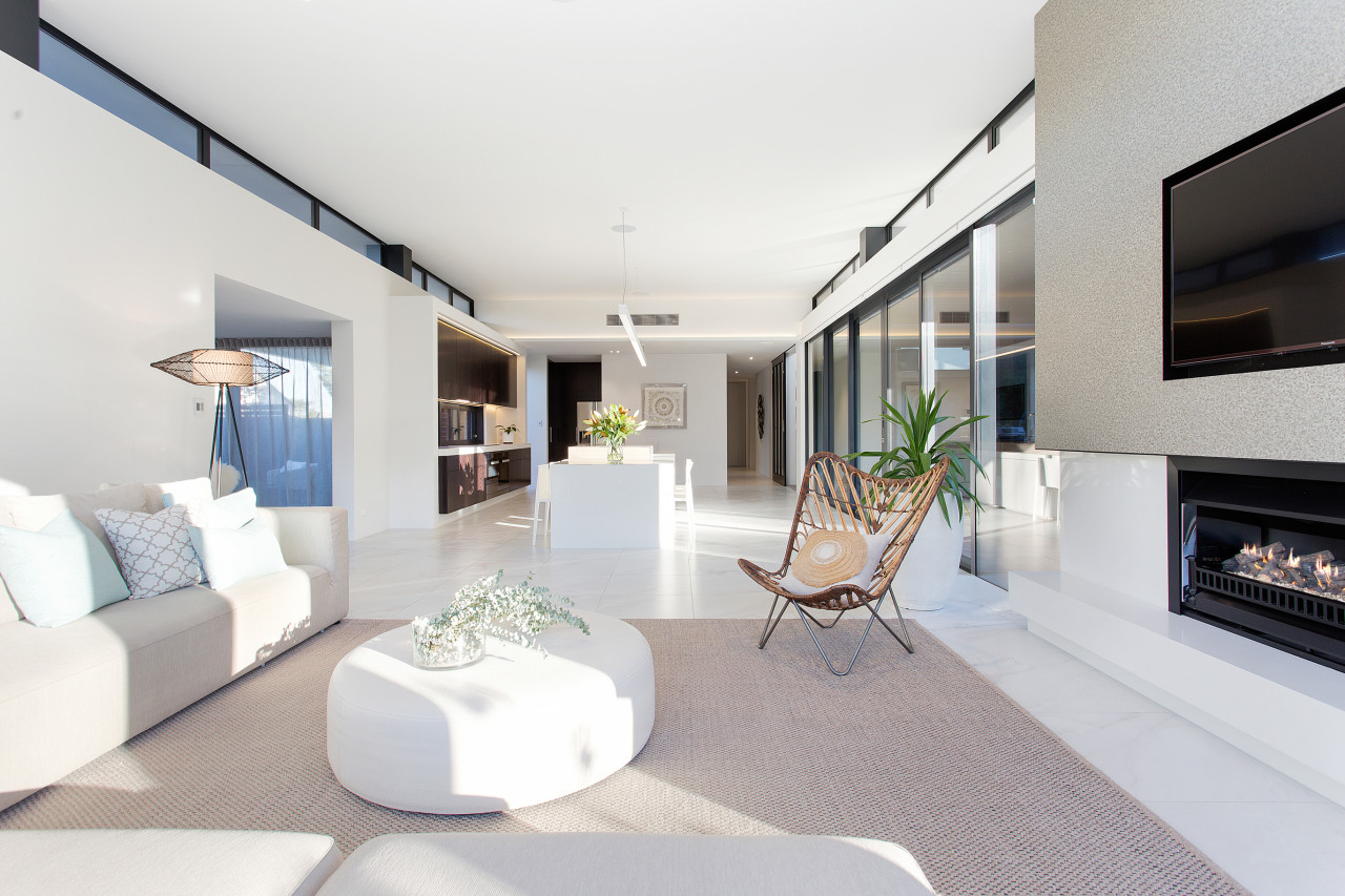
“The home connects with its green outlooks via long stretches of floor-to-ceiling glass which are balanced by generous overhangs, providing shade and protection,” says David Rea.

However, the deep overhangs are only one of several reasons that the home looks so serene and harmonious. The simple, clean forms are accentuated by the lack of distracting details such as exterior roof gutters. Plus the house has two strong vertical elements that both contrast and complement its overall horizontality – the double-height entry and double-height lounge.
In addition, the home is designed to look like it is actually constructed from walls of glass, rather than solid walls punctuated by windows. To this end, the steel structure holding up the home is disguised in some areas as dense window framing – structural support not hiding in the woodwork, but rather in the windows.
“Clerestory windows add to the lightness of the interiors, too,” says O’Neil. “These provide a breathing space between the windows below and ceiling above, creating a floating effect.”
Contributing to the crisp, planar aesthetic, the tile floors run out past the windows to same-level exterior decking and the ceiling also extends past the walls as the soffits of the home.
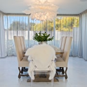
Lastly, the height and proportions of various elements are connected. For instance, the top of the chimney flu lines up with the home’s upper parapet. And the dining room, a few steps down from the living zone, lines up with the bottom of the clerestory windows in that larger room.

The idea of complex design used to simple, strong effect is seen in miniature in the entry stair. This looks like concrete steps held up by glass, but in reality the staircase is underpinned by substantial cantilevered steel elements which are surfaced in concrete. The proud ends are caps added on the outside of the glass balustrade that conceal the tricky steel-to-glass fixings.
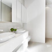
The interior design, along with the kitchen and bathroom design, fell to the team at Lume Design.
Having so much natural light flooding into the interiors gave the ability to mix up the materials and finishes, says designer Jeff Merrin.
“Dark stained quarter cut American white oak was used to add visual texture in the kitchen, entrance, wine cellar and the library, while oversize custom pieces were designed to balance the grand scale of the home, light fittings included.”
Credit list
Designer
Builder
Landscaping
Roofing
Kitchen cabinetry
Benchtops
Tapware
Hob
Fridge freezer
Paint
Tapware
Heating
Awards
Interior design, kitchen and bathrooms
Kitchen manufacturer
Cladding
Window joinery
Splashback
Ovens
Ventilation
Main flooring
Wallcoverings
Vanity
Basin
Shower fittings
Control systems
Story by: Charles Moxham
Photography by: Jamie Armstrong
Home kitchen bathroom commercial design
Radical yet respectful
Sculptural centrepiece
Curvaceous and connected
Home Trends Vol. 35/3
There's a sense in which we've established a layout plan that is the basis for nearly all new kitchens – one in which th...
Read More


