Elegant divide
Custom iron and glass walls bring light and visual connection – just one refined touch in a renovation and extension creating new living/dining/kitchen at rear of home
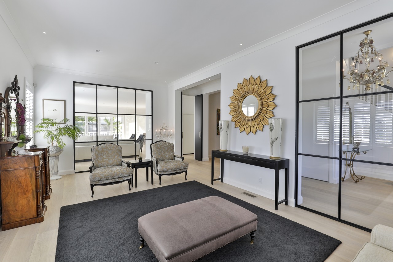

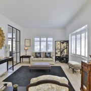
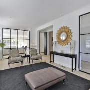


Designed by Jennie Dunlop, Dunlop Design
From the interior designer
Introduction
Twenty years ago I was invited to redesign an Edwardian 1912 home in order to upgrade the 1980s interior by replacing the various add ons with a new 8m X 10m extension.
In 2021 I was asked once again to totally upgrade the ground level to suit my homeowners who are now empty nesters with grandchildren.
The brief
I was given fairly free rein to create a home which was more contemporary with cleaner lines while also maintaining the integrity of the classic architectural style of the Edwardian elements of the home which had been retained previously.
Given the generously proportioned rooms with a high stud, beautiful restored original timber joinery and panelling on the staircase it wasn’t difficult reimagining the space.

The build
The largest part of the demolition process was the uplifting of glossy heated marble tiles throughout the ground level and replacing with beautiful custom manufactured wide board oak flooring, including underfloor ducted heating.
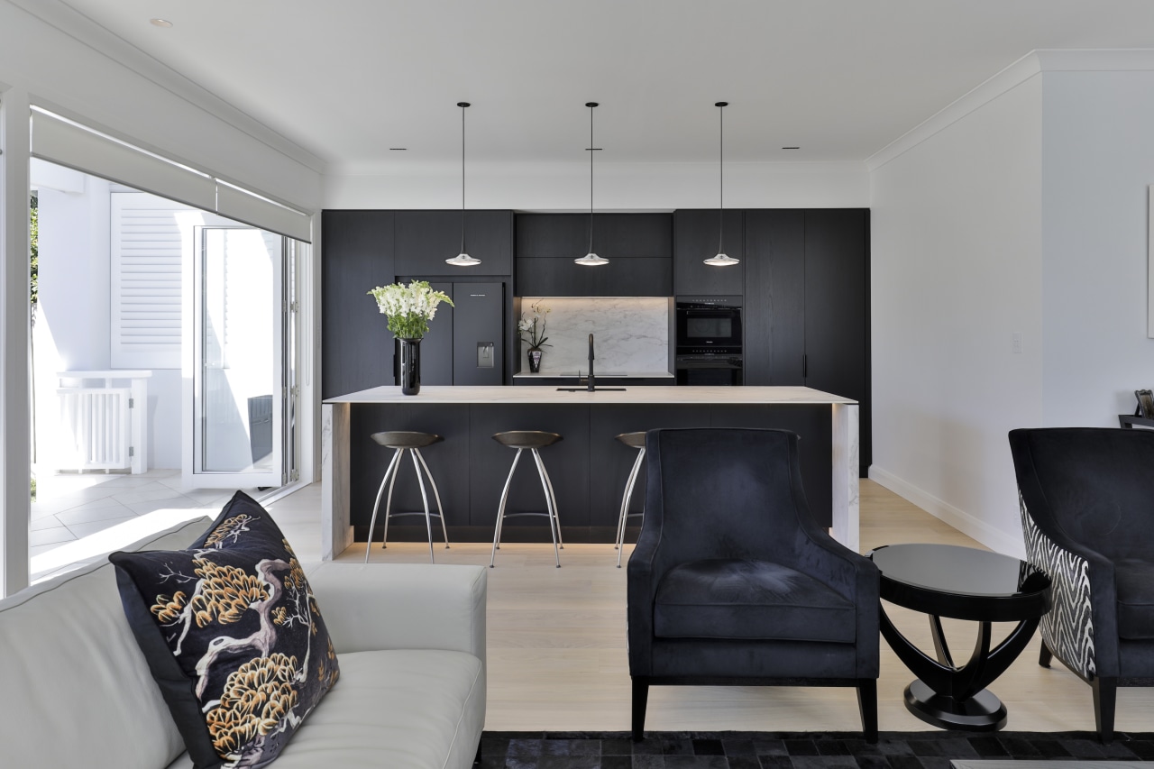
The large skylight over the kitchen was removed to enable the island to have three beautiful Falling Leaf pendants above including – plus, new lighting was introduced in all spaces.

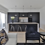
The existing Burr Elm kitchen cabinetry including black granite benchtops was replaced with sleek Black Oak cabinetry incorporating 12mm soft grey ceramic benchtops in a satin finish.
Although a scullery was an option, my homeowners decided they didn’t require one in their city home.
Design solutions
The rear part of the home incorporated a large open plan kitchen and living space, with casual dining.
The under utilised formal dining room has been transformed into a light modern dining space well able to accommodate family gatherings.
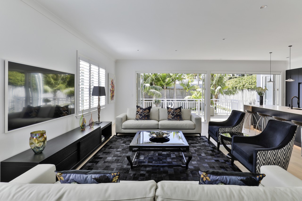
The family seating area is doubled in size with two new 2.7m long sofas and two armchairs.
Repositioning the TV from the corner of the room to the only large blank wall which is off centre of the space made for some creative thinking in order for the seating area to look balanced from all angles in the room.
I overcame this by increasing the length of the media unit to 3m, thereby allowing the TV to be above the left hand end rather than the centre.
Credit list
Interior designer
Kitchen designer
Roof
Glazed panelled walls
Flooring
Rugs
Paint
Lighting
Dining table/chairs
Awards
Builder
Cladding
Interior louvres
Stair carpet
Powder room wall coverings
General heating
Living area furniture
Other
Home kitchen bathroom commercial design
Eclectic meets elan
Best of both worlds
At home in the country