Dress circle waterfront parade new home by Accent Architects
Waterfront parade new home by Accent Architects
Cities that border a harbour invariably have scenic roads along the waterfront. And these areas of premium real estate tend to feature an interesting mix of architectural styles that have evolved over time.
Wellington's Oriental Parade is a prime example. Much of the architecture along this route is familiar to locals and regular visitors, and subject to a raft of regulations, which is why inserting a new building into the mix was always going to be a challenge for the designer of this new house.
Architect Gina Jones of Accent Architects says the architecture needed to be in keeping with the local vernacular. But the house also needed to be designed so neighbouring properties would not be overlooked. And it had to have a double gable so the mass would not appear overwhelming when viewed from the properties on the hill behind.
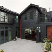
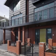
"The materials were determined by the need for low maintenance the site is very exposed to salt-laden winds," Jones says. "Consequently, the cladding is charcoal-coloured zinc, which never needs painting. We also introduced red brick, which echoes the older red brick buildings in the street. Every fifth row of brick is recessed to create a subtle shadow or banding, which is matched by the depth of the zinc panels. This is similar to the banding on the trees along the beachfront it also mimics the pattern that appears on the sand on the beach after it has been groomed."
To reference the more traditional homes in the neighbourhood, Jones created a small front yard, complete with iron gate, brick pillars, a small garden and pathway. Steps lead up to the front door to create an elevated entry that is not face-to-face with passers-by.

The living areas on the first floor also have a degree of privacy, thanks to a long balcony, accessed through large bifolding doors.
In addition to the balcony, the living areas open to a courtyard at the rear of the house. A view of the harbour is still possible from this sheltered outdoor living area glass doors provide transparency right through the house.
For the owners and guests, the wow factor is not limited to the harbour view and architecture, however. It is also provided by the furnishings by Anna Cuthbert of Cuthbert Interiors.
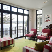
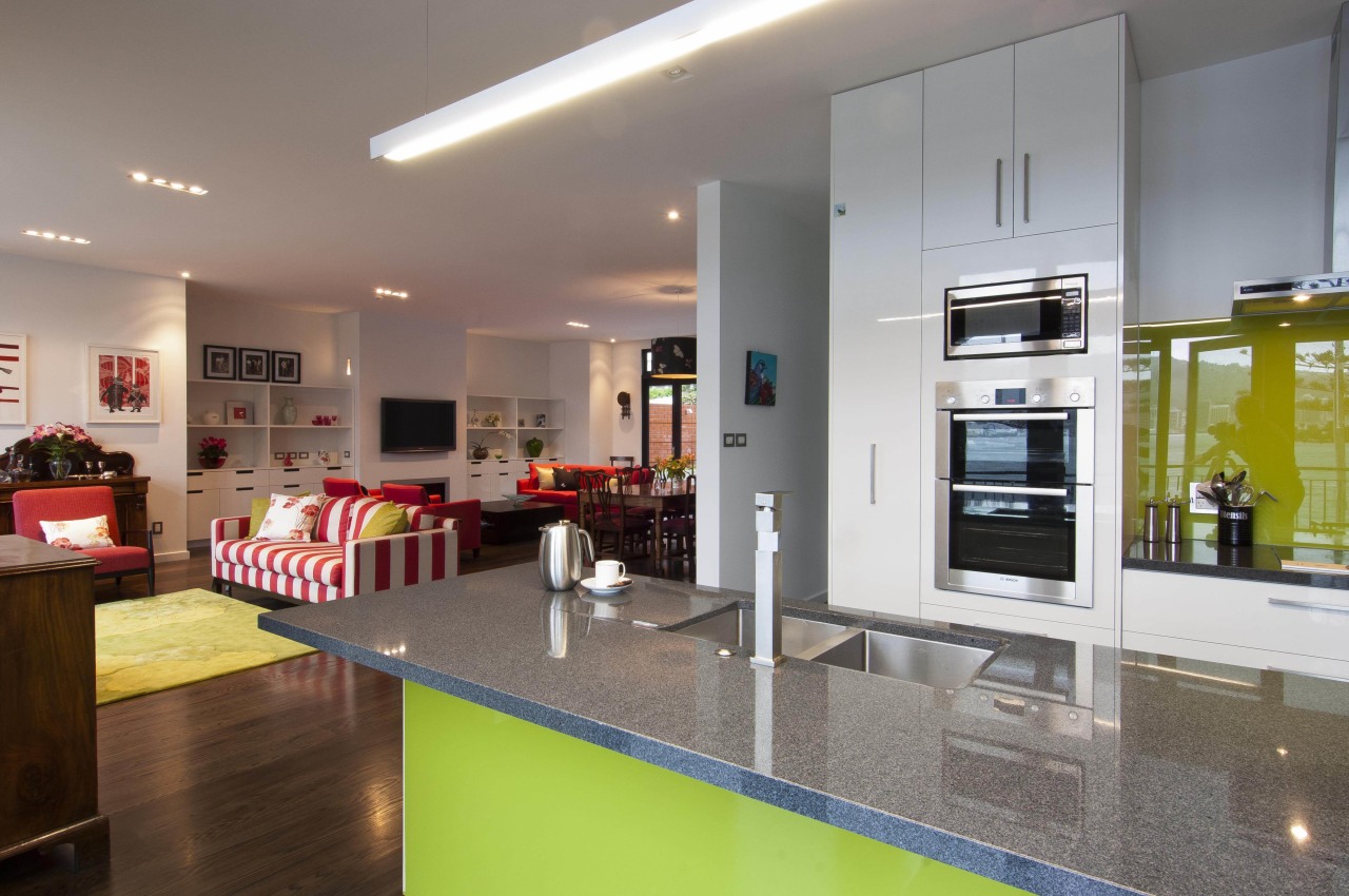
"Every interior needs to reflect the owners' personality," Cuthbert says. "These clients are particularly passionate about the pale lime green shade that can be seen in several furnishings, including the custom area rug. And they love the rich watermelon shade of the sofas and chairs. These colours are vivid, but they are relieved by the walls painted in Resene Sea Fog. This grey-white shade also works well with the oak floors, which have a charcoal base."
Cuthbert says the informal sitting area, which overlooks the beach and harbour, is reminiscent of a traditional bach it even features '60s-style Awaroa chairs upholstered in a chunky boucle fabric.

The interior also incorporates heirloom antiques from the family's original homestead, including the dining suite and a commode.
"There is a sentimentality that we wanted to acknowledge by blending the old with the new," says Cuthbert. "Contemporary artworks sit above antique furniture pieces, for example, and the heirloom dining chairs are upholstered with a bright fabric. It is a little bit eclectic, but nothing looks out of place."
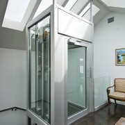
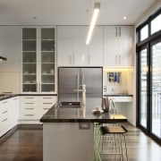
Practicality is also assured, says Jones. The clean-lined kitchen, which is positioned to maximise the view, has a scullery that provides plenty of storage. Further storage is provided on the lower level, along with extensive garaging and a car turntable. To future-proof their retirement home, the owners also requested a lift, which is positioned beneath a large skylight.
Credit list
of responsibilities Architect
Landscape designer
Services engineer
Kitchen manufacturer
Roofing
Paints and varnishes
Skylights
Fireplace
Benchtops
Kitchen sink
Oven
Ventilation
Living room furniture
Living room rug and pendant light
Interior designer
Structural engineer
Builder
Cladding
Wood flooring
Lighting
Desk
Kitchen cabinets
Splashback
Tapware
Cooktop
Refrigerator
Dining chairs
Story by: Colleen Hawkes
Home kitchen bathroom commercial design

