Cloud nine
With its light-filled, double-height living space, white walls and sculptural glass stairs, this penthouse has an ethereal quality
It is common for empty-nesters to move from a large family home into an apartment, but few would make the all-encompassing break from the past that the owners of this penthouse did.
Architect Sara Lundgren, associate principalof Krueck & Sexton Architects says the couple, one of whom was the developer of the apartment building, had lived in a turn-of-the-century neo-Gothic house on the shores of Lake Michigan.
"It was beautiful, but very heavy and dark," Lundgren says. "Having made the decision to move into one of the two-storey penthouse apartments, the pair made a clean break, and brought nothing from the old house with them."
Lundgren says they wanted the apartment to be a complete contrast to the old house.
"It needed to be open and light, with a very spacious, flowing interior. And, although the floor area of this penthouse is a similar size to the house, it is laid out in a completely different way, with larger rooms and a lot more light."
The architect says Krueck & Sexton was commissioned for the project when the tower was just half built. This meant the team could have an input on drawings for the top two penthouse floors, including the position of the stairs.
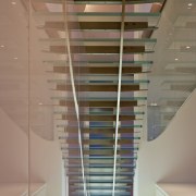
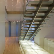
"We always envisaged that the stairs would be a special element," Lundgren says. "One doesn't normally expect to see stairs in an apartment tower, so we chose to play this up by creating a sculptural glass staircase and positioning it right in the centre of the apartment. This means you are constantly interacting with the stairs. When you first enter the penthouse, you are confronted with the stairway, and you are always walking around it, beneath it or on it as you move though the space. This helped drive the materiality of the stair."
The staircase, which features glass treads, sits on an onyx plinth, which is illuminated from beneath. The stairs are also defined by a custom-patterned, sandblasted glass wall that extends down through both floors, linking the public areas on the lower level with the private master suite on the upper level.
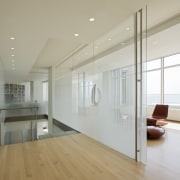
"The pattern is imprinted on both sides of the glass, but the patterns are slightly out of alignment, so the glass has a movement of its own. It appears to dance as you move past," says Lundgren.
In keeping with the owners' desire for a light, airy space that would be both a sanctuary and an ideal home for entertaining, the living spaces feature white walls and expansive, floor-to-ceiling double-height windows that maximise spectacular city and lake views.
"It's a little like being in a cloud it makes you feel like you're levitating," says Lundgren.
The simple colour and material palettes include clear maple floors and English sycamore joinery, which features a built-in seating unit and storage cabinets. A white marble window seat runs around the perimeter of the apartment, concealing a radiator and providing seating and a storage ledge.
The kitchen continues the uncluttered look, with white lacquered cabinets and white Japanese glass benchtops. The room can be closed off on two sides for catering, yet its central position by the stairs also means it can provide a drinks serving area for arriving guests.
On the upper level, the master suite of rooms includes a yoga room and office with glazed walls that overlook the living space below. And, despite the minimalist look, a close attention to detail is evident throughout. Marble vanities, for example, vary in height according to their function, and all the storage is customised.
Credit list
Builder
Flooring
Paints and varnishes
Furniture
Stair treads
Sandblasted glass wall
Sculpture
Benchtops
Taps
Oven, cooktop, ventilation and dishwasher
Joinery
Audiovisual equipment
Blinds
Stair plinth
Fireplace
Kitchen cabinetry
Sink
Water dispenser
Refrigeration
Story by: Colleen Hawkes
Photography by: William Zbaren
Home kitchen bathroom commercial design


