Calm vibrations
Rich colours, soft fabrics and clean lines give this apartment the relaxed look of a high-end serviced suite
For a busy professional, the place where you rest your head in the evening needs to be more than just a house it should be a low-maintenance, relaxing haven.
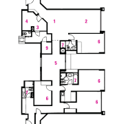
Creating an essence of calm and spaciousness in this apartment was the request of the homeowner to Designworx Interior Consultant. Designer Terri Tan was involved in the remodel. She says two units were combined to create one large apartment, and rooms were opened and expanded in the remodel.
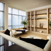
"We removed the original third bedroom next to the living room to create a more generous living area. The resulting space was then divided into two separate areas a formal entertainment area and a cosy corner for more private conversations," she says.
The original kitchen was also removed and converted to a wet kitchen and maid's room. Adjoining the wet kitchen, a utility room was transformed into a dry kitchen with an open counter.
"We used glass to screen the cooking area in the dry kitchen from the dining room. This allows the client to show off his culinary skills without exposing the entire living room to cooking smells," says Tan.
The finished product was required to have the appearance of a high-end serviced apartment, yet feel like a warm and friendly home. Tan says fabrics and furniture were chosen to create a timeless, yet modern look.
"To satisfy this seemingly contradictory theme, we used a lot of rich, luxurious materials, but chose neutral colours and textures that were more contemporary."
Granite flooring and off-white leather dining chairs provide a soft, yet clean, modern look in the open-plan living area. A square dining table with a tinted mirror finish is a centrepiece of the space.
A mix of halogen and energy-saving lighting is used in the living area to create different mood zones. In the dining space, decorative hanging pendants create an ambient light that encourages relaxation and conversation. To allude to a similar feeling in the reading area, table lamps provide a soft light.
Flooring and dividing walls delineate open-plan areas. The dining space and living room are separated by two dividing panels, with a visual link retained.
Designworx Interior Consultant kept the original granite flooring in the living area, but installed off-white carpet in the lounge.
"This means that the spaces are more easily read as separate from one another. The carpet also gives the lounge area a softer feel," says Tan.
The master bedroom features teak timber lattice divider panels, separating the bed from a reading area with day bed. In the other two bedrooms, the original timber flooring was retained for easy maintenance, but in the master bedroom, Designworx Interior Consultant installed carpet to give a more comfortable, warm feel.
The owner wanted enough space in the master bedroom for a generous wardrobe, so Designworx Interior Consultant converted a smaller room into a walk-in wardrobe that links to the master bathroom with a stand-alone tub.
Credit list
Story by: Camille Butler
Photography by: Peter Chua and
Home kitchen bathroom commercial design
Thrice as nice
Marvellous in marble
How to get your bathroom right


