Bathroom renovation design adds classic touches to a clean-lined minimalist space
Modern elements combine with an old world-look wall finish to tie to both original and new parts in a renovated and expanded home

Balance is an important consideration in any renovation – and not only in terms of colour and form. For this bathroom makeover, the owners wanted the design to tie to a contemporary extension at the rear of an historic home as well as linking to the original 1900s aesthetic.
They also wanted a romantic feel for the room. The only constraints were an existing fireplace, door and window – and a soaring 3.4m high ceiling. In response to this brief, designer Darren Genner of Minosa Design fully rearranged the space, creating a light-filled design that played on the connection between old and new.“In terms of the room’s spatial redesign, we placed the toilet behind the door for privacy.
This encourages the owners to leave the door open so, as you pass by in the corridor, you are drawn into this alluring space by the artwork and bathing area.
”Genner introduced a blade wall to conceal the large walk-in shower, allowing more than one family member to use the room at once, and to create a backdrop for the freestanding tub.
“While this space is a great size, it only had one window, so its natural light was limited. To address this, we added a large skylight over the shower and this floods the room with light.”
“The wall opposite the door was chosen as the place for the vanity and, always being on show, this had to be beautiful. We designed the bespoke unit with a solid, round-edged walnut countertop and two large servo-drive drawers.
”The vanity also features a handmade ceramic countertop bowl, furthering the rounded look.
“We positioned the large, fixed vanity mirror and two elongated display cabinets to balance the understated vanity,” says Genner.
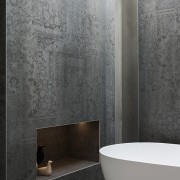
Acknowledging the lofty proportions of the space, the designer introduced a tall ladder, also in walnut, as a towel rail in the shower area.“The large-format wall tiles provide a canvas for other feature elements to stand out against,” says Genner.
“Along with the tub, the tiles’ subtle, lace pattern adds another traditional accent to the room’s otherwise clean-lined feel.
”The size of the tiles also reduced the number of grout lines required, giving the wall surfaces the look of wallpaper.
An ornate picture rail caps the tiles, adding another old world touch.“The minimalist pendant above the vanity creates an artistic focal point – a refined element within the vanity wall composition.”
Story by: Charles Moxham
Photography by: Nicole England
Home kitchen bathroom commercial design
Small space, big impact
Classic dovetails contemporary
Tranquil waters
Home Trends Vol. 34/2
Placing the kitchen at the heart of a home is not just about creating a convenient zone for easy food preparation and ea...
Read More


