Australia's architectural past and the future of office design come together at 5 Martin Place
This bold yet also understated architectural design sees a new glass officer tower rising alongside and then cantilevering over a beloved heritage Sydney building

Downtown Sydney is home to some of the most coveted commercial real estate in the world. But what to do on such prime land, where a heritage building has to be both preserved and celebrated and yet progress still has to march on? Well one rather bold solution is to build a new office tower that rises up alongside the protected building and then for its upper floors cantilevers out over the newly refurbished historic structure.
Such was the revolutionary thinking behind the upgrade of 5 Martin Place by developers Cbus Property and Dexus. The design was a collaboration between architects Johnson Pilton Walker (JPW), with Peter Blome as project associate, and Tanner Kibble Denton Architects (TKD), with Megan Jones in the role of project director. JPW was largely responsible for the new tower and replacement of a 1960s addition to the original highly significant historical building on site, while TKD was responsible for the sensitive heritage restoration.
Dexus CEO Darren Steinberg says 5 Martin Place combines the intricacies of a significant heritage restoration project with a modern office tower, to deliver one of the most innovative commercial workspaces in Australia.
Sitting on the corner of Martin Place and Pitt Street, the former Commonwealth Bank of Australia building was the first fully steel-framed building in Australia. The original building was completed in 1916, with an almost seamless extension made along Pitt Street between 1929-33, reproducing the existing sandstone and trachyte exterior detailing. In 1965, the bank was extended in the other direction, along Martin Place, in a style not entirely sympathetic to the existing structure. From the '70s on, the interiors were progressively adapted/compromised by filling in light-wells and adding false walls and ceilings to hide services.
Looking forward, the developer's brief outlined a situation where building the new tower out over the historic building was a daring but logical response. Requirements included maintaining the commercial relevance of the key heritage building and the wider Martin Place precinct; attracting quality tenants as befitting the status and location of the building; enhancing the existing heritage values and regaining the lost qualities of the interiors.
A major part of the multi-faceted project was the painstaking restoration of the original building.
TKD Architects was largely responsible for the revitalisation of the original 1916 building and the 1933 extension, as well as the new elements within it, including the glazed atrium.
When opened in 1916 this building set the bench-mark for CBD office space with high ceilings, quality materials and finishes, and access to good natural light and ventilation, says TKD's Megan Jones.
"Now it will again be an exemplar for high quality office space.

"The original light-well, which provided natural light to the centre of the large floor plates, as well as the Banking Chamber, had been infilled. We designed a contemporary glazed atrium with a glass floor over the reconstructed lay-light, interpreting and referencing the extensive original decorative glass elements throughout the building and transforming both the commercial floors and the former Banking Chamber."
A key part of the restoration was setting the co-ordinated services within an integrated chilled beam unit, sweeping out the clutter of concealed services hidden by false ceilings and allowing the existing heritage ceilings to be exposed.
The Banking Chamber and other protected spaces have since been retrofitted for retail, with the heritage elements remaining in full prominence.
Cbus Property's and Dexus' aspirations for the project showed their recognition that the building's heritage values are integral with its commercial value. This was seen in the joint-developers' willingness to sacrifice floor space for the re-introduction of the building atrium; their commitment to revealing and repairing the 1916/33 spaces, elements and finishes and, lastly, to commit to the extreme structural complexity of the cantilevered tower so that the existing building was not compromised.
Redevelopment of the 1960s addition and the creation of the new office tower was generally the responsibility of JPW.
"We reworked the 1960s element with a new facade which is consistent with and articulates the height, scale, design concept and elegant proportions of the adjoining 1916 building," says Blome. "Its detailing also acknowledges the prominence of this principal fae§ade fronting Martin Place."
The facade materials, including sandstone and reclaimed trachyte from the 1968 building, are harmonious with the original 1916 facade.
However, the most dramatic part of the complex revitalising programme is the new build component with its dramatic physics-defying structure.
The new tower rises twenty storeys alongside the heritage building, with the upper ten floors also cantilevering right over the historic bank building without imposing any permanent loads on the existing structure. The bottom half of the tower is in concrete while the top half has a steel structure. Aurecon was structural engineer on the project and the company's design director Tony Lavorato says it involved a complex feat of engineering.
"The solution was a cantilever structure where the overhanging structures above the existing 10th level of the heritage building are supported using hanging columns on the western facade, forming an inverted king post truss," says Lavorato. "This delivers the load of this section of the building to the northern and southern elevations, which rely on a strut-and-tie arrangement to transfer the load from the hanging columns to the main building concrete cores and down to the foundations."
This construction method required the temporary support of the building during construction of the main structure and some levels of the fit-out. This was achieved by temporarily supporting the structure on hydraulic jacks located over selected strengthened columns of the heritage building.
The cantilever was not expressed in the tower facade at it was felt the structural ingenuity of the tower would detract from the charm of the original building. However, the innovative structure and inclined columns are visible through the clear glass.
This structural solution also delivered floor plates with minimal core requirements and expansive column-free floor space to maximise uninterrupted views and daylight penetration into the floor plates all major drawcards for prospective tenants.
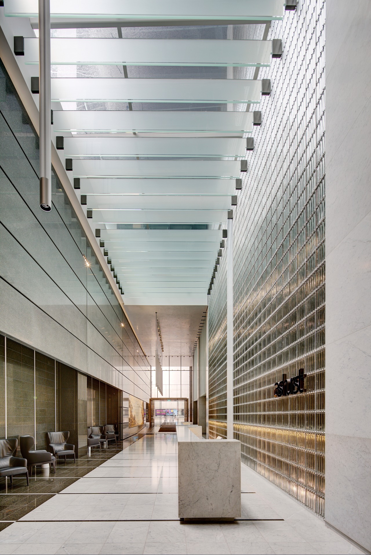
An important part of the inner-city project was the re-activation of the connection to Martin Place and Rowe Street. This was achieved by the through-site-link between them incorporating the commercial office lobby and new retail outlets.
Sustainability is at the core of the design, achieved through aspects such as the multi-service chilled beams, a high efficiency fae§ade, sensor lighting and a regenerative power system.
Cbus Property CEO Adrian Pozzo says the building's recently achieved 5 Green Star and 5 Star NABERS Energy ratings demonstrate how traditional buildings can be upgraded and redeveloped to meet new sustainability standards.
Credit list
Project
Architects
Structural, hydraulic and fire services engineer
Mechanical and electrical engineer
Fire engineer
Roof
Doors and door hardware
Paints
Veneers
Lift services
Developers
Construction company
Facade engineer
Quantity surveyor
Cladding
Facade design
Public area wallcoverings
Ceiling panels
Lighting
Awards
Story by: Charles Moxham
Photography by: Brett Boardman
Home kitchen bathroom commercial design
Radical yet respectful
Sculptural centrepiece
Curvaceous and connected
Commercial Design Trends Vol. 33/3C
The retail sector is in the midst of massive disruption as online shopping takes an ever increasing slice of the consume...
Read More


