Office fit-out places a social kitchen at its heart to emphasise connectivity
Design of Fisher & Paykel Sydney offices by Custance features transparent meeting pods, while a curving, 3D plywood ceiling bisects the space
The idea of the Social Kitchen is at the centre of Fisher & Paykel's vision for our kitchens of today and tomorrow a versatile hub of the home where we cook, prepare food, help our kids with their homework and entertain friends. Gone are the days where appliances dictated limiting work triangles instead advanced appliances are seamlessly integrated into a wider, more user-friendly vision. And the company has taken this concept literally to heart in the fit-out of its new Sydney offices.
The brief to designer Jonathan Custance was for a flexible, collaborative workplace for 65 staff that could accommodate a growth in numbers to 90 without need for hard fit-out alterations. The project also had to include F&P and Haier showrooms and embody F&P's vision and brand values.
In response Custance transformed a standard rectilinear 1340m² floor into a light-filled, fluid space where there's a sense of discovery and connection.
Visitors or clients arrive at the first-floor offices via a rear lift core, with the reception straight ahead. From here they're guided either towards the showrooms to left and right, or around the reception station to discover the Social Kitchen and pod-like meeting rooms directly behind the reception wall.
"The Social Kitchen is symbolically placed at the heart of the design as a place of sociability, collaboration, creativity and eating together," says Custance. "Staff use the space to both cook in and to socialise, and at the same time whether clerk or salesperson get the feel of F&P's latest models."
The Social Kitchen and eight meeting room pods together form a central zone that neatly bisects the entire room with desking running back on both sides.
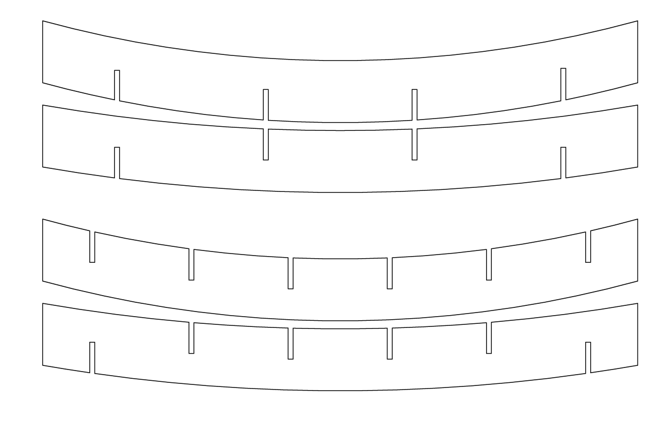
"A richly toned sweeping, curved plywood ceiling provides an organic element within the standard flat ceiling and adds to the central focus highlighting the conceptual and physical heart of the facility and achieving a sense of volume and height in this area."
The 3D ceiling was created using 2D elements in a simple, effective way. 3D software and a CNC cutting machine achieved the precision cuts required. The flat pieces were then slotted together, prior to hanging no interlocking fixings required.
"Overall, the fit-out exudes light, transparency and connection," says the interior designer.
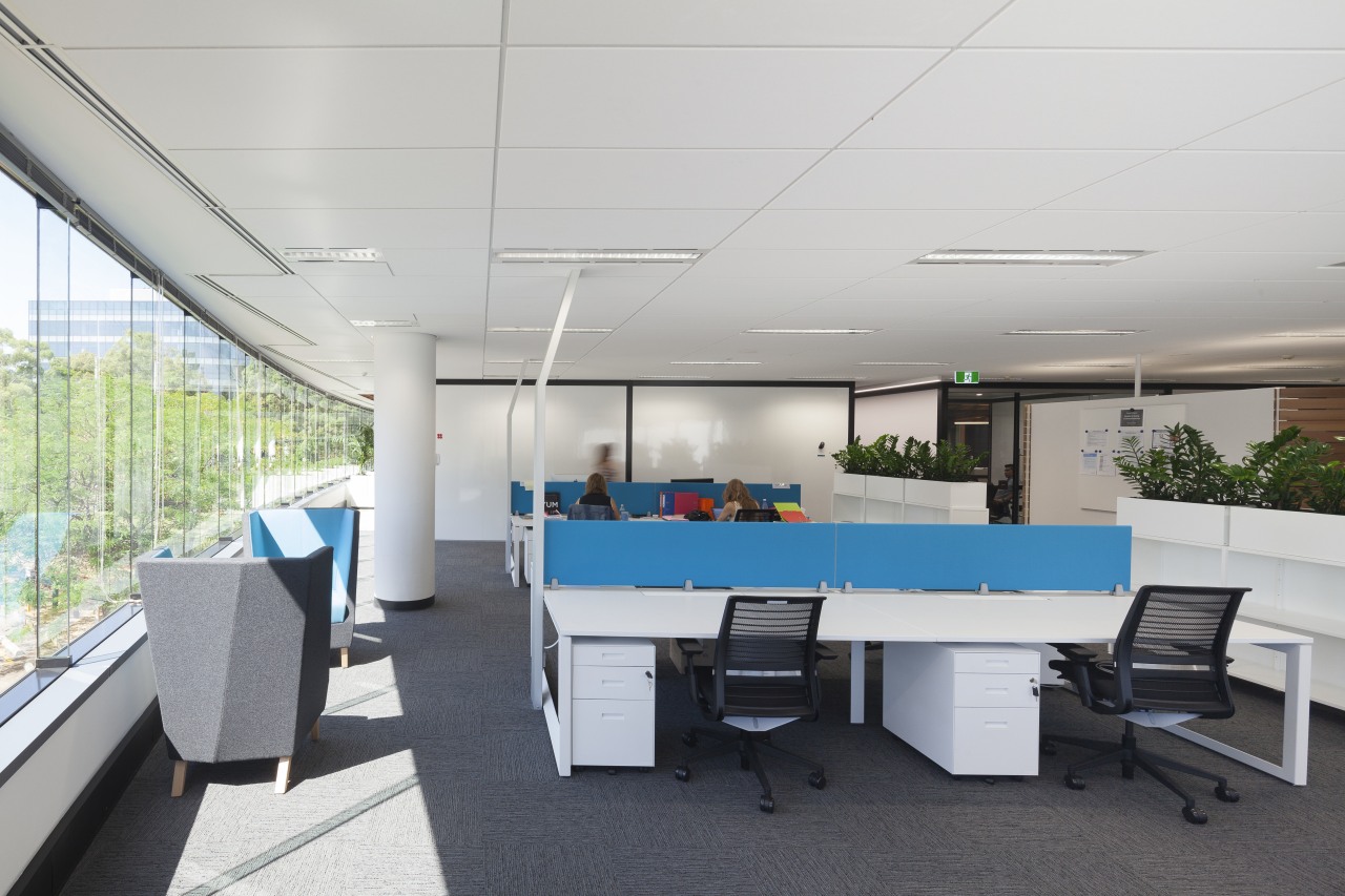
"Half of the pods to left and right of the Social Kitchen are transparent on both sides allowing occupants to look out to the central kitchen and also office workers to look right through them to the other side of the office. Desks are also positioned clear of the glass perimeter wall, creating another circulation corridor to complement the connectivity of the central zone and several cross avenues."
As well as chatting in the acoustically treated meeting pods, visitors, staff or clients can have informal meetings at the large tables beyond the Social Kitchen or at casual furniture beyond that.
All workstations take advantage of views and natural light, while the office utility spaces are contained in timber-slatted pods within the work-station areas. Any future expansion can be easily and inexpensively accommodated by clipping a double bay to each workstation cluster and repositioning freestanding storage elements.
Much as the offices' strong interconnectivity reflects F&Ps modern kitchen thinking, so too does the fit-out call to mind the design of its appliances.
"Black and white finishes are central to the colour palette," says Custance. "Rolled white Alucobond, black aluminium framing and precision glass sliding doors on the meeting room pods call to mind the crisp design and close attention to detail seen on all of F&P's advanced appliances."
The lift core is also clad in a soft-curving wall of moveable white Alucobond panels. These can be quickly slid aside to store appliances, but also create a smooth, seamless effect when closed.
And the two-tone theme is also continued in large black and white inspiration lifestyle photos dotted throughout the contemporary office spaces.
Colour highlights are seen within the meeting pods, on low seating elements, and on dividers in the workspace areas. The timber feature ceiling adds natural warmth and provides the perfect backdrop for the domestic kitchen appliances.
Other areas in the fit-out include a branding wall seen upon initial entry and the two appliance showrooms one for Haier and one for Fisher & Paykel. In a design that is all about discovery as well as connection, these are first glimpsed through a vista shaped by the curving walls of the lift core.
Credit list
Project
Mechanical and electrical engineer
Fire consultant
Flooring
Core panels
Paints
Workstations
Reception furniture
Kitchen equipment
Story by: Charles Moxham
Photography by: Ian Carlson
Home kitchen bathroom commercial design
Natural feel, natural outlooks
Wonder wall
Walnut and weatherboards
Commercial Design Trends Vol. 32/3C
Commercial Design Trends is aimed at our professional readers, and showcases commercial buildings. The book features reg...
Read More


