Where the tui sing
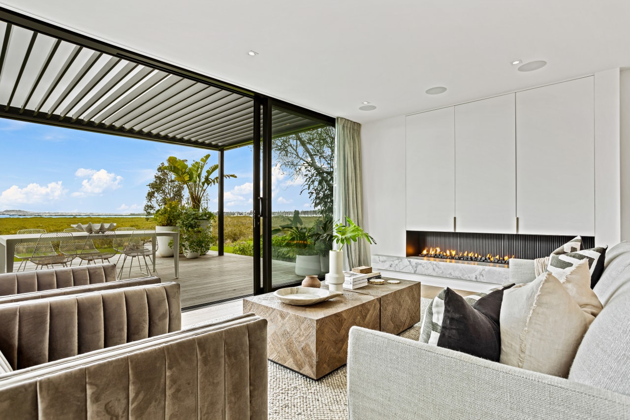
Curves, custom furniture, natural materials and texture hold sway in this interior, leading a seamless flow from inside to out, accentuated by stacker doors and high-pitched ceilings
Designed by Kate Gardham, Suede + Stone
From the interior designer/owner:
This Auckland home has wide open spaces where the Tui sing and the boats sail by.
It’s a space where we can retreat and relax in as well as a place to bring friends and family together around the outdoor fire pit that’s nestled down on the shoreline.
We purchased part way through the build and had the opportunity of re-designing the layout so the flow and functionality would work in with our busy, entertaining couple (no kids) lifestyle and to our luxe and relaxed vibes.
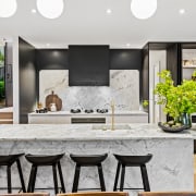
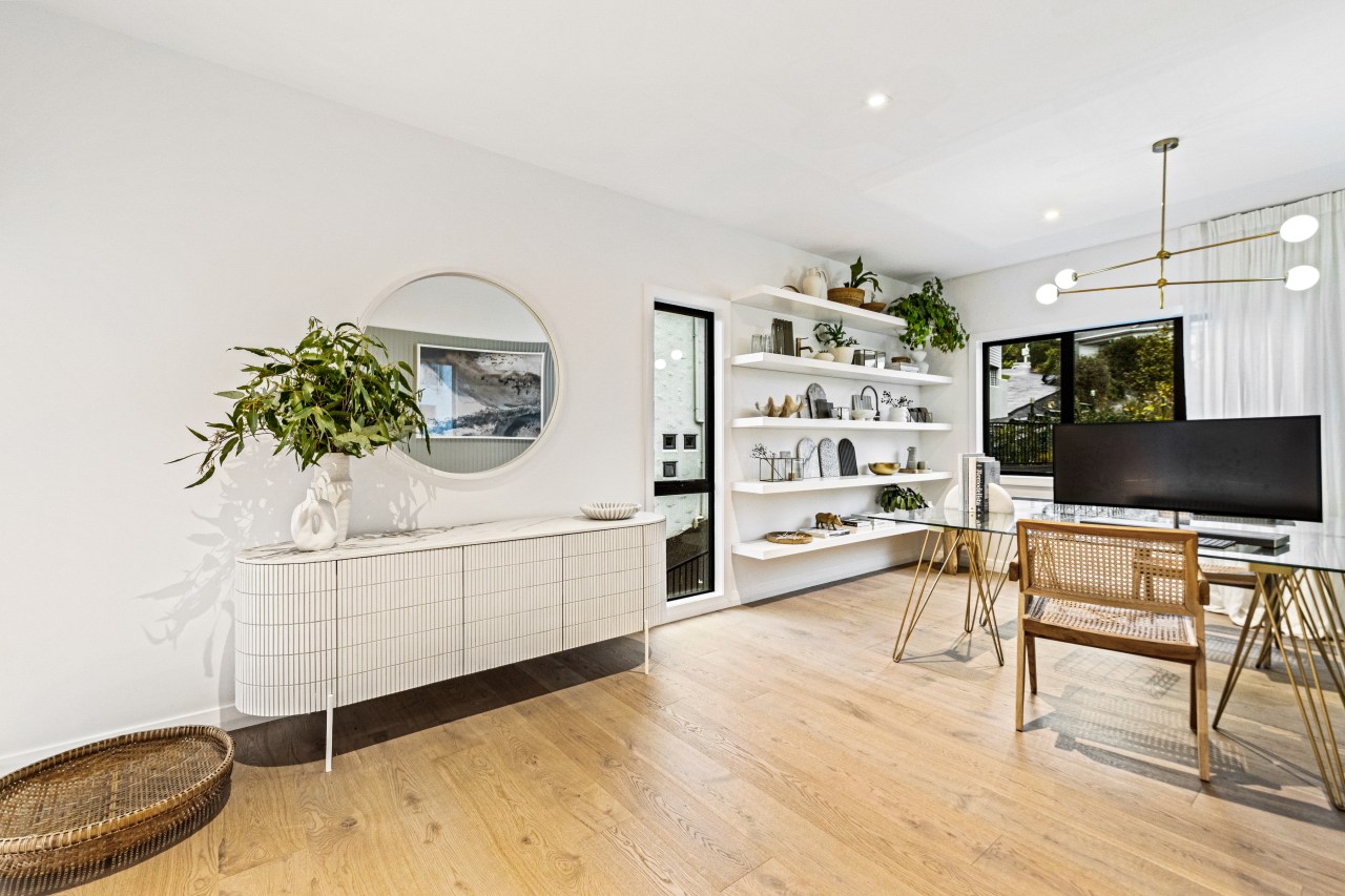
We love curves, movement, natural materials and texture is very important to us as we love depth and tactility with colours and finishes – as seen here, when you run your fingertips over the leathered granite benchtops, Japanese finger tiles, brushed brass accents, steel, American Oak and linen curtains.
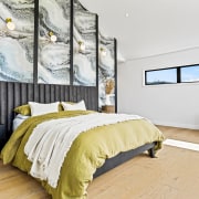
Scalloped walls were built and wallpapered, and a custom reeded velvet bedhead introduced to the master.
Even the olive bedding was chosen to connect with the mangroves + Nikau palms outside.
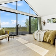
There is this lovely seamless flow from inside to out and this is accentuated by the stacker doors and high-pitched ceilings.
Lighting was key to creating softer pockets of light and ambience throughout the home.
This home was built and situated towards the city and sea views.
Large stacker doors and pitched ceilings were designed to accommodate the views and to let more natural light in.
The original design proposed to us was for a much smaller kitchen which didn’t have much storage and had the powder room opening up from the main living space.
However, the idea of seeing a toilet while eating or relaxing didn’t appeal to us at all, and we decided it needed to be changed.
Using the Hafele pivot door meant we could relocate the doorway for the powder room to the hidden scullery – this gave us the privacy we wanted.
We were then able to use this newly freed up space for the bar area.
The scullery is used as a secondary work-space for our busy morning rush and entertaining preparations.
Within the main kitchen, the generous island was designed facing the sea and city views so we can sit with our friends and family around all three sides – allowing conversations to flow freely.
We desperately needed a studio office to work from so bedroom 3 was appropriated and walls removed to create this space to allow us both to work together.
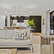
All appliances are integrated, even the TV is hidden behind doors – with that view we didn’t want the TV to be the focal point of the living room.
The original design for the upper level was a small ensuite and wardrobe all in one, which didn’t allow enough storage for all our clothing.
We wanted a space we could walk freely between our rooms, so created a master wing.
The door to the master was removed to maximise the views and bedroom 2 was turned into a generous walk-in master wardrobe.
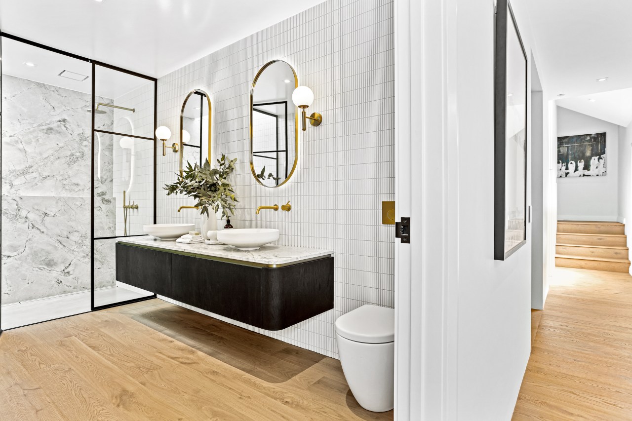
This allowed us to create a twin jack and jill ensuite where we could both get ready at the same time without getting in each other’s way – twin sinks and shower achieved this and also gave us the benefit of extra storage.
A skylight was added above the shower for natural light and to enjoy the Nikau palms.
Serving both functional and aesthetics, a Hafele trio docking station was introduced in a vanity drawer, to conveniently and unobtrusively charge phones, toothbrushes, hairdryers.
We felt that plugs should be hidden away and not detract from the lovely finishes we have picked.
The subtle curves in the wall paneling, cabinetry and benchtop, kitchen splashback and furniture introduce a lovely flow on effect and cohesion throughout the home.
We designed and manufactured all our cabinetry – being a kitchen designer, this was important to me personally to be able to oversee all these details.
Furniture was lovingly hand made by my partner to suit the space, along with custom tapware from Astra Walker.
Cues were taken from the exterior cladding and I had to have the black steel doors for the shower spaces – we feel our home has a degree of luxe, layering and longevity.
I think the biggest surprise for me was the master bedroom feature wall, I knew it was going to be amazing but I just didn’t think I would want to sit in there so much.
All plugs are discretely hidden within the bedhead and it's lovely to rest against on those lazy Sundays reading or just simply taking in the views.
Challenges
Creating a curved scalloped wall is one thing, however we had the added challenge of creating the curved bedhead within the context of the angled pitched ceilings in the master bedroom.
The 4m-high studs really give the scalloped detail full effect and made the bedhead totally worth the effort my partner, Andrew Holder, put into it.
Credit list
Interior designer/owner
Kitchen designer
Landscaping
Louvres
Flooring
Bathroom tiles
Paint
Fireplace
Control systems
Dining table chairs
Builder/co-owner
Kitchen manufacturer
Rugs
Wall coverings
General heating
Lighting
Living area furniture
Awards
Designed by: Kate Gardham, Suede + Stone
Story by: Trendsideas
Photography by: Mitch Brown, Fabit Photography
Home kitchen bathroom commercial design
'Worthy of Architectural Digest'
Small space, big impact
Tranquil waters
