What's in store?
An Austrian supermarket chain is foregoing corporate branding to commission local architects, who are putting a whole new slant on supermarket design both inside and out
Mention supermarket design to any big-name grocery chain and you're likely to get a treatise on customer shopping patterns. There will be long-winded explanations as to why the fresh produce department should be near the entrance, and the marketing implications of putting the most popular items in the middle of a long aisle.
The internal focus of most supermarkets makes this hardly surprising. But in a picturesque corner of Austria, one large chain is pushing the boundaries of supermarket design to a whole new level.
Gone is the large, closed-box, concrete bunker mentality that ensures most stores are totally isolated from their surroundings. Gone also is the readily recognisable corporate branding that ensures all stores look alike. For the MPreis chain, designing a supermarket is all about creating a destination and providing a more interactive retail experience. Good architecture is an intrinsic part of the package.
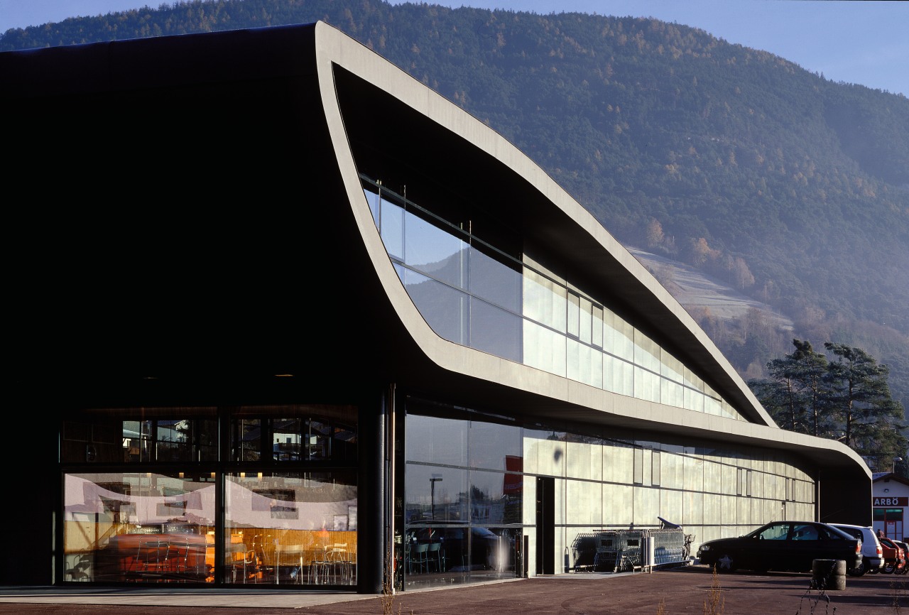
Over the past 15 years, MPreis has commissioned more than 30 different architectural practices to design separate stores the major brief being to make each store an individual design response to a particular site. The result is a collection of buildings that open up to the spectacular Tyrolean mountain scenery.
But that is one of the few things they have in common. The architecture, while having strong modernist influences, is as diverse as the architectural practices MPreis does not roll out duplicate stores or franchises, and that's the way the owners like it.
Cousins Hans-Jorg and Anton Molk, who have been expanding the family business since the late 1980s, have a keen design sensibility, which reflects the company's mission statement.
"Generally, a brand is recognisable through uniformity. At MPreis, we take an entirely different direction. Our trademark is the variety of different ways our architecture is expressed each store is designed especially for its location, but it is still recognisable as the MPreis brand."
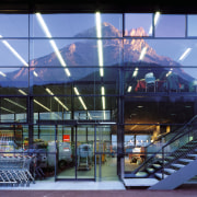
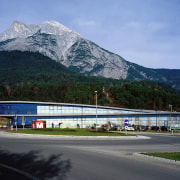
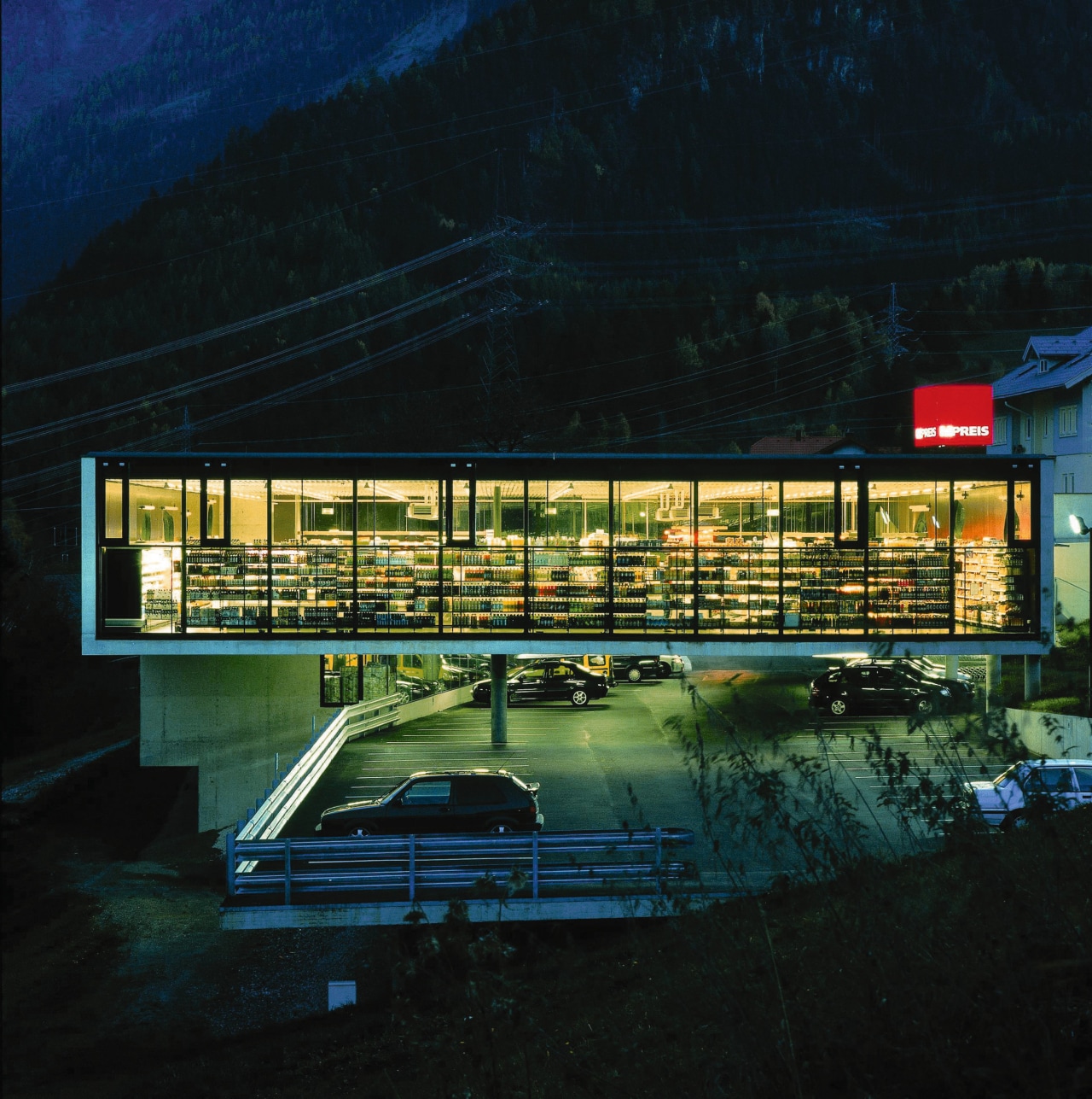
The two stores featured on these pages, in Telfs and Wenns, highlight the innovation that is encouraged. Both make a bold architectural statement, and both are characterised by expansive glazing and a small red cube that provides the sole MPreis branding.
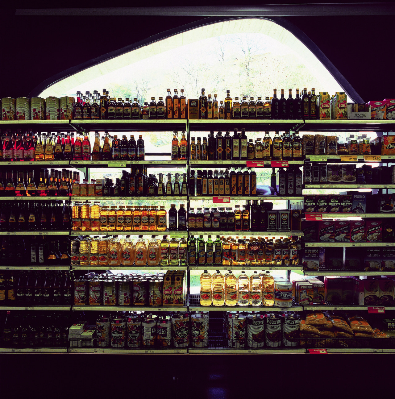
Architects Rainer Koberl and Astrid Tschapeller, who designed the Wenns store, say it was the first of the company's stores to be built on a steep slope. Designed as a large U shape with fully glazed walls at either end, the store also features free-form cutouts in the side walls. These have an organic shape, and are designed to ensure they won't compromise the wall's structural integrity, while still providing views of the magnificent scenery beyond.
But the difference doesn't end at the door. Inside, the Wenns store promotes a market-style layout.
"Supermarket interiors are usually much more sterile," says Koberl. "Here, we set out to create a completely different atmosphere. Natural lighting has been maximised, along with the views.
"The shiny metal ceiling is countered by very deep red, almost black walls and flooring, which provide a wonderful backdrop to the produce."
Koberl says it's a look that is more reminiscent of local village stores and farmers' markets. The village concept is taken further with the introduction of a cafe and outdoor terrace a concept applied to all stores.
"Many of the MPreis supermarkets are positioned on the outskirts of towns and villages, a long way from main streets" says Koberl. "Traditionally, villagers like to be able to shop and stop for a coffee. In many areas, the MPreis coffee shop is the only meeting place for miles. Compared to the typical, modern supermarket, these stores have taken on a very different, and much more social role in the community."
Story by: Trendsideas
Home kitchen bathroom commercial design

