Water lines
This waterfront home featuring minimal decor, stainless steel, wood and sleek lines, was designed to reflect its environment

It's all very well having an affection for a minimal aesthetic, but when children are added to the mix, the design requires elements of safety and practicality.
Combine these factors with the owners' desire to ensure the building was in harmony with the waterfront setting and you have a multi-faceted and challenging brief, says interior designer Noela Coffey.
"I don't see the house in its complete state as necessarily being nautical, but it certainly reflects the waterfront setting," says Coffey, who prefers to use a theme as a starting point, as opposed to a rigid formula.
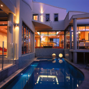
The shell Coffey began with was the work of architect Maria Vrondas. The home was designed to connect with the river view and the swimming pool. The result is a pavilion- style residence that appears to float and wrap around the water elements.
The extensive use of full-height glass and open-plan, split-levels, allows for views over and through to adjoining rooms. The slender floor plan through the mid-section encourages efficient solar access and ventilation, says Vrondas.
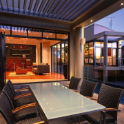
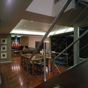
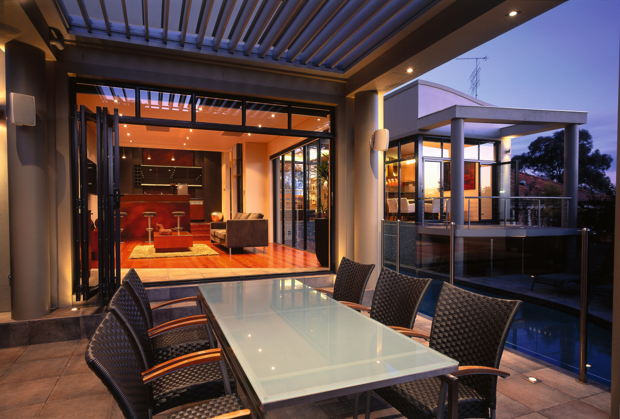
In keeping with the waterfront theme, Coffey opted for stainless steel balconies inside and out. The repetition of materials also serves to link the kitchen and internal staircase with the external balconies. The hard, semi-reflective surface also provides an effective contrast with the warm brushbox timber floors, says Coffey.
Extensive use of timber throughout the home fitted perfectly with the owners' preference for natural materials. The natural look continues with warm-coloured stone tiles laid inside and out to enhance the indoor-outdoor flow, says Coffey.
"The internal tiles and external tiles were exactly the same; The only difference is they were laid on a 45 degree angle to complement the timber flooring."
The glass fence around the pool was built to ensure the children's safety, but visual connection with the pool and river is maintained, says Coffey.
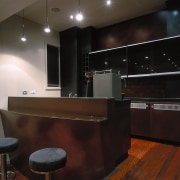
A linear grid pattern forms the basis for the placement of the lights in the dining areas and the kitchen. The line of the lights was designed specifically to reflect the directional change in the timber floor.
A coffered ceiling in the dining room was made more dramatic with a concealed perimeter of fibre optic lights. This further enhances the height of the stud and makes an interesting light feature that suits the cleans lines of the interior, says Coffey.
The bedrooms are in keeping with the minimalist look. Veneer also features in the bedroom - above the bed in a long head panel that runs from one lamp to the other.
Once again, Coffey wanted the materials to be the focus, rather than the soft furnishings.
"I decided to keep the bed covers quite simple and non-obtrusive, so I had them made in plain fabrics. But to play up the texture I went for a shiny taffeta. Texture is added to the mix with quilting," says Coffey.
The guest bedroom also features a landscape painting made up of nine panels in oil, chosen because Coffey wanted to create a view for the room when the curtains were drawn.
Curtains, rather than more minimalist blinds were chosen for the bedrooms because the owners wanted privacy and cosiness in the evenings. Coffey also wanted a to add a softening element to the space.
The master bedroom was decorated in soft, beige tones and Coffey chose the artwork for its freely painted lines.
"I wanted to contrast the hard lines of the house with artwork, but I was conscious of keepingthe colour palette muted."
In the bathroom, the earthy colour scheme continues with pebble stones on the floor, while the sleek black vanity top provides a minimal contrast. The freestanding cabinet in the corner is for linen storage, says Coffey.
Credit list
Builder
Pool
Kitchen manufacturer
Veneer
Window treatments
Tiling
Paints
Home Audio
Hot water systems
Interior designer
Kitchen designer
Joinery
Fencing and Balconies
Flooring
Accessories
Bathroom
Shower stall
Story by: Trendsideas
Home kitchen bathroom commercial design
Light-hearted by the sea
In tune with the land
Surface attraction
