Vive la France
Part of a whole-house refurbishment, this remodelled powder room expands on an underlying French theme
Powder rooms, by definition, are spaces not intended for constant use and can, therefore, take on a more independent design scheme to the rest of the house.
For spatial and interior designer Jennie Dunlop, this powder room presented an opportunity to elaborate on an underlying theme.
"There is a slight French feel to the refurbishment, so I thought that with this space we could have some more fun with that concept and give it a more ornate treatment."
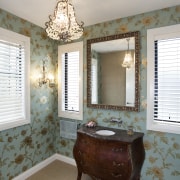
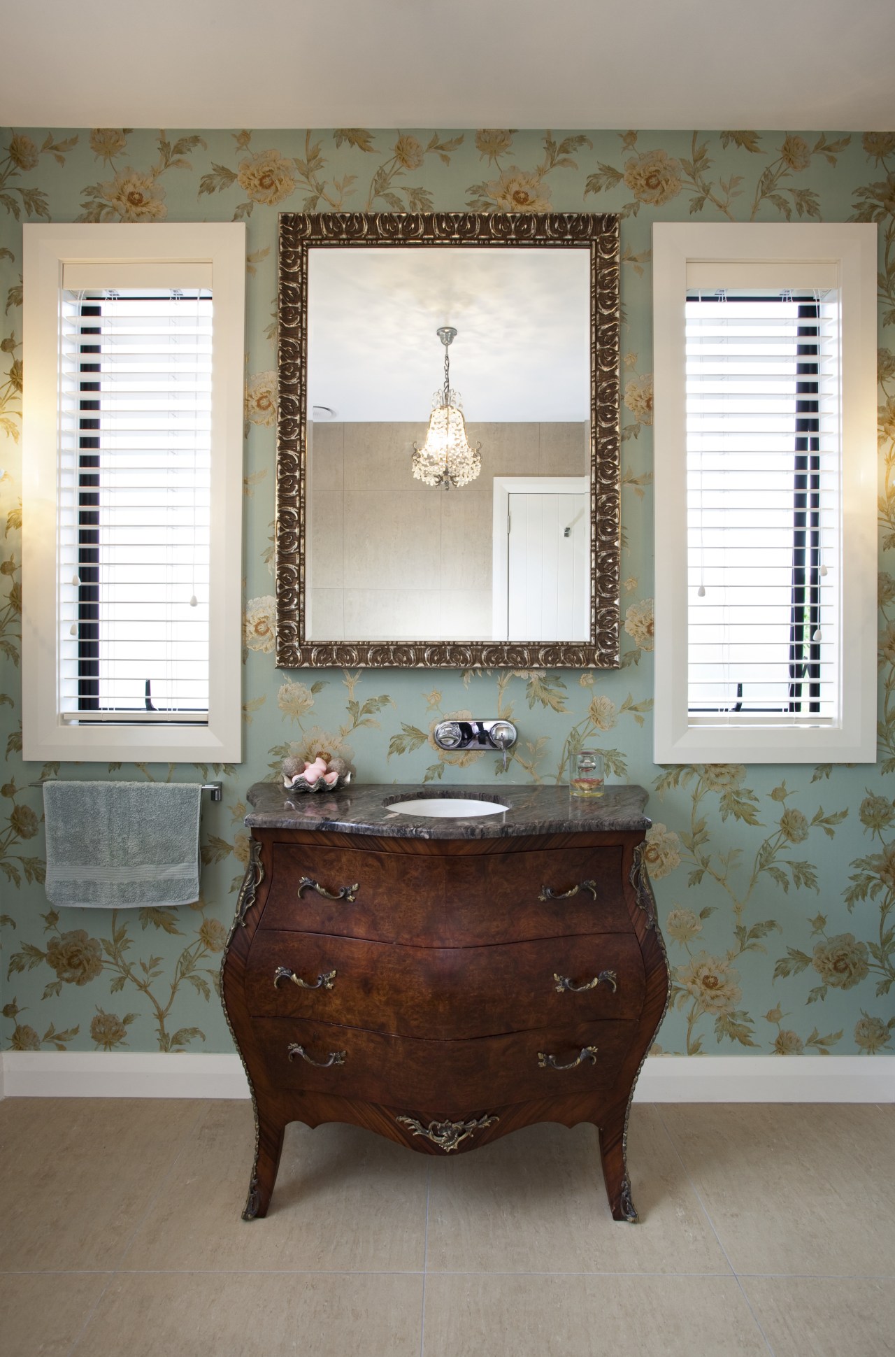
The original space included a wall-to-wall vanity with a window above, which Dunlop felt didn't connect with the overall theme.
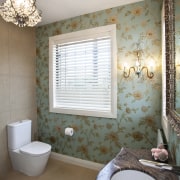
"The off-centre window left nowhere for a mirror, and, though generous in size, the room lacked symmetry. Now, the 19th-century French commode and paired windows flanking the mirror, create an intimate, classical tableau."
Lighting was also very important in setting the scene, as was the right wall covering.
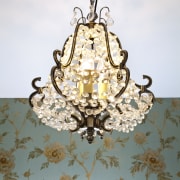
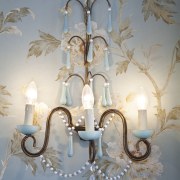
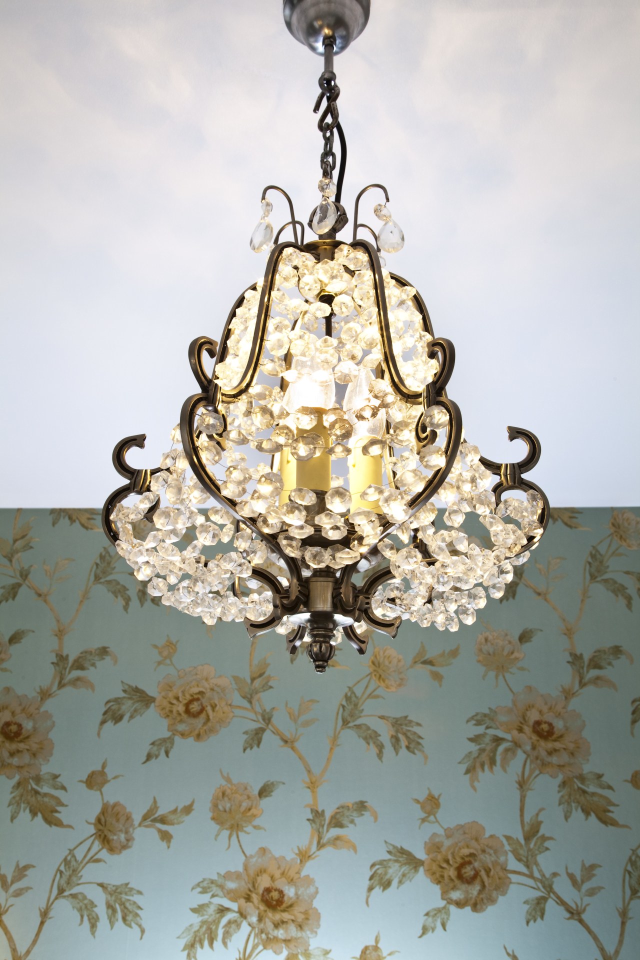
"I had envisioned a small and dainty chandelier from the outset, so when we found the pear-shaped pendant, I knew it was perfect. It was exactly the same with the sconces although they don't provide much light, they fit in with the scheme so perfectly, that they had to be included."
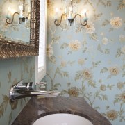
"The wallpaper too, was a good find. The combination of aqua, bronze and beiges is complementary to the colour scheme in the rest of the house. Contemporary touches, such as the travertine tiles and the tap, also reference the rest of the house," says Dunlop.
Credit list
Designer
Vanity
Toilet
Wall coverings
Lighting
Ventilation
Builder
Basin
Tap
Tiles
Blinds
Accessories
Story by: Justin Foote
Home kitchen bathroom commercial design
Classic dovetails contemporary
Tranquil waters
Small space, big impact


