Upstairs & downstairs
A mother and son happily cohabit in this airy home – a lifestyle move made easier by having the ground floor for mum and the upstairs for son
Designed by AUN Design Studio
From the architect:
Visualising a boy playing with his friends in the neighbourhood – they run into this house and walk in and out of those houses; picturing adults leaning against the fence chatting and watching their children run and play.
These fond memories 'reflect' the homeowner's childhood living experience and the relationship with his mother.
After decades of being apart, growing up, living, studying, and working abroad alone, the owner wanted to come back to a home that facilitates his elderly mother and himself, despite their different ages, living together in harmony.
So, the home needed to suit two people co-existiong – despite their different ages and needs.
The new home is built on the original grounds of the existing house.
While the location is closely surrounded by adjacent houses, the design intentionally reflects the memories the son and mother had created over the years within the neighbourhood, with connections both inside and outside the house.
The designer decided to separate the entrance layout due to the different activities and lifestyles of the owners, and chose to lay the house in the middle to create an open space.
There are gardens on both sides of the building that receive natural light and wind.
The space is curated by separating 2 lives into 2 levels.
The ground floor primarily serves as the mother's own living compound, including a common area, a kitchen, and a dining room.
The upstairs is planned as a private space for the son.
The overall design, thanks in part to the specification of materials and colours, makes for a simple house.
The designer chose to retain the bare concrete surface of the building without painting it, and opted for a dark grey colour for the door frames.
To complete the form of the house, the roof of the carport and the fence at the front were shaped, forming a continuation that harmonises without alienating the surroundings.
Additionally, steel laths chosen for the fence help make the area feel airy and add a stark contrast to the solid body of the house.
When open, the dining room doors on both sides of the adjacent gardens invite in natural light and gentle breezes, creating an ideal atmosphere for relaxing, resting, and socialising.
The staircase leading to the second floor was positioned in the centre of the house as a sculpture.
Inspired by origami, the Japanese art of transforming a flat square sheet of paper into a finished sculpture through folding and sculpting techniques, the functional staircase also addresses the owner's love of art within the limited spaces of the home.
Well-curated, perforated steel renders the staircase semi-transparent, with each thin sheet of steel geometrically folded to reinforce its strength.
The staircase thus becomes self-structured, without the need for any additional support.
All of the perforated steel sheets are suspended from the second floor, floating above the first 3 concrete steps, each designed in different forms and materials as if transforming from the ground up.
The treads of the 3 concrete steps are covered with perforated steel to prevent slipping.
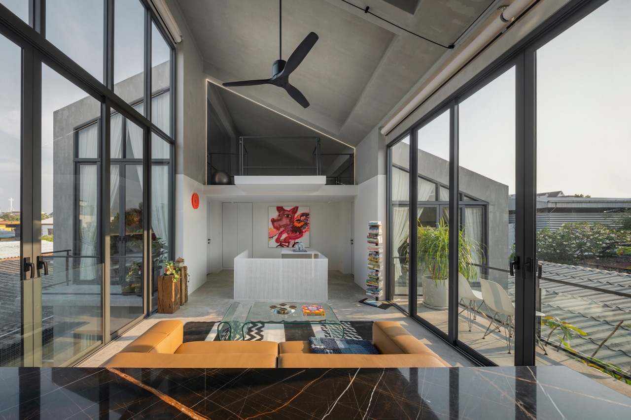
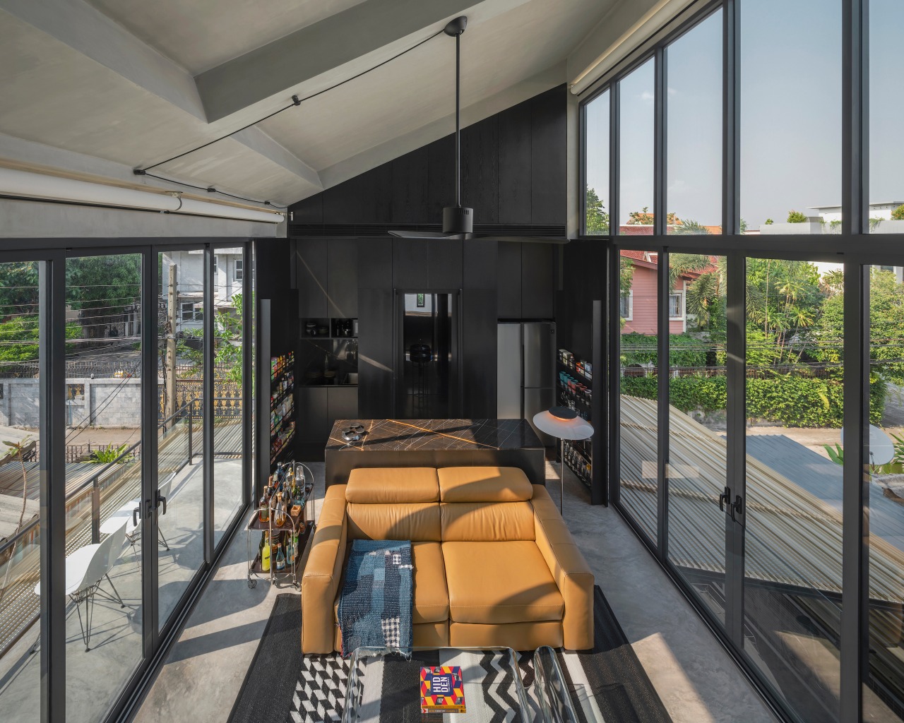
The second floor serves as the owner's compound, designed for a young man who loves entertaining.
The private space was thus designed to facilitate socialising (with food and beverage service), including the tradition of watching football on holidays without disturbing the mother.
A living room is set adjacent to the bar, with a small balcony to extending it into the larger entertaining space.
A full guest bathroom with shower is concealed behind the bar, helping to maintain the privacy of the area when a guest stays over.
The bedroom is located on the opposite side of the working room, positioned to offer a variety of external views, while maintaining connections through the dressing room and bathroom.
Above the dressing room and bathroom, a relaxation area for yoga or meditation completes the layout.
The interior style focuses on a few pieces of furniture, not only for flexibility, but also to accommodate the owner’s need to control the construction budget.
The designer ensured the continuity of the architecture and interiors by exposing surfaces, walls, and ceilings, with bare mortar and white painted walls applied up to the height range of the occupants to create a sense of visual comfort.
To add an interesting dimension, the owners can hang decorations from the homeowner’s personal collection: paintings, chairs, lamps, hooks, clocks, works of art, etc.
These items can be adjusted and moved, increasing and decreasing in number over time.
Credit list
House designer
Landscape designer
Structural engineer
Electrical engineer
Interior designer
Lighting design
Mechanical engineer
Photography
Story by: Trendsideas
Home kitchen bathroom commercial design
Radical yet respectful
Sculptural centrepiece
Curvaceous and connected


