Upmarket apartment with indoor-outdoor flow to large terrace
What you can achieve when the same company building an apartment complex is also responsible for the internal layouts ... and you have plenty of space to play with!
Many modern apartments are organised in a regimented way to maximise limited space and work around anchored services.
However, when the footprint size is generous and builder and architect share one vision from the outset, a far more versatile outcome can result.
The four apartments in this complex follow an innovative floor plan that optimises a sense of space and makes them feel as much like a large family home as part of an apartment building.
Claude Giorgi, director of Giorgi Exclusive the firm behind the upmarket complex says there are a number of key design elements that contribute to the sense of spaciousness.
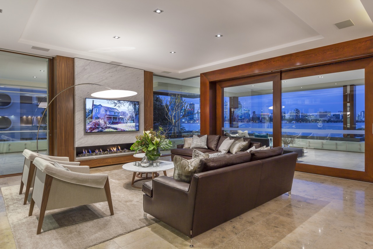
"One is the huge 96m² main terrace which connects the open-plan living, dining and kitchen space and also wraps right around the corner on the river-facing side of the unit," says Giorgi.
"Massive cedar-framed glass doors glide back to left and right, making the indoors and outdoors one giant entertainment space."
Jura limestone tile flooring continues from inside to out and the 3.2m ceiling also runs from indoors to out enhancing the connection.
On show from throughout the living areas, the kitchen is designed for visual presence as much as for utility. All messy aspects of food preparation are relegated to a walk-in pantry.
The kitchen plays an important part in the inside-outside design, too. The main kitchen extends past the side of the glass wall as an alfresco kitchen, complete with barbecue, wine fridge and its own cabinetry.
A near-invisible glass pivot door separates the two kitchens.
While they appear to be a single kitchen, one visible difference is in the treatment of the splashback. This changes from sleek stainless steel indoors to alternating horizontal strips of opaque and clear glass for the outdoor kitchen.
The alternating glass strips on the outdoor splashback brings privacy from neighbouring buildings while also admitting natural light and views. At the same time, the glass splashback protects the outdoor kitchen from the elements.
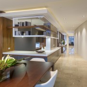
Another surprise design feature is that you can look right through the apartment from one end to the other the long vista adding to the feel of a spacious home.
These long views mean that the apartment's river and city outlooks are appreciated from throughout the interior.
"The open indoor-outdoor living spaces and connected gently curving spine wall corridor help avoid the passage feel often seen in units," says Giorgi.
"Features like this are more easily achieved when the same company is responsible for the building and the interior layouts creating a shared vision.
"It also means we are able to make touches like the lighting and cabinetry integral to the architecture."
The large master suite also opens onto the main terrace and continues the airy aesthetic. Bathroom and bedroom share one volume, with the vanity on the back of the bed head wall.
"These areas can be separated by pocket sliding doors concealed in the bed head," says Giorgi.
"This arrangement allows views from the private bathroom out past the bed head and bedroom to the river views beyond. And it also optimises natural light flow into the rear space."
The public foyer and elevator are screened from unit interiors. They also separate the secondary bedrooms and a lounge from the main living spaces, the master bedroom, and study.
Adding to the overall uncluttered feel, the service utilities are all tucked away behind the scenes for example, the air-conditioning is concealed up in the edges of the cove ceilings.
Story by: Charles Moxham
Photography by: Robert Stocco
Home kitchen bathroom commercial design
Home Trends Vol. 32/3
Bathrooms take centre stage in this latest edition of myTrends HOME – from an expansive master suite with spectacular de...
Read More


