Upmarket apartment makeover connects rooms with harbour views
A restrained yet exotic palette, recessive wall planes and significant artworks combine in a sumptuous interior that connects with its harbourside outlooks

When your home base is in England and your new holiday retreat is a 10th-floor harbourside apartment on the other side of the world, you want the latter to be of the refined quality that you’re accustomed to – at the same time optimising the waterviews your luxury getaway affords.
This was the fairly open and trusting brief for architect and interior designer Richard Archer when fitting out this 1960s apartment in Elizabeth Bay, Sydney.
“The apartment was chosen by the owners for its spectacular location and large floorplate,” says Archer. “However, its highly ornate, rather tired interiors required a complete renovation.”
Given its existing state, all the original walls, floors and ceilings were stripped out, leaving an almost blank canvas ready for Archer Design’s entirely new layout.
However, there were some constraints from the outset. The new interiors had to incorporate existing support columns into the mix and – typical in an apartment makeover – the original plumbing outlet positions also had to be retained. Plus, everything had to be brought up into the apartment via a very modest elevator.

In response to these issues, Archer disguised the columns, retained the existing kitchen and bathroom positions and chose all new elements with the stipulation that they could be flat-packed for delivery.
For the new design, the architect was keen to capitalise on the apartment’s immediate proximity to the shimmering beauty of Sydney Harbour.
“Essentially, we developed a plan that opens this sizeable floor plate up to the views – ensuring almost all rooms enjoy a connection with the harbour.”
In addition, Archer used several ways to make the sizeable apartment seem even bigger than it already was and to reflect the locality in the decor.
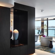
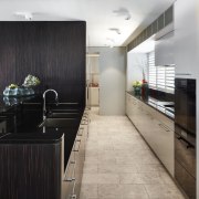
“We clad the fixed columns and front-of-kitchen cabinetry piece in a sustainable wood veneer. These dark-toned elements provide a solid core for the fit-out.
“And while they’re substantial on one level, being darker, they also recede to the eye adding to the feeling of spaciousness.”
Many of the new interior walls are in a smokey bronzed mirror finish, adding softness and also space through reflection. The smokey tones give the reflections an ambiguous quality, too, so it’s hard to read the depth of the walls, again to roomy effect. The mirror surfaces make the most of the views as well, wherever you’re standing or whichever way you’re facing.

Then there are the other key factors that make the interiors sing and connect with the harbour waters – the restrained, highly effective palette, the international style furniture selection, and the stunning recognised Australian and New Zealand artworks threaded through the home. Even the bespoke living area rug is a stand-out work or art, capturing the life and sparkle of the harbour in its design.
“The limited palette comprises three main hues – the dark ebony of the veneer, a subtle white-green eucalypt tone on most walls, and the deep petroleum blue on some panels, which echoes the harbour waters. And then there are richly upholstered walls and vibrant splashes from the artworks that I selected for the spaces.”
This palette met the owners request for intense colouration – a departure from the tones of their homeland – and sumptuous materiality, with the proviso that it never overpowers the space or the views.
It’s hard to imagine the furniture being flat-packed in. The living area seating, for example, is huge – its scale not obvious in the context of the apartment’s own generous proportions. International and timeless in style, most pieces are low, to maximise views, subtle toned, and understated.
Credit list
Architect and interior designer
Interior and kitchen design
Tiles
Paint
Mechanical consultant
Control systems
Kitchen cabinetry
Kitchen sink
Oven
Ventilation
Dishwasher
Kitchen floor
Awards
Builder
Kitchen manufacturer
Floor
Wallcoverings
Heating
Lighting
Furniture
Benchtops and splashback
Taps
Cooktop
Refrigeration
Waste disposal
Kitchen walls
Story by: Charles Moxham
Photography by: Luc Remond
Home kitchen bathroom commercial design
Classic dovetails contemporary
Tranquil waters
Small space, big impact
Home Trends Vol. 35/2
One of the best ways for you to start creating the bathroom – home or kitchen – you've always wanted is to look through ...
Read More


