Treading lightly on the earth
Despite its modest footprint on steep topography, this engaging, sustainable family home makes the most of its internal spaces while elegantly framing its spectacular outlooks

Designed by Aaron Jones, Urbanfunction
From the building designer:
Designed for a small, young growing family, this home was an exercise in balancing quality living with budget constraints on a steep east facing site.
We determined from the outset that to meet these budgetary requirements and build cost effectively, we would need to keep both the footprint touching the ground and the overall square metre area to a minimum.
With the brief in mind and a site with interesting topographical challenges, we set about finding the perfect place for the home to maximise views to the bay headland and draw sunlight from the north west to ensure warmth was captured naturally.
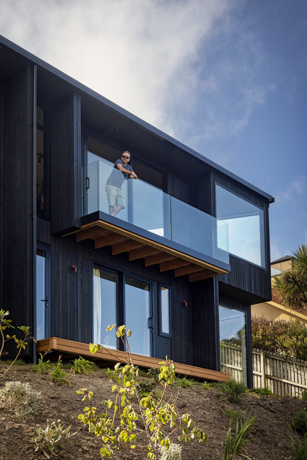
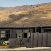
This was achieved with a simple cut into the hillside, all excavated spoil was kept on site and pushed forward to create usable terraced platforms for children to play and productive edible gardens to be established.
Floor height was established using a Gopro on a 5m pole, studying the resulting footage to ensure the best views were framed correctly.
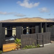
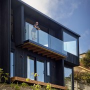
A sloping roof was designed to follow the steep gradient and ensure the building form – despite its height – appeared low in the surrounding environment.
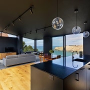
This resulting roof form allowed us to pull the ceiling down to the windows, framing the view and creating a sense of being drawn into the bay below.
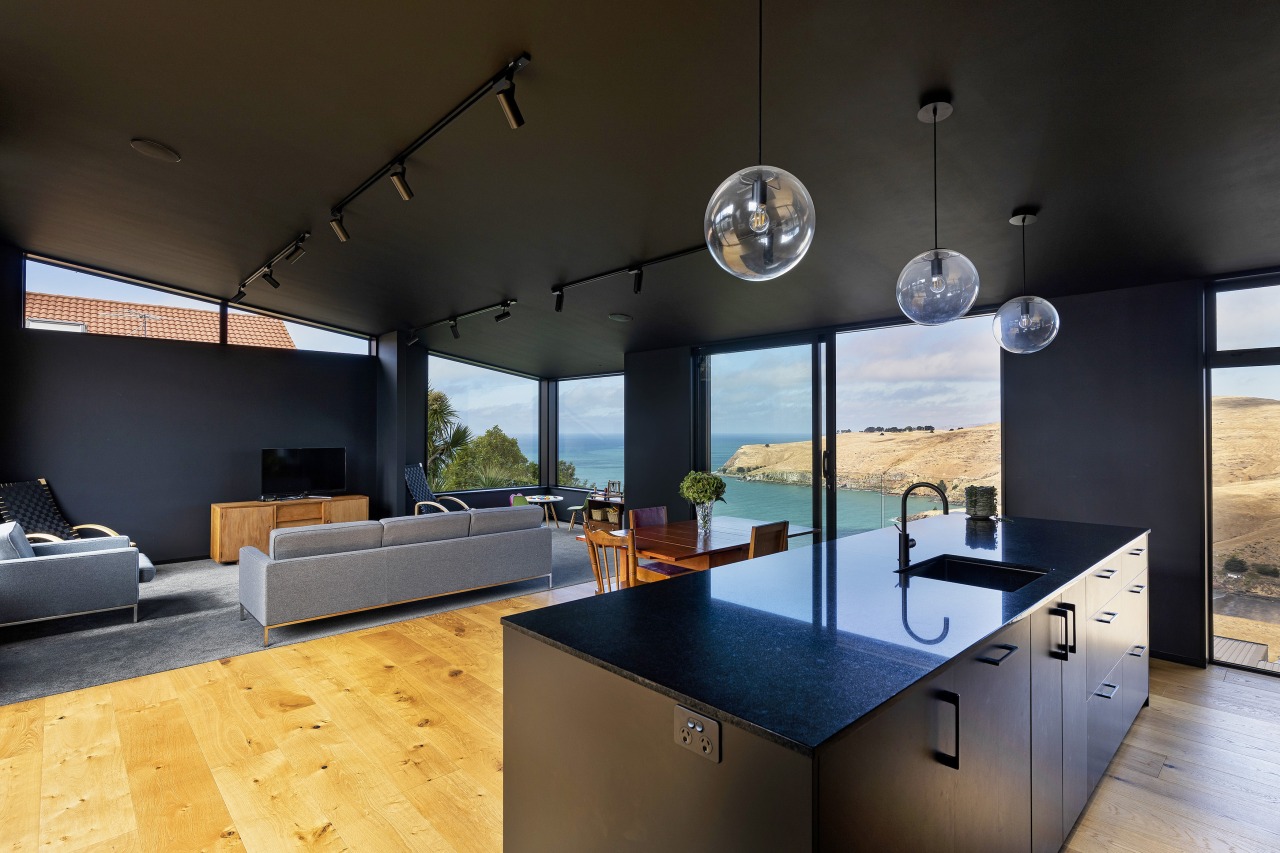
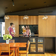
With a pitch black interior proposed to feel cave-like, windows were placed to act as natural changeable artworks, bringing the dramatic landscape into the interior.
Raking ceilings following the roof slope increase volume and create a feeling of space beyond the square metre area of the floor plan.
Lofty western windows set at the highest pitch of the roofline bring afternoon sunlight into the living spaces.
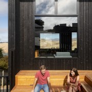
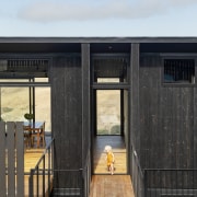
Charred Larch timber was used externally to minimise maintenance cycles and allow the building to appear as a dark volcanic rock.
Home kitchen bathroom commercial design
