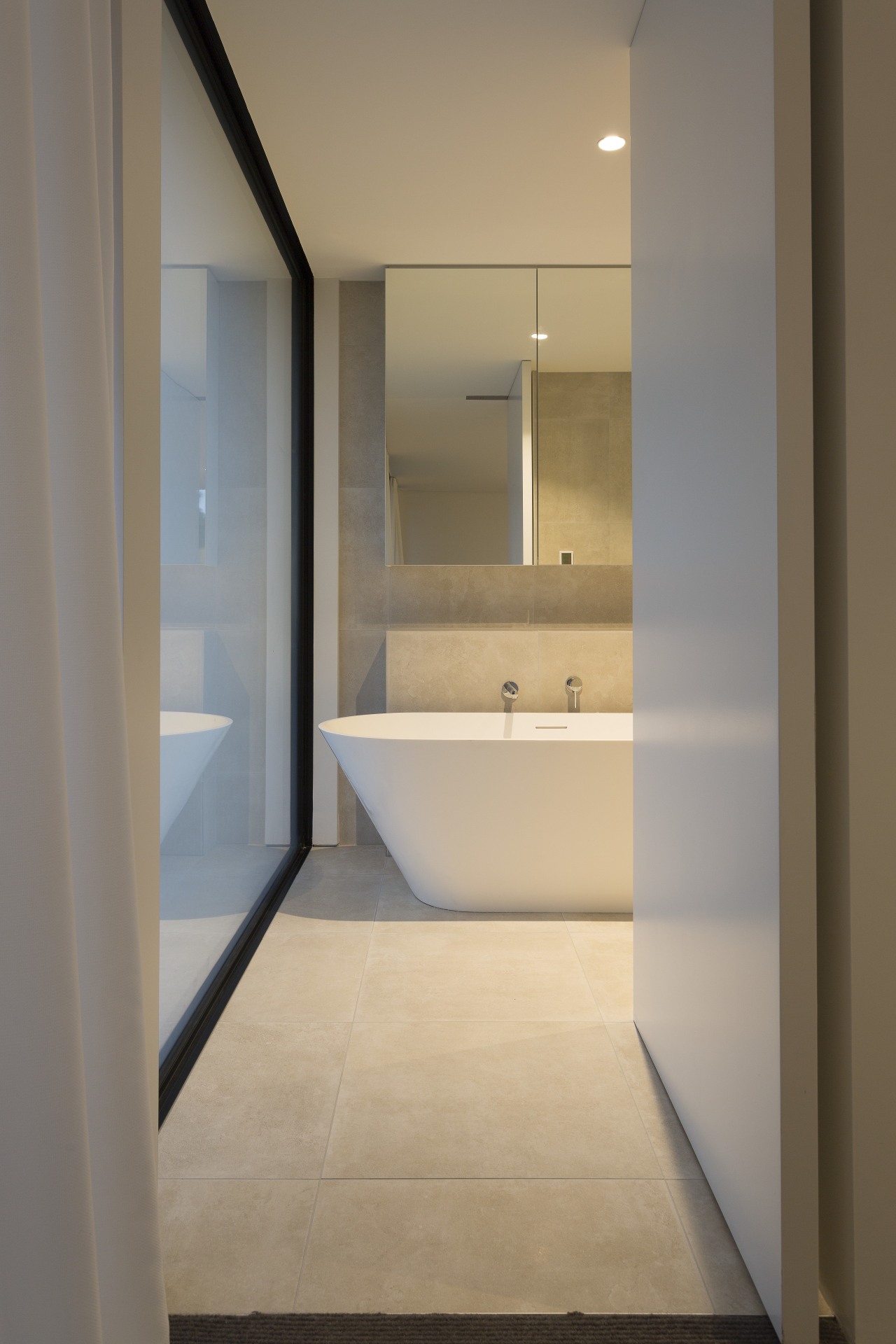
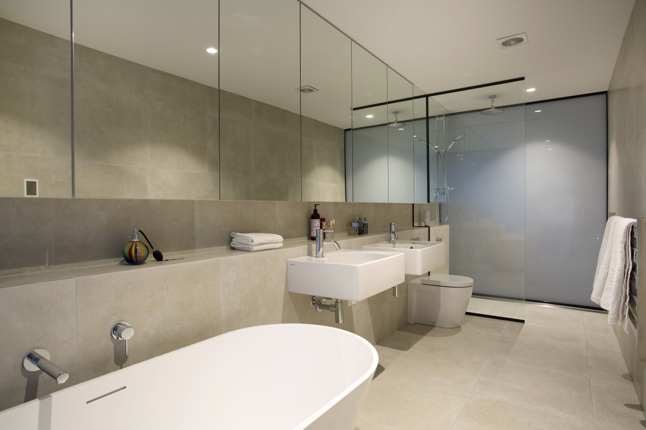
Translucent glass walls give privacy and add diffused light to this master bathroom
Despite this home's tight site and central-city location, its spacious master suite provides a private, light-filled haven for its owners

The two key challenges of designing a home in a tightly packed suburb are getting as much natural light as possible into all the rooms, and maintaining privacy for the occupants. These goals may seem at odds, because introducing light, means having plenty of windows, which doesn't exactly promote privacy.
Designed by Tobin Smith, from CoLab Architecture, this generous master suite, on the first floor of a contemporary new home, achieves both privacy and light, without one compromising the other.
"The house is designed for a couple," says Smith. "They have grown up kids who come and stay, but for most of the time, it's just the two of them. We scaled their bedroom and bathroom so it can be a private retreat for them, if needed, as there isn't a secondary living space in the house."
Both rooms are filled with light. In the bedroom, almost two walls are taken up by floor-to-ceiling windows, screened by sheers. In the adjoining tunnel-shaped bathroom, the end walls are in frosted glass, filtering natural light into the space, yet giving occupants complete privacy.

"Being in an inner city suburb, there are neighbours in close proximity, so we wanted to maximise both privacy and the amount of light our clients could get into their bathroom," Smith says.
"From an architectural perspective, we were quite determined to have glass across the entire eastern end of the house continuous through both spaces and so the solution to frost the entire bathroom window became apparent early on."
The same size piece of glass was also installed at the other end of the bathroom, forming the back wall of the walk-in shower, and borrowing light at night from the landing on the other side. During the day, it works the other way natural light comes into the landing from the ensuite.
"It's quite playful, too, as you can see subtle movement through the glass when people are up close to it, without actually giving too much away," he says.

Everything is ordered in the bathroom; the width of the row of mirrors is the same as the width of the concrete-coloured tiles. These in turn, are the same width as the wardrobe doors in the adjacent bedroom.
The mirrors not only visually widen the room, most also front wall cabinets, avoiding the need for bulky vanities. The built-out shelf below is for everyday items, such as soaps, gels and hand towels.
"We were conscious not to cut the bathroom off completely," the designer says. "That's why we prioritised the bathtub at the bedroom end of space so that a visual connection could be maintained through the bedroom and out to the trees on the boundary of the property.
"The owners were dream clients in terms of their request for colour, because they love white, and we love white as well, so we went for a real stripped back colour palette."
Story by: John Williams
Home kitchen bathroom commercial design
Sculptural centrepiece
Radical yet respectful
Curvaceous and connected
Home Trends Vol. 33/4
Home is where the heart is, but what we love about a house varies for person to person. Is your ideal home one with clas...
Read More


