To the orangery Baronial-feel house extension by Michael Wyatt
Baronial-feel house extension by Michael Wyatt


There can be many reasons to add to a house that already has an unmistakably bold presence. One might be to obtain a sunny reading retreat, while another could be to future-proof the home with a ground-floor bedroom, so the owners can age in place.
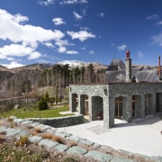
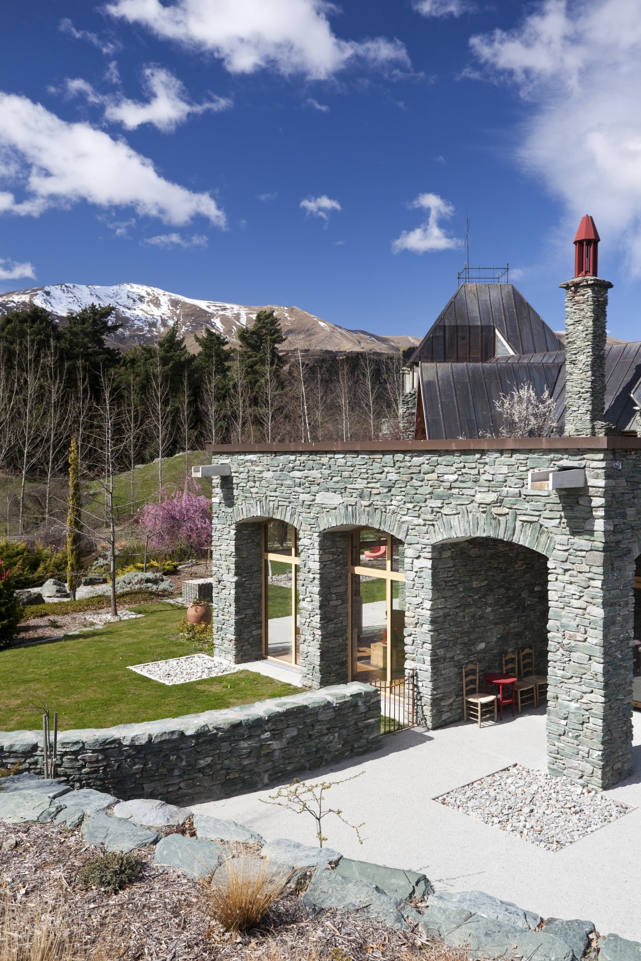
Such ideas were uppermost in the minds of the owners of this house, when they asked architect Michael Wyatt to design an extension. Since the main residence, by architect Peter Beaven, had the air of a manor house, they asked me to design an adjacent structure in the form of an orangery, or old-world glasshouse, says Wyatt.
"The main house features an extensive use of stone and beech wood inside and out. For the orangery alongside, I clad the external walls in the same roughly stacked stone.
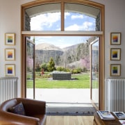
"However, instead of using stone on the inside of the extension as seen in the main house I selected white plaster walls. Generous amounts of glazing ensure you can still see the stacked stonework on the corner pillars and columns without leaving your sofa."
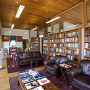
Ceilings are in the same beech wood as the main house, but instead of sloping ceilings, here they are flat.
"As well as using the same materials, the design of the add-on responds to the house architecturally, too," says Wyatt. "The home has a prominent arch over the front entrance and this has been picked up and repeated to form the distinctive facade.
"However, there are also points of contrast one of the most dramatic being that we decided on a flat roof for the extension. The house has a rising-and-falling copper roof, appropriate for the mountain setting, while the guest wing on the far side has a relatively low hip roof. Now, the new roof continues the hierarchical deference to the house and its rising and falling rooflines."
The extension is reached from the house by an enclosed walkway. Inside, the new addition comprises a library, a bedroom, an ensuite and a dressing room.

The interior is divided down the middle by a wall of bookshelves, topped with panes of glass the library or studio space is on one side and the bedroom, bathroom and dressing room are on the other. This layout gives the long building a less elongated feel, allowing natural light to play across the entire volume through the glass panels.
"The public or library side faces back towards the home while on the bedroom-bathroom side, an area of land has been excavated to create a landscaped, private outlook," Wyatt says. "Optimising outdoor connections was another priority for these clients."
Story by: Charles Moxham
Home kitchen bathroom commercial design
