This terrace house feels completely refreshed after a major renovation
Following on from an upstairs rethink, this renovation opens up the ground floor of the home front-to-back with a deft reworking of the existing rear spaces
While the outcome of a renovation may be streamlined and simple, the behind the scenes thinking that gets it there is often anything but.
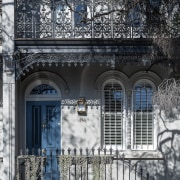
When architect Victoria D’Alisa undertook the ground floor renovation of her own home, the front rooms were refinished and painted. The rear of the 1890s terrace home, however, required a more substantial undertaking.
“The existing floor layout was quite typical of terrace houses, being long, relatively narrow and often tricky at the rear – here, with steps at the side leading up to a courtyard,” says D’Alisa.
As well as offering poor egress, the original interior had several small rooms and very thick load-bearing walls.
“Essentially, we wanted to remove all the clutter and open up the spaces with a more streamlined design. So this level has been completely transformed from the dining area back.”
And with more than one load-bearing wall removed, the space above the ceiling over the new kitchen had to hide the plethora of steel beams required to support the floor above.
At the same time, the back of the house was also reworked to accommodate the renovation.
“We actually pulled back the rear to make way for a larger courtyard, but at the same time extended part of the existing footprint on one side, where it had previously stepped in.”
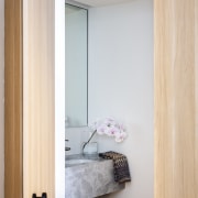
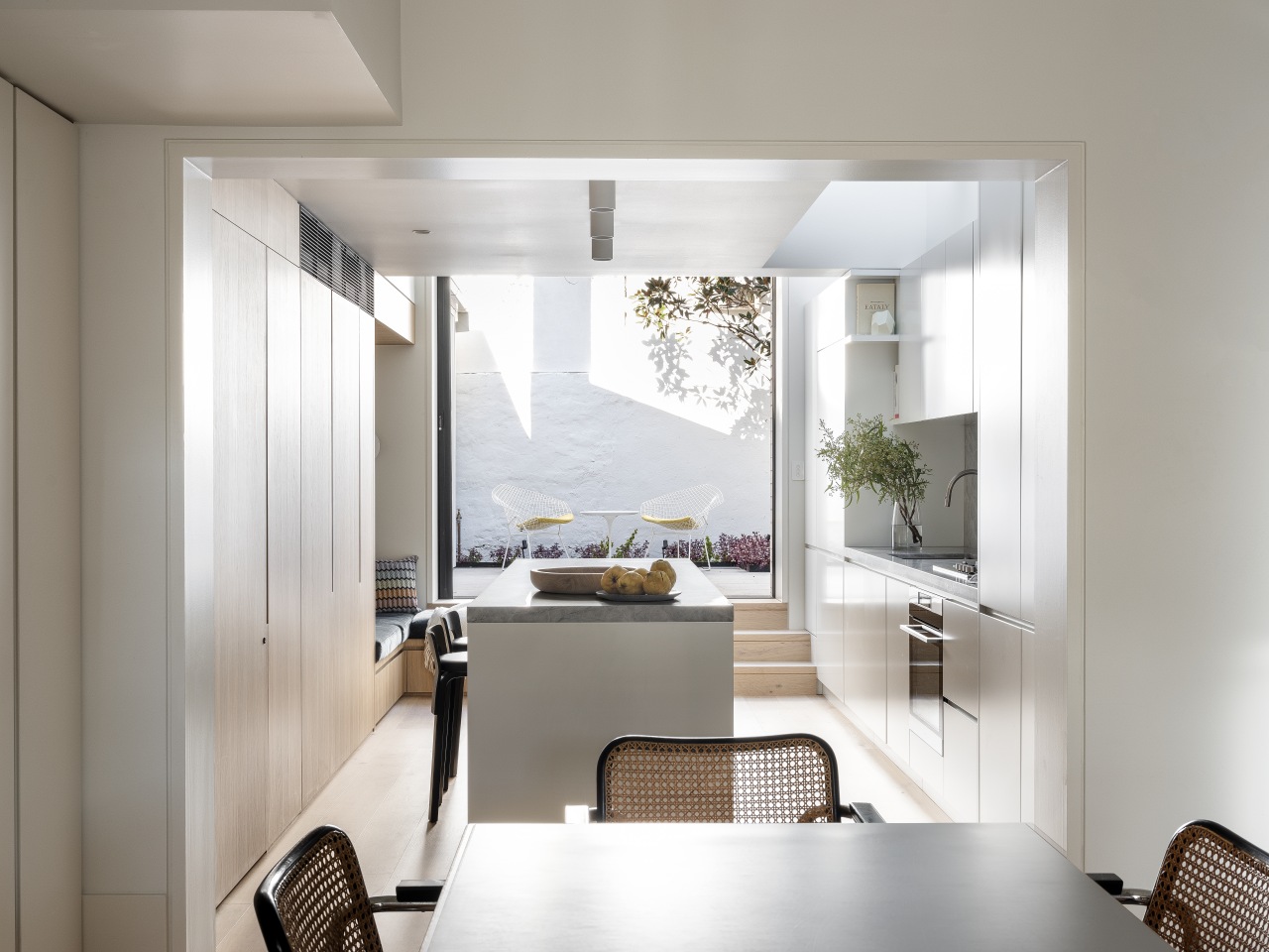
The reshaped and simplified space now accommodates a powder room and laundry, as well as the kitchen, with the ancillary rooms tucked out of sight behind custom joinery. In fact, with the doors to both the powder room and laundry integrated into the bank of cabinets opposite the kitchen, they are quite easy to miss.
There was also sufficient space to include a reading nook with storage next to the cabinets, in an area that is bathed in natural light.
For the finishes, a relatively simple material palette of timber veneer, grey marble and white polyurethane joinery was chosen for the combined kitchen, laundry, and bathroom space.
“We didn’t want to finish the kitchen proper in wood veneer, given there was plenty in the wider design. Instead we went for a space-enhancing white – despite all the facilities included, this area is only 20m² in size.”
“The marble benchtops and splashback stand out against the white and wood surfaces.”
Retaining the raised courtyard beyond the kitchen meant less engineering was required and a little gem magnolia tree could be retained. The difference in levels provides an intimate perspective on the courtyard and worked well with the cosy reading corner.
On the back of the home, a new parapet wall in white brick houses pocket doors, including a screen door, to optimise indoor-outdoor flow.
“The choice of face brickwork references the traditional surrounding built fabric and the off-white colour provides modernity,” says D’Alisa.
“A white painted timber screen shed with a granite topped barbecue area to one side of the yard works well aesthetically and functionally.”
Credit list
Architect, interior designer and kitchen designer
Structurals
Builder
Cabinetry
Sink
Refrigeration
Roof
Main flooring
Lighting
Awards
Kitchen designer
Mechanicals
Kitchen manufacturer
Benchtops and splashback
Taps
Ventilation
Dishwasher
Paint
Furniture
Designed by: Porebski Architects
Story by: Charles Moxham
Photography by: Tom Ferguson
Home kitchen bathroom commercial design
Trends 19-09
As the world embraces sustainability, many house designs, material choices, and energy solutions are informed by clever ...
Read More


