Tailor-made
How do you communicate the style of a new clothing brand?In this case, with subtlety and fine materials
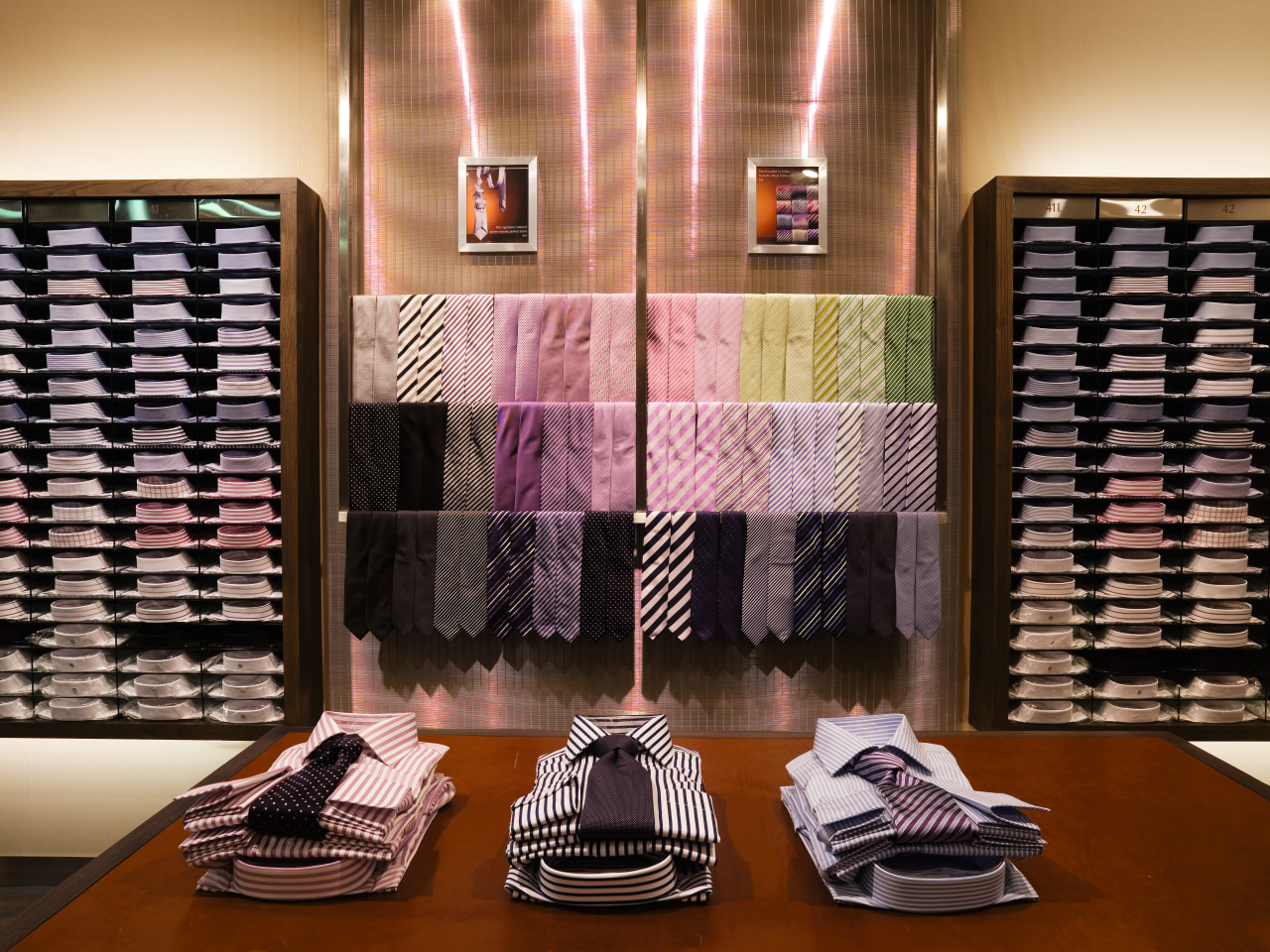
A brand is often defined in the retail space. But while colours, materials and fittings all make up the look of a store, the design should remain neutral enough to allow the merchandise to dominate.
Retail design consultant Mark Landini from Landini Associates says a retail interior should have a subtle personality. He kept this in mind when asked to design the flagship store for new Australian clothing brand Rhodes & Beckett.
"We were given the brand concept, which is based on the true story of two early 20th Century British tailors who embarked on an adventure to create fine shirts and suits for men and women out of Egyptian cotton. We asked ourselves, if Rhodes and Beckett were here today, how would they want their shop to look?"
The answer to this question eventually evolved into a contemporary and clean interior design inspired by, but not mimicking, the style of the British tailoring tradition, says Landini.
"We opted for a neutral colour palette and the use of fine-quality materials with simple, pared-back lines for a modern design," he says.
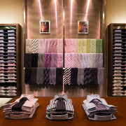
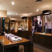
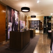
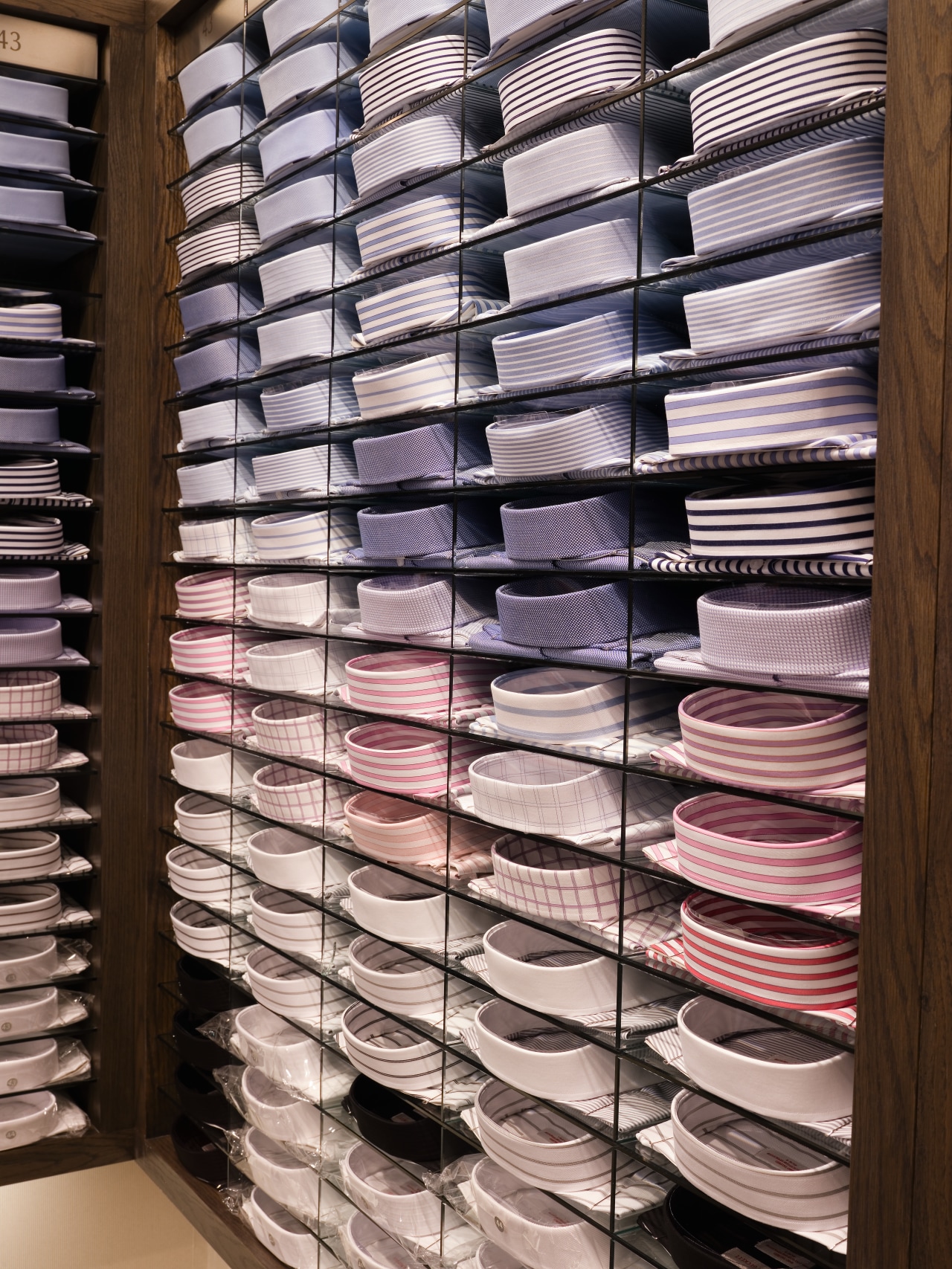
Uncluttered window displays provide pedestrians with partial sight lines into the interior. Once inside, the ambience is defined by Verona chestnut leather and American oak joinery against a textured striped wallpaper in warm white.
Ambient lighting above and behind the merchandise cabinets illuminates the wall, highlighting the product and helping to prevent dark shadows. Colourful shades of cotton draw customers' eyes to the product. Landini says bright colours, such as red, were avoided on fittings that might distract from the merchandise.
"We also wanted to get away from the dark timber traditionally used in stores selling men's suits, as the brand is also aimed at women both those who shop at the store for themselves and those who purchase for men."
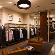
Two leather couches in the corner of the store offer respite and reading materials for tired shoppers.
Landini says the site of the flagship store was chosen as two of the owners owned the neighbouring department store, and because the street contains the premium brands with which Rhodes & Beckett aligns itself. It also included an upper level that had potential to be the Rhodes & Beckett head office.
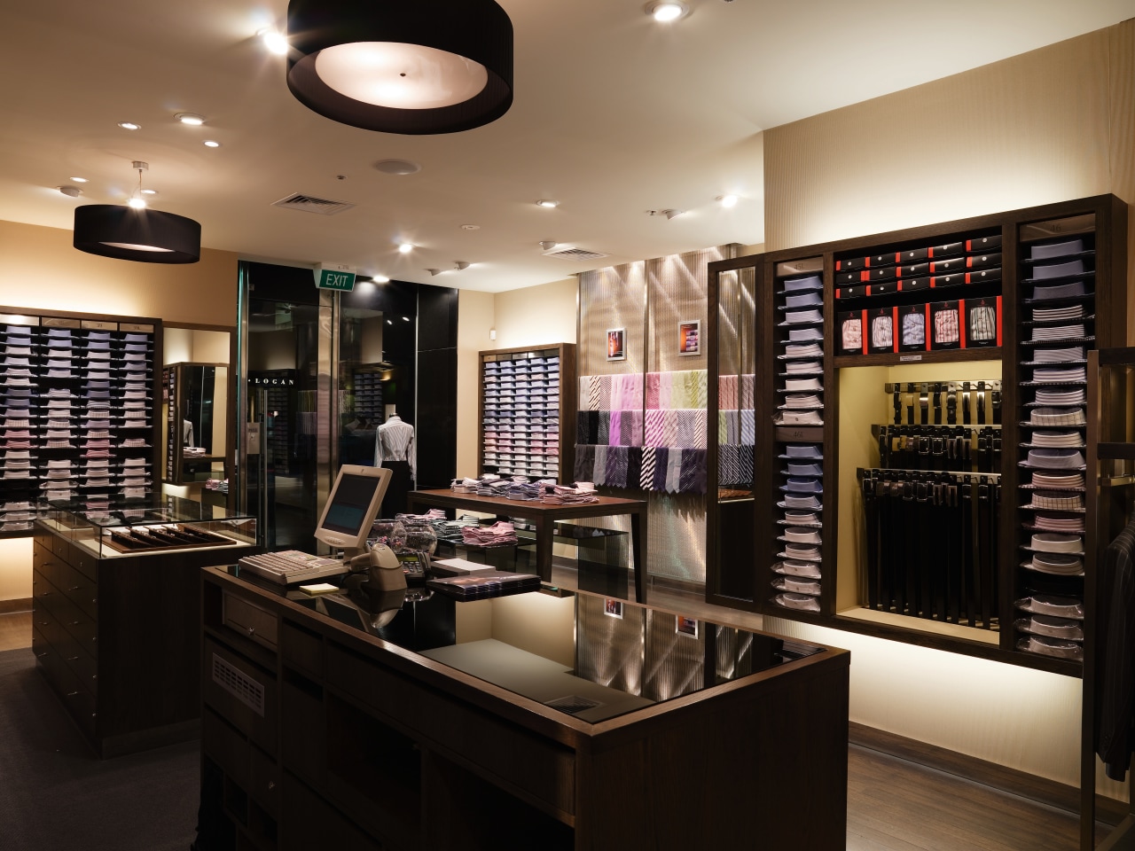
"The mezzanine floor, while ideal to turn into an office, divided the retail space, and the staircase dominated much of the ground floor," he says.
"The biggest challenge was to conceal the stairs and mezzanine, so as not to divert attention from the stock."
The mezzanine was walled up and the stairs concealed behind a leather-covered door. This door matches the leather door in between the mirrored fitting room doors that shuts off the stock room.
Landini Associates is now charged with replicating the look in new Rhodes & Beckett stores throughout Australia. Landini says a Lego-block approach to the design ensures that materials and flexible joinery can be tailor-made to suit any store, while still retaining the brand's subtle personality.
He says the materials are also designed for longevity, so that Rhodes & Beckett stores need not be overhauled for another 10 years.
Story by: Trendsideas
Home kitchen bathroom commercial design
