Sweet treats
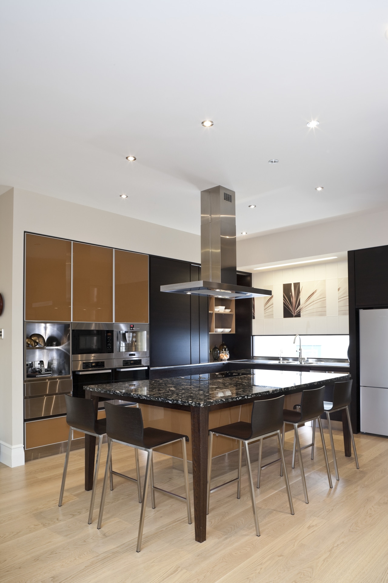
Confectionary colours of chocolate, caramel and butter make this kitchen feel like a cafe in the centre of the home

For a family with four young children, organisation in the kitchen is probably the key to maintaining a smooth and well-run household.
The owners of this kitchen wanted a space that was modern, but with a feeling of warmth and some natural elements. They also required a space where people could sit down or help with food preparation as they enjoy informal entertaining. Plus, with an active family, the whole kitchen needed to be child-friendly.
Interior designer Natalie Du Bois proposed a colour scheme that incorporated chocolate, caramel and buttery tones reminiscent of confectionary with the aim of creating an inviting, cafe-like atmosphere.
Cabinetry with doors and drawers in a combination of chocolate-stained veneer with solid clashed edges and caramel coloured glass, creamy light timber floors and cabinet interiors in a shade of fudge emphasise this effect.
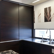
To introduce a touch of nature into the design, large sepia-coloured porcelain tiles above the horizontal window at one end of the kitchen were printed with photographic images of native flaxes.

"The images were arranged to add originality and make an artistic centrepiece for the kitchen," says Du Bois.
The granite benchtop, which appears to be made up from a multitude of different coloured pebbles in a black riverbed, provides another natural and original element.
As part of the contemporary flavour of the kitchen, the island is designed to look like a table, with coloured glass cabinets below it high off the floor and supported by a stainless steel structure.
Lighting was also carefully considered to add impact. The previous kitchen backed onto an internal stairwell, which had little natural light. So, as part of the renovations, the wall between the two was fitted with a glass-fronted and glass-backed cabinet to introduce extra light to the stairs. LED lighting under the shelves in the cabinet creates an interesting glowing effect in both the kitchen and staircase.
Additionally, LED lighting has been added under the toekicks of the island and below the bench to illuminate the glass cabinetry. Fluorescent lighting over the tiles adds impact to the graphics and provides task lighting for the sink preparation area.

To ensure the kitchen is safe and suited to the needs of a young family, the designer has incorporated a number of special features.
Drawers containing sharp objects such as knives are fitted with He¤fele electro-magnetic child locks. The button that operates the lock is on the side panel to the right of the coffee machine, well out of reach of young children.
"We also made the island extra deep and selected an extra-narrow gas hob, so that children sitting up at the island can't touch the cooktop. Also, with the hob here, the cook can keep an eye on the children in the living room," says Du Bois.
Credit list
Kitchen manufacturer
Cooktop
Refrigeration
Cabinetry
Flooring
Wallcoverings
Tapware
Hardware
Oven and dishwasher
Ventilation
Splashback
Benchtops
Sink
Accessories
Story by: Mary Webb
Home kitchen bathroom commercial design
Sculptural centrepiece
Radical yet respectful
Curvaceous and connected


