A character shop front is transformed into a sustainable home
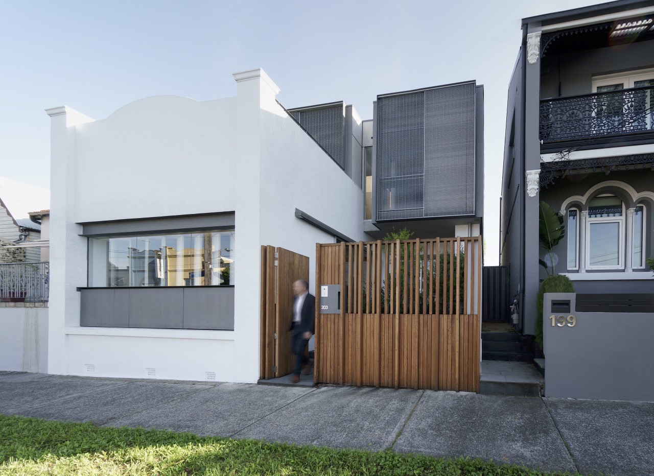
Hidden behind the original facade of a former shop is a beautifully considered family home. Discover how it manages to make a dramatic statement while treading lightly on the land
Architects: Studio203
From the architects:
Lilyfield House is positioned at the intersection of a once busy thoroughfare that is now an important link in the cycle network within Sydney’s Inner West.
The existing house and former shop was single-storey, cellular, limited in light and outlook, had rising damp and a poor plan for a growing family. But a double width block, a north-facing rear garden and lane, a large shady tree and a ridgeline position with potential for views offered the possibility of a brighter and more open house. A tight-knit local community with everything in walking distance added to the attractiveness of the location.
Accessible from only two sides and subject to acoustic constraints under a flight path, these 3-storey alterations and additions were to cater for our own family of five and working from home.
It could easily have been a blank canvas project; a clean slate and a new start. But in all the flaws of the previous house there was a character and local identity that we believed needed to be retained and embraced. The idea was to add a new layer to the streetscape so that the former shopfront facade could talk of the past and the new forms could hint at the new.
Within the retained walls, there was to be a new openness and a new level of amenity and functionality, to be achieved within a very limited budget.
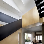
At the heart of the house a 3-storey top lit space connects the layered functions and platforms, brings light and winter sun deep into the plan and provides a vertical path for stack ventilation.
At the bottom of the atrium, there is no program, no furniture. This is a free space ready for impromptu dance and music performances, gymnastic displays, battles and constructions.
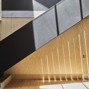
The idea of a ‘public’ path rising through the house, giving access to terraces to the south and north, is interwoven with the private spaces that are arranged around the central atrium and its black stairs, bridge and hearth.
Beyond these spaces, the garden terraces form an outer constellation such that every room is held between the central void and a garden experience.
The plan progressively reduces and allows light and sun to penetrate deep into the house. As the house rises, it culminates in a more intimate living space and opens to framed district views.
The house is efficient and sustainable in its use of an inner city site. The house, constructed on a reduced footprint, maximises passive heating and cooling and does not require air conditioning.
Exposed concrete soffits and walls together with historic masonry walls provide thermal mass and radiate cool in hot weather. External sliding screens and tilt-up shutters protect from sun.
In winter, the well-insulated envelope holds the heat gained through north glazing at three levels, and a dark polished bluestone floor radiates absorbed winter sun.
Rainwater harvesting is connected to toilets, laundry and garden. LED lighting is used throughout. Bathrooms have access to natural light and ventilation.
Hot water is provided utilising renewable energy via a Sanden Eco Heatpump.
Heating is a combination of a high-efficiency Bosch Condens hydronic heating system, and a re-used double-sided gas fireplace, with maximised heat distribution via the atrium. The house is set up for solar harvesting.
Lilyfield House, which does not require airconditioning, uses less electricity than a one-person household in summer and exceeds water efficiency targets.
A richness of spatial and tectonic experience is combined with a reduced, economical materials palette: white set render, sealed, identifies retained masonry from the original house. Concrete is off form. Bamboo flooring and plywood provide economical warmth and texture. Glazing delivers acoustic and thermal performance.
Credit list
Architect
Kitchen designer
Interior designer
Cladding
Window joinery
Tiles
Paint
Lighting
Furniture
Rainwater harvesting:
Blinds
Builder
Kitchen manufacturer
Landscape
Roof
Main flooring
Wallcoverings
Heating
Control systems
Hot water supply
Plywood
Home kitchen bathroom commercial design
Small space, big impact
Classic dovetails contemporary
Tranquil waters
Trends 19-10
It’s pretty undeniable – a quest for connections to the outdoors and plenty of natural light is a theme that runs throug...
Read More


