Spanish lesson
Although within a new addition to an historic home, this suite respects the 1920s Spanish architecture
Balancing the new with the old is always a challenge when you have a home in an historic preservation zone. For starters, every aspect of a remodel needs to go through a review process.
But respecting the historic architecture of such a home can bring plenty of rewards, as this project demonstrates. The suite is within a new addition to a 1920s home, which has a Spanish style of architecture.
Architect Linda Brettler says the remodel adds 500sq ft to the house, and accommodates the entire master suite.
"We had the advantage of a high ceiling, as the addition is stepped down from the rest of the house, but the roof height remains the same," she says.
"The house is in an historic preservation zone, and we wanted to complement the architecture, so we chose to introduce key Spanish motifs, including arches, niches and alcoves. This was also a way to break up the space and make it seem more private and intimate. We didn't want a great sense of openness."
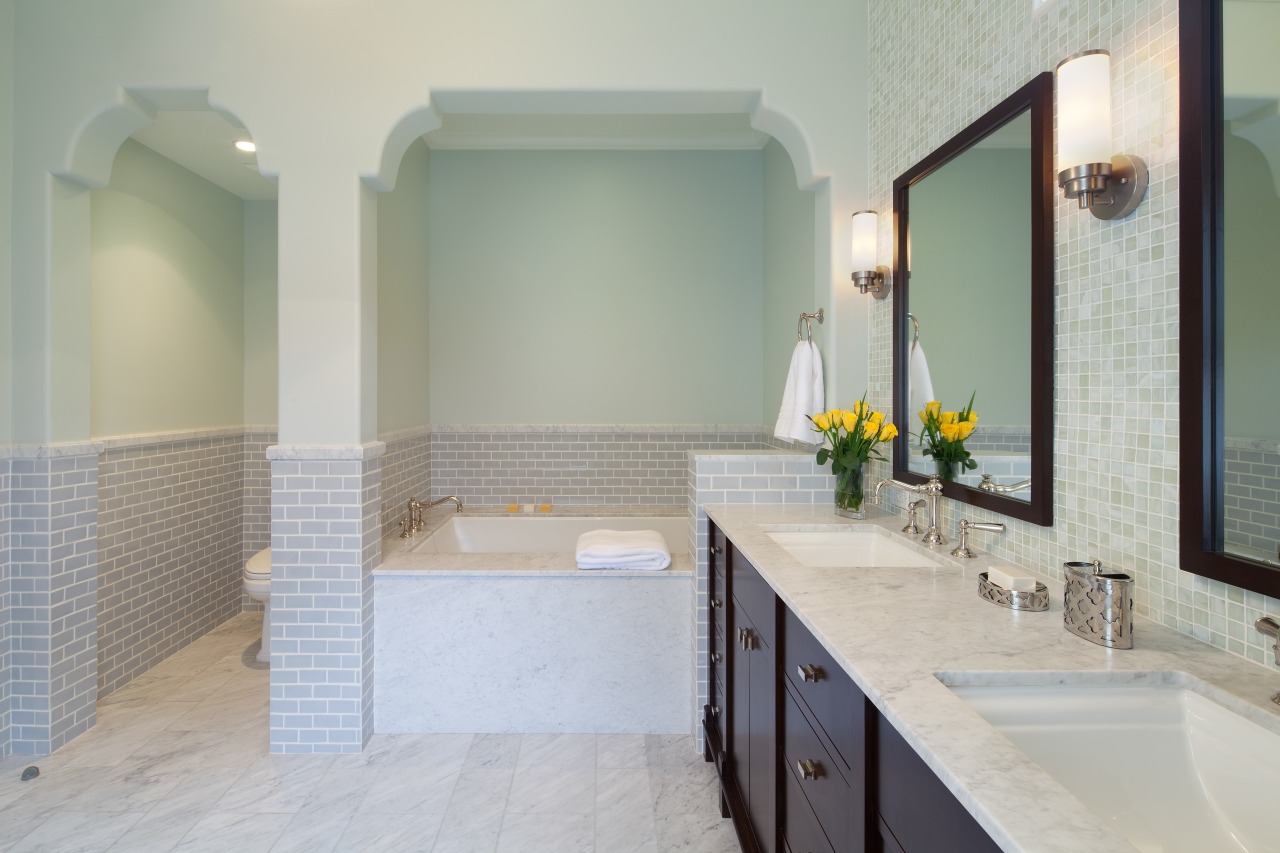
Brettler says the palette needed to be quiet and serene, so the points of difference are in the detail, rather than color accents. However, a dark wood stain for the handcrafted vanity helps to ground the space visually. This was inspired by an image found by the owners, who also selected all the tiles.
"In true Spanish style, the dark wood vanity is like a piece of furniture. Because the rest of the room is light filled, it provides a balance. The cabinetry also reinforces an Arts and Crafts element that can be seen elsewhere in the house."
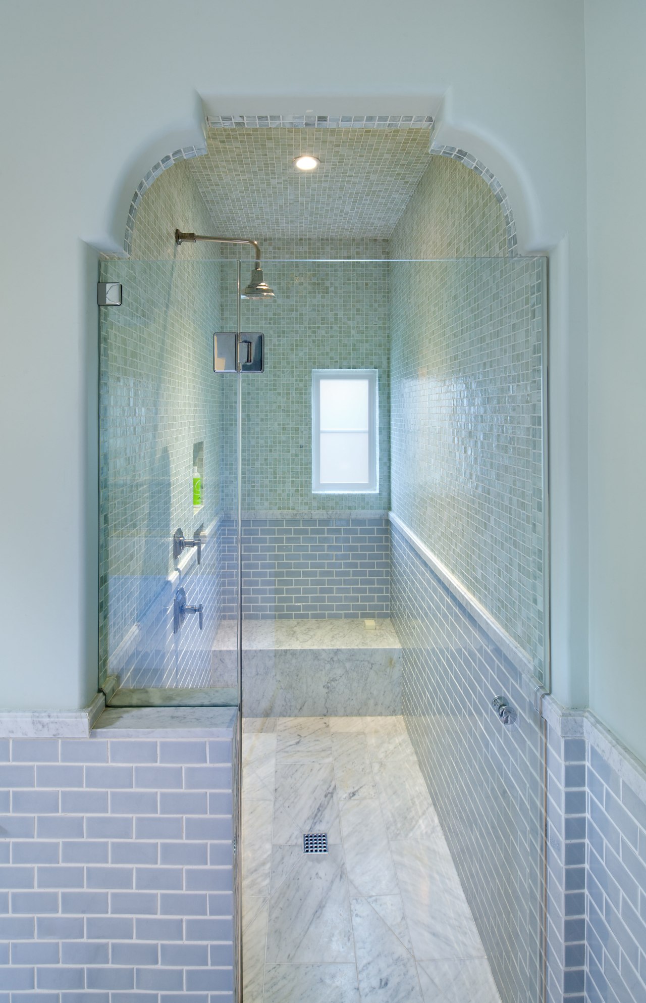
The architect created three separate niches, each framed by a Spanish arch one to accommodate a large tub, one for the toilet room and one for the shower stall.
"I added a half wall to the side of the tub that meets the vanity, so the wood is not right up against the tub," says Brettler. "It also makes the niche look more substantial."
In keeping with tradition, the architect introduced a tiled wainscoting that wraps around the entire room. This features high-gloss Ann Sacks Earthenware tiles. The soft gray tones complement the Walker Zanger Vintage glass mosaics that line the wall behind the vanity, and above the wainscoting in the shower.
"We paid a lot of attention to scale," says Brettler. "While the mosaics are very small, the wainscoting tiles are medium sized, and the floor tiles are large. And instead of capping tiles on the wainscoting, we have used slabs of marble, so the trim is continuous. It creates a very finished look."
The walls above the tiled wainscoting are painted in a very soft shade of pale green.
"A pure white bathroom would not have been nearly as interesting," says the architect.
As well as the main windows, there is a small square window above the vanity, and another window in the shower. This niche is fully tiled, with glass mosaics lining the ceiling as well as the walls, creating an inviting watery sanctuary.
Story by: Trendsideas
Home kitchen bathroom commercial design
Trends Vol 30 No 4
Bathroom Trends is dedicated to providing inspirational design ideas, products, services, and information for bathroom b...
Read More
