Solid foundation
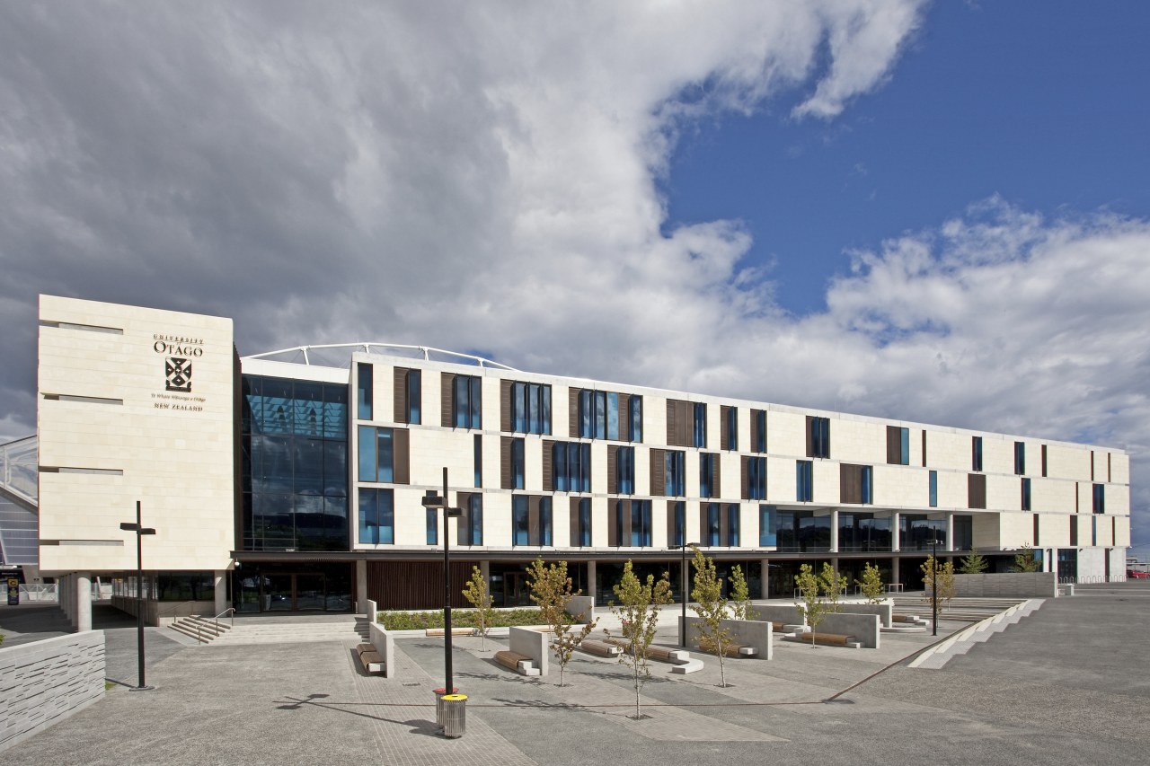
University Plaza of the University of Otago is an holistic educational experience
Universities have been a presence in Europe since the Middle Ages, but their origins go back to the monastic schools of the 6th century. Those early communities of learning fostered by the Christian church have transformed into the institutions we know today, offering wider curricula and becoming more accessible in the process.
Aside from academic pursuits, universities are now expected to nurture a broad range of cultural norms within the students.
University Plaza at the University of Otago exemplifies this ethos, providing students across the campus with a recreational centre, as well as having an academic presence, says architect Blair Johnston of Warren and Mahoney.
"The building has a two-fold identity. The first is the Unipol centre, which offers recreational services and facilities to students. The other component is the university's Foundation Studies programme for international students."
"From an architectural standpoint, these purposes are fundamentally different, with each requiring an individual treatment that, in this instance, needed to interface closely to produce a suitable outcome," says Johnston.
Adding further complexity to the architectural programme was the close connection the two structures share a common wall between University Plaza and Forsyth Barr Stadium.
"The university was adamant that the structure look like an academic building," says Johnston. "The key to reconciling the two programmes and meeting the client's brief lay in the development of an interlocking planning diagram."
Consequently, the design presents a highly articulated facade, incorporating a high degree of glazing, which enables the building to be read as academic in nature and purpose. Meanwhile, the interior can be segregated to accommodate the two distinct uses.
"At the heart of the design was the division of spaces to create two separate zones within the fabric of the building envelope. The academic spaces, which require adequate natural light and ventilation, have been set around the perimeter of the northern and western facades, while the sporting facilities have been placed along the eastern party wall and the southern facade."
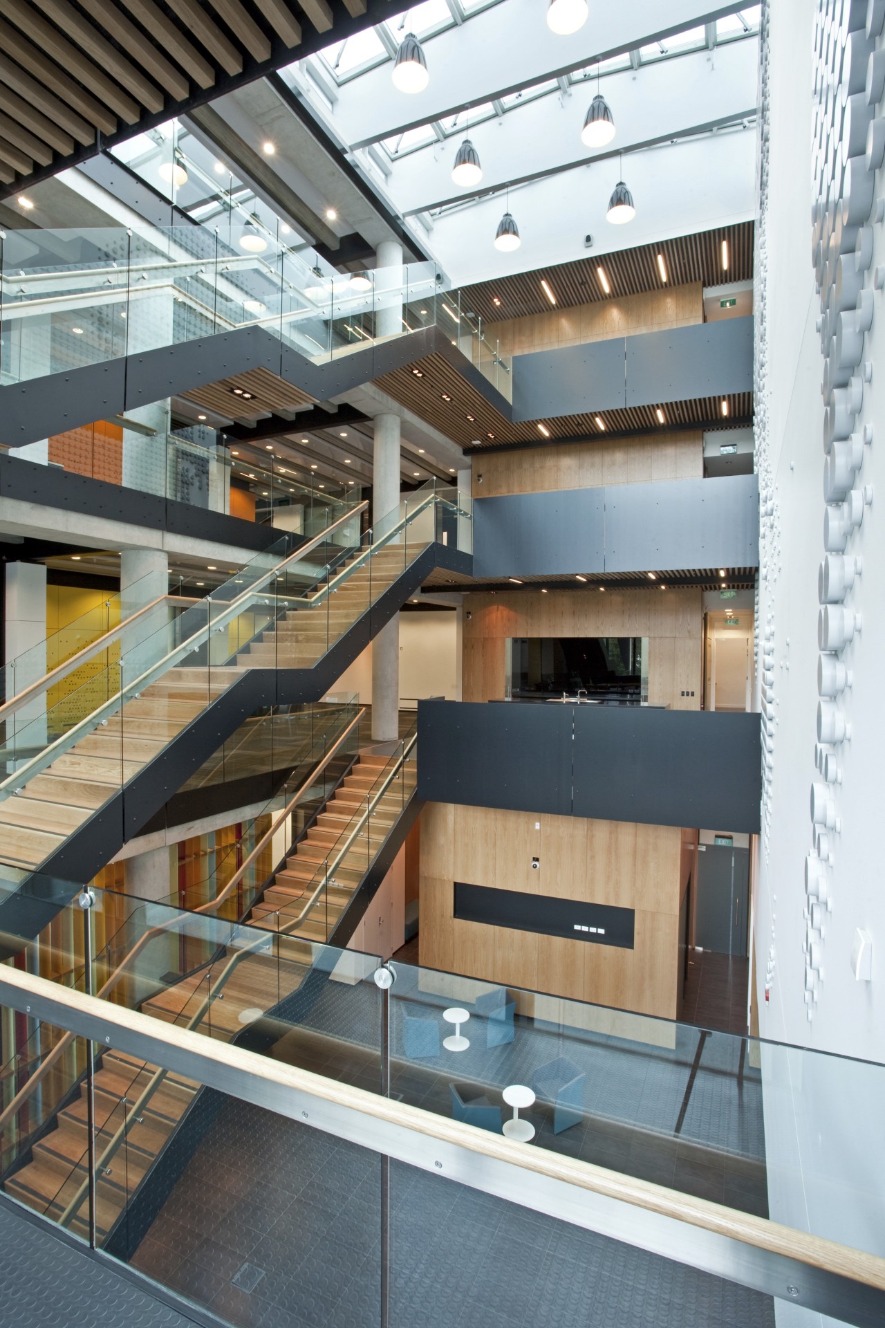
Each zone also has its own entry. A full-height central atrium punctuates the Foundation Studies space creating a vibrant, light-filled, active social space for students outside formal classes. Casual seating and zones for informal study are located around this area and primary vertical circulation is located within this space.
A double-height atrium welcomes visitors to the Unipol zone. All visitors pass through this space so open sightlines were imperative. A cafe, open to the general public, is also located within the atrium.
"The large flexible gymnasium spaces are on the first floor," says Johnston. "This location allows high-span elements to be placed at roof level, thus achieving a high level of structural efficiency."
Vertical circulation stairways are again intrinsic to the architectural vernacular of the space in this instance actually bisecting one of the gymnasiums.
"Circulation was one of the key factors, as the facility is expected to reach one million visits in the first year alone and played a role in determining the interior design scheme," says Johnston.
"Intuitive wayfinding becomes imperative in such a location, so the material palette was pared back and colour introduced to provide visual cues that are highly visible from the circulation core."
Also central to the building's design was the way it would interact with the external plaza area.
"The building lies on the extreme eastern boundary of the university grounds, with provision for the campus proper to accommodate future growth in that area," says Johnston.
"The facade design and the division of internal spaces maximises the interaction with the plaza, creating active edges along this frontage, while also encouraging use of the facility by a wide spectrum of university users and the general public."
Credit list
Developer
Construction company
Mechanical and electrical engineering
Landscaping
Cladding
Glazing system
Balustrades
Flooring
Paints
Veneer
Signage
Architect and interior design
Project manager
Quantity surveyor
Fire consultant
Roof
Hardware
Columns
Wallcoverings
Ceiling
Public area furniture
Lift
Story by: Justin Foote
Home kitchen bathroom commercial design
