Sense of luxury
This thoughtfully detailed kitchen is a master class in working with a shoestring budget to create a look that reflects champagne tastes
Designed by Melanie Sa'u, Cube Dentro
From the designer:
The owners, a young professional couple in their 20s, were after a kitchen for their first home.
The new home was to be situated in a new coastal subdivision on the outskirts of Auckland, so the concept needed to reflect the light, bright and beachy surroundings.
Being a draftsman, the owner’s penchant for clean lines, attention to detail & balance needed to be reflected.
At the same time, the kitchen still remains a practical space to work in as the owners start their journey on the property ladder.
With a budget of $20K, the challenge was to incorporate all of these requirements while delivering a space that conveyed a designer feel rather than a first home spec build.
The design response was to not overbear the space with cabinetry, while providing enough storage for the couple and future plans to on sell the 3-bedroom home.
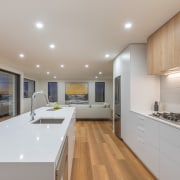
A feature woodgrain rangehood box sits seamlessly between tall cabinetry creating negative space, a sense of lightness and establishing a well-grounded kitchen with the surrounding spaces.
With budget and a designer linear look in mind, consideration was taken into the clever use of materials and alternative ways to create luxurious details on a shoestring budget.
The oven and microwave were positioned side by side with a custom black gloss trim kit and panel below to give the illusion of companion appliances.
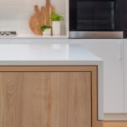
Bestwood Ranfurly Oak in a Timberland finish was introduced on the island and rangehood box not only to emphasise the details intertwined through the kitchen, but also to add texture and natural tones to the space.
Not only a social and working hub of the kitchen, the island provided a platform to showcase some detail and flair within the design in the form of a mitred stone down turn half rebated into the timberland frame and box section.
A 3mm shadow line referenced throughout the kitchen adds a subtle detail to the discerning eye, while the offset of the island box section creates a visual quirk against the balance of the back wall.
A large pantry caters for ample storage for not only the kitchen but the adjoining spaces and sits seamlessly within its purpose-built cavity, blending into the surroundings with the use of over height doors.
Careful attention to detail can be seen through the kitchen, drawing the eye in and around the space to the key alignments of each element of the design, from the tile lines, to the island size and its box section, to the way the stone downturn is purposely proportioned to line up with the top drawers in the kitchen on both the island and back wall.
This kitchen is truly a reflection of ‘champagne taste on a shoe string budget’.
The final result is a well refined design that is light and airy while remaining balanced with careful consideration to even the smallest of details.
Credit list
Cabinetry
Benchtop
Oven, cooktop, ventilation, dishwasher
Home kitchen bathroom commercial design
Small space, big impact
Classic dovetails contemporary
Tranquil waters


