Rewriting history
Referencing history without being trapped by it, and reinventing the space to make a house that looks, feels and works like new was the goal of this sympathetic remodel
Small home, good neighborhood. In many communities this combination might be considered a death knell, with demolition, removal or renovation beyond the scope of the original architectural intent the inevitable result.
Although not all structures have the necessary merit to warrant salvaging, every once in a while a home comes along with a heritage that deserves sympathetic treatment. Such was the case with this home, which was found by a couple interested in 1950s architecture, says Jeff Sheppard, the architect responsible for the home's remodel.
"The trend in this community is to take small, pre-1950s and 1960s ranch houses and either remove them from the site or add appendages. Luckily this particular home, which was originally designed by local architect Richard Crowther, was discovered by a couple who could see its potential."
The owners eventually met with Crowther and, after talking with him, began a year-long design process aimed at uniting three goals.
"We wanted to restore the essential elements of the home, find ways to reference important details without simply copying what was originally there, and add details that make the house as new and inventive today as it was in 1956," say the owners.
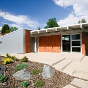
With the removal of white paint from the terra cotta block exterior, the house revealed its warmth and texture. Exterior wooden siding was replaced with weathered aluminum, although the vertical lines of the wood were retained.
"Our biggest decision, and the easiest, was to buck the local trend and keep the architecture exactly as it was no additional square footage and no change to the building footprint," say the owners.
Roughly half the size of typical houses in the neighbourhood, the home was both small and tired when purchased. It featured only two bedrooms and a one car garage. These negatives were, however, outweighed by many positives.
"The house was sited correctly. It was designed around a central courtyard, with interior spaces looking into this area. It was also orientated toward the south for passive solar heat, and it is narrow and long, which is desirable for cross ventilation," says Sheppard.
Sheppard says the major question was how to add to the structure without destroying it.
"When we first looked at it we contemplated a two-car garage, and perhaps one or two more bedrooms. But the appeal and proportion would have been lost if we added too much," he says.
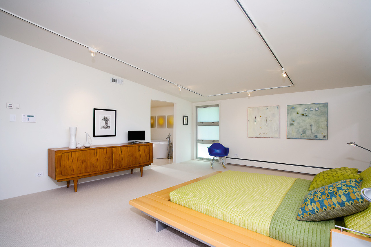
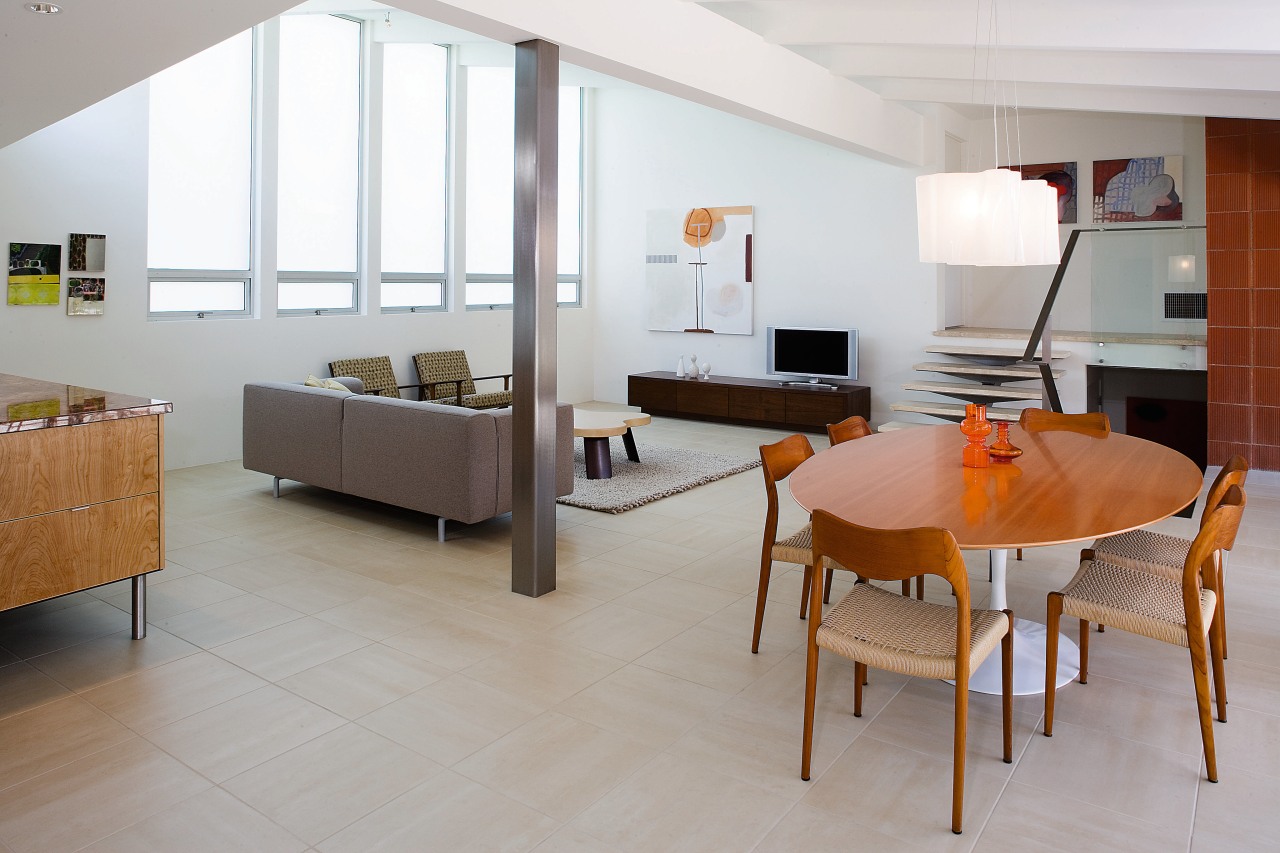
"Rather than altering the exterior we decided to work within the existing footprint, and spend money on clarifying the interior. Space was captured by adding a new down staircase within the existing entertainment room. This stair leads to a newly remodeled basement that includes a bedroom and bathroom. The stair, which also rises to the master bedroom, acts as a minimalist sculpture, adding to the contemporary vocabulary," he says.
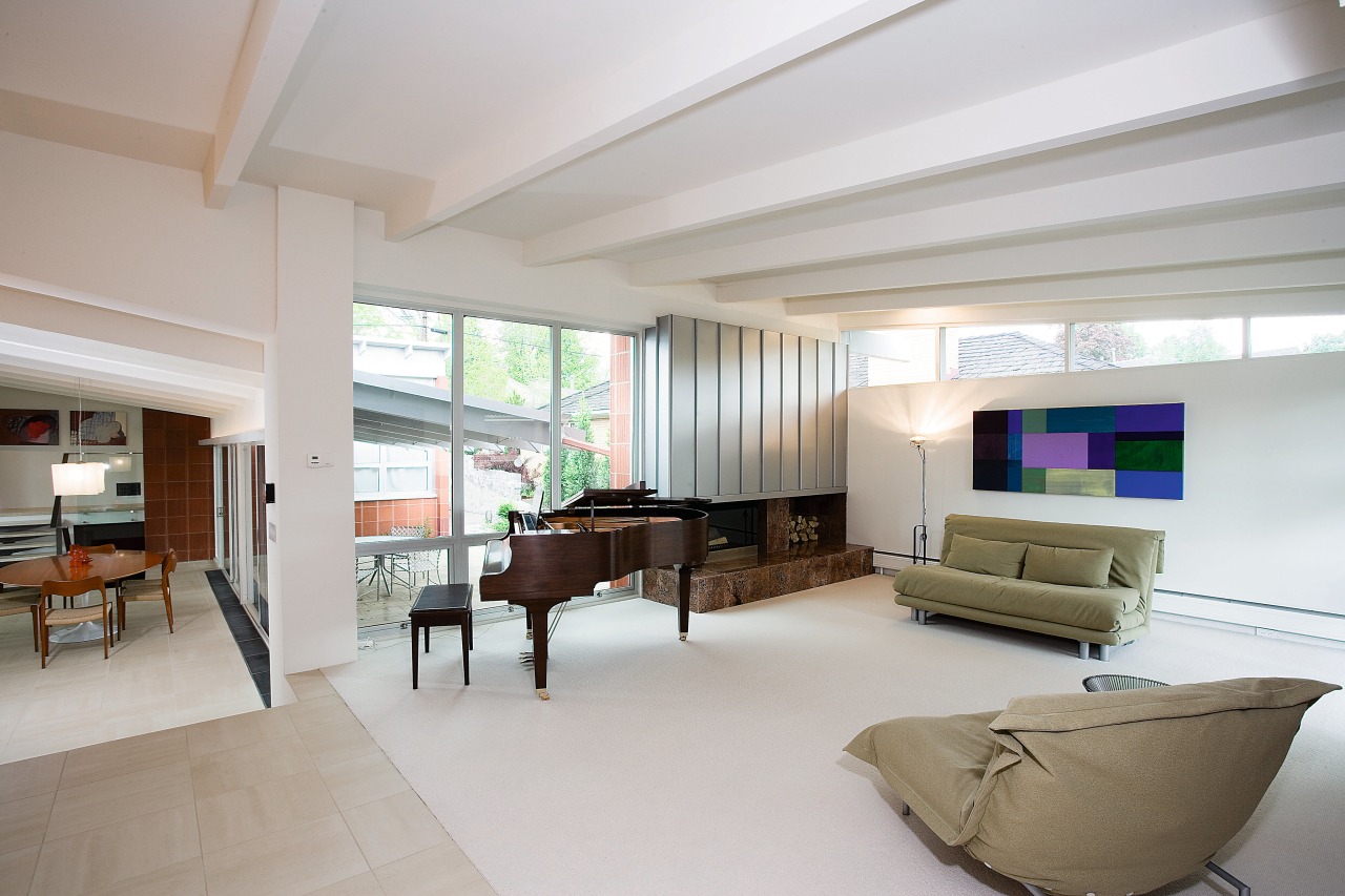
To extend the living space and make the environment more pleasant, the wall between the kitchen and living room was removed.
"The kitchen area is kept uncluttered through the integration of storage cabinets that also work to direct the flow of foot traffic. Kitchen objects are furniture-like and floating, a concept we implemented throughout other areas of the house."
The owners researched and selected materials, colors, fixtures and furnishings often with reference to the original design.
"Whenever we had to make a choice which tile to use, how to replace the exterior wood siding, whether to add a set of stairs we always made good choices when we looked back to the original design and found a meaningful reference point."
Credit list
Kitchen manufacturer
Structural engineer
Paint
Countertops
Bathtub
Shower fittings
Bathroom tiles
Artwork
Builder
Siding
Flooring
Kitchen cabinetry
Faucets
Ventilation
Dishwasher
Bathroom basins
Shower enclosure
Bathtub
Family room furniture
Story by: Trendsideas
Home kitchen bathroom commercial design
Sculptural centrepiece
Radical yet respectful
Curvaceous and connected


