Restaurant chic
This surprising kitchen offers the visual interest of an upmarket eatery with functionality to match
An entertainer's kitchen can go well beyond the functional creating a visual, as well as culinary, heart of the home.
This project is a collaboration between owners Daryl and Tara Hewitt and kitchen designer Chris Wheeler. The space reflects several design concepts noted by the couple during their overseas travels, with everything woven together by Wheeler's professional touch.
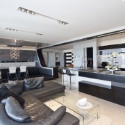
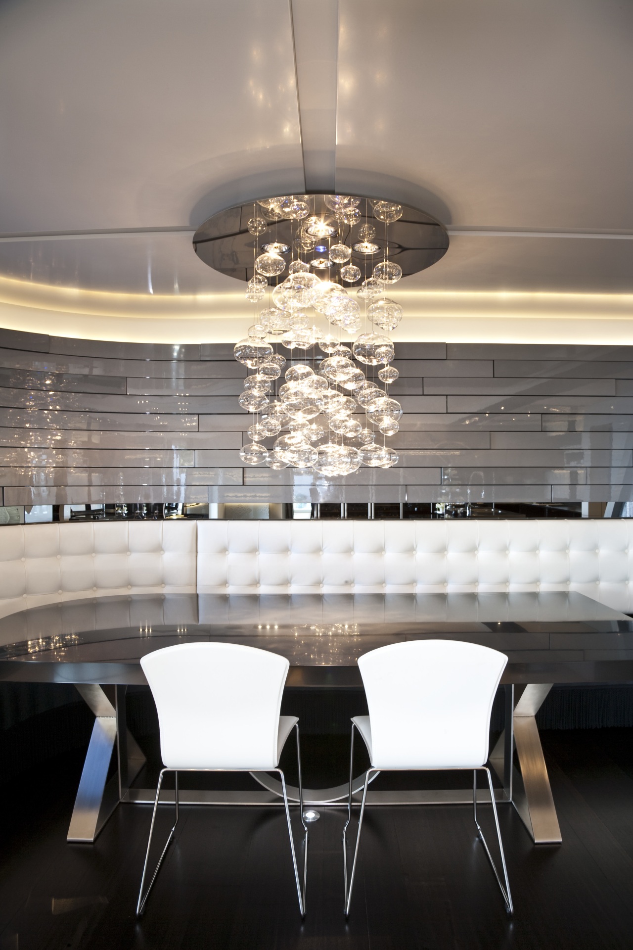
"The house has strong lines, so the space was softened with retro curves which link the kitchen and dining areas," says Wheeler. "We also wanted to create a flowing aesthetic, whereby one element leads the eye to another.
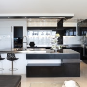
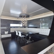
"For example, the negative detail on the island points towards the banquette dining area, as does the curved formwork that runs overhead. Similarly, the dining area is angled to face into the kitchen."
The owners are avid entertainers and the area has a restaurant feel, with a raised dining area and low counters in the kitchen meaning the owners can cook and converse at the same time. Beyond the chefs, there are many things to look at.
"We own a design and build company and chose elements that would inspire our clients hence the stand-out factors and the use of the latest fittings and fixtures.
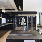
The large island is a centrepiece. This is in stainless steel, and has a 16mm pressed and raised element in the sink area of the countertop," says Hewitt. "Stainless steel blade inserts and LED concealed lighting also feature and the bold negative detailing is repeated, sometimes in reverse, in other areas."
The distinctive wall and ceiling panels are another design high point.
"We introduced a classic tile pattern that we had seen in France to complement the retro curved joinery and repeated this on the ceiling with routered and polished Hi-Macs acrylic panels," says Tara Hewitt. "A black strip of tiles contrasting the white continues the reverse detailing look."
Another dramatic aspect of the design is the wall of high-gloss black panels at the end of the kitchen complemented by the custom industrial-look grill above.
A high-tech hob and electric drawers with no handles and safety sensors add to the sense of a professional workspace.
"While the kitchen is a treasure trove of ideas, a seamless feel was achieved by having elements flow together and also by adhering to a simple colour scheme," says Daryl Hewitt. "A high level of finish, which included back-gluing and fixing to conceal screws, was also part of this."
Credit list
Kitchen designers
Kitchen manufacturer
Ventilation
Refrigeration
Cabinetry
Taps
Refrigerator and dishwasher
Warming drawer
Award
Builder
Grill
Splashback
Wallcoverings
Lighting
Waste disposal
Flooring
Story by: Charles Moxham
Home kitchen bathroom commercial design
Vibrant spiral stairs improve penthouse connections
Silver moons rising
Sculptural centrepiece

