Renovation and addition creates open, airy living zone at back of home
A traditional frontage with a tile roof and stained glass windows gives way to spacious, light-filled new entertaining spaces at the rear

It’s hard to improve on the elegant, gracefullines of a traditional house facade. On the other hand, you can’t beat the relaxed functionality of modern, light-filled living spaces – this newly renovated home enjoys the best of both worlds.
Unseen from the street, the comprehensive rear renovation was undertaken by project architect Linda Simons of LSA Architects.
“The homeowners are from large families and wanted to be able to entertain all year round,” says Simons. “Previously, the back of the home consisted of smaller, enclosed rooms and just a small deck that felt disconnected from the rear garden, a couple of metres below.”
Simons says the homeowners’ brief was to retain the classic looks at the front and introduce a sprawling family-kitchen-entertainment space at the back. The L-shaped, open-plan spaces were to wrap around a reworked outdoor living space with a new swimming pool, al fresco dining and a barbecue.
When connecting a modern addition to an older home, a straight contrast often works best, and such was the case here. The pop-up roof on the new section of the home connects directly to the gabled tile roof of the original home.

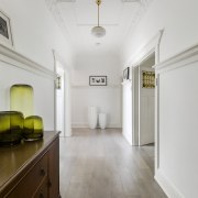
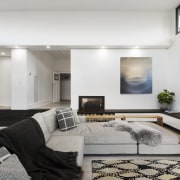
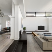
And similarly, there’s a clear line between old and new on the interior. Stepping through from the existing living room to the new family room, ornate ceilings, skirting boards and stained glass windows give way to clean, crisp lines and floor-to-ceiling glass sliders.
“Natural wood floors and pristine white walls run through both areas, creating a visual connection between old and new,” says Simons. “The addition also includes steps that accommodate the property’s sloping site without need for a drop from deck to backyard.”
The renovation contains three key living spaces – the family room, dining area and an entertainer’s kitchen. However, the need to maximise space, access and functionality for some secondary spaces led the architect to some clever design solutions for these areas.
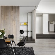
“Part of the brief was to create a workspace for a home business that could be hidden from sight if required, while still feeling part of the new open-plan living volume."
“In response, we designed an understated wood-clad elevated box-like office insertion with retractable doors. The office can be closed off when the homeowner needs to concentrate or be opened up as part of the wider space.”
And a little like a giant matching bookend, another cubed, wood-clad insertion lies on the other side of the kitchen – again, this box’s simple lines belie its multipurpose functionality.

“The strategic placement of this two-way bathroom-powder room allows it to be accessed from both outdoors or the kitchen – so it serves as a powder room and a pool bathroom, avoiding need for wet footprints through the home.”
A walk-in pantry that links straight to the kitchen is tucked in at the side of this insertion.
“And while the two box-like forms recede visually, the entertainer’s kitchen between them draws the eye from most areas,” says Simons.
The kitchen deftly balances functionality and drama. The room-high wall cabinetry holds a wealth of storage but, blending in with the wider colour palette, it also recedes from sight. Out front, the chunky dark granite island is dramatically contrasted with a waterfall side counter in a beautifully veined white marble. The latter provides for casual breakfast seating.
A new main bathroom reflecting a boutique hotel-style feel and an upmarket, contemporary master ensuite were also part of the project.
Credit list
Architect, interior designer, kitchen designer
Cladding
Tiles
Paint
Lighting
Benchtops
Taps
Warming drawer
Ventilation
Dishwasher
Builder/landscaping
Roof
Main flooring
Wallcoverings
Heating
Kitchen cabinets
Splashback
Ovens
Hob
Microwave
Awards
Story by: Charles Moxham
Photography by: John Wheatley, UA Creative
Home kitchen bathroom commercial design
In tune with the land
Light-hearted by the sea
Surface attraction
Homes Trends Vol. 34/4
Whether space for your new bathroom is generous or modest, you'll want to create a room that not only looks good but is ...
Read More
