Proud face, warm heart
A comprehensive rethink of this stately residence sees its classic good looks backed by contemporary aesthetics and convenience
Sometimes combining the best of the past with the best of the present is most effectively achieved by using empathy and contrast in equal measure.
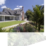
The owners of this classic 1920s residence asked architect Vince Abela and interior designer Rachael Buxton to combine its old-world charm with the requirements of modern family living. This included retaining the formal aesthetics of the front rooms, and ensuring the house connected well with its outdoor spaces.
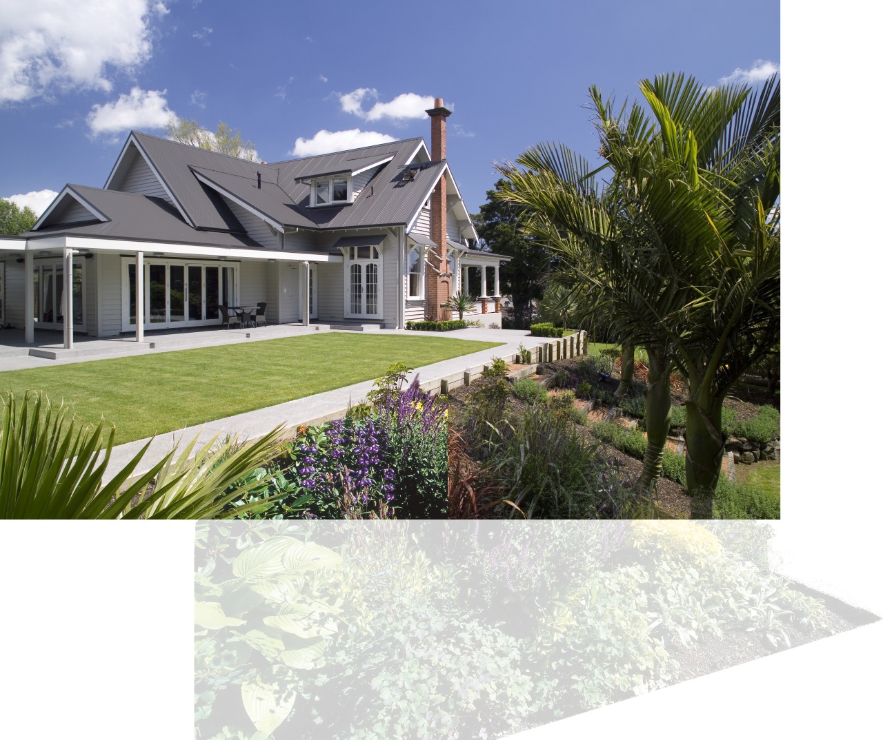
"Little was touched on the home's frontage," says Abela. "However, major renovations were undertaken at the rear. We introduced a pool, a combined guesthouse and pool house, and a covered spa area here. These connect back to the house through a new covered courtyard area and French doors."
With the land rising at the rear of the property, the pool acted as an intermediary step between the raised guest house and spa area on one side and the courtyard at house level on the other. A stone wall runs along the side of the pool and into the hill at one end, and into a fireside surround in the courtyard area at the other acting as a linking element.
A lawn to the side of the residence was also raised to house level providing another easy indoor-outdoor connection. Facades at the side and rear of the house were also renovated.
"Creating a harmonious look was achieved in part through the entire roof being renewed, avoiding contrasts of variously aged materials or tones," says Abela. "The same roofing was also used for the pool house and adjacent guest house, helping to draw the new and existing buildings together."
"Similarly, the home's classic weatherboard sidings were extended on the new facades and the pool-side buildings," he says. "New doors opening to the side lawn were set to the height of existing doors, creating continuity in this way as well."
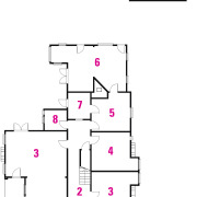
The interior was also substantially reconfigured at the rear by the architect. A laundry was re-sited and a spacious, open-plan room created.
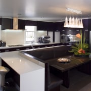
"This room encompasses the kitchen, family room and an informal dining space," says Abela. "This area already had a drop in ceiling height from the lofty front rooms. This demarcation made a logical departure from the classic to modern spaces."
Rachael Buxton provided an interior design transformation that both heightened the character of the existing rooms and also the aesthetic balance of the new, open-plan kitchen-dining-family room.
Essentially, the owners wanted the interiors to be comfortable and contemporary, in keeping with the needs of a young family, says Buxton.
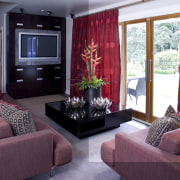
"In the formal living room, ceiling-to-floor drapes accentuate the height of the space and provide visual interest," she says. "Touches of green in the decor, a favourite colour of the owner, are found in the wall hues, the chartreuse ceramics on display and in the cushions."
These highlights offset the room's largely camel or tan colour emphasis chosen to make the room a warm and welcoming place to spend time in. The demure furniture was chosen for similar reasons.
Modern touches include the metal-framed mirror and stainless steel fire surround below it.
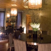
The dining room is conceived as a dramatic, self-referencing space. Wallpaper designed by noted Australian designer Florence Broadhurst has been customised to a decor of coppers and bronzes. While the white ceiling in the living area accentuates height, the varnished kauri here brings intimacy.
"Contrasting these rooms, the open-plan renovation has a more minimalist feel," says Buxton. "Here long, unbroken lines contribute to the contemporary aesthetic. Kitchen cabinetry matches the television cabinets in the family room area and uniform wall tones also draw the space together. Lighting and floor coverings demarcate areas of use.
Story by: Charles Moxham
Home kitchen bathroom commercial design


