power to the people
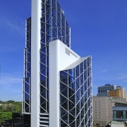
Cutting a dramatic profile on the KL skyline, the new Menara Bumiputra-Commerce office tower addresses the needs of expanded business and the wellbeing of employees
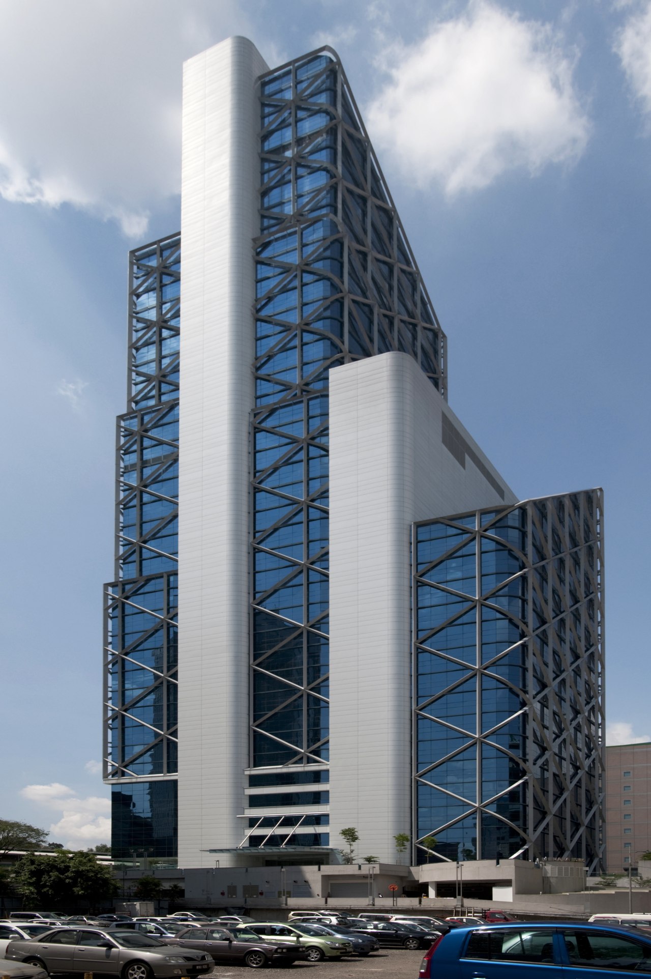
As the holder and protector of fiscal assets, a high-profile international bank succeeds by showing responsibility and fair dealing to all. It makes sense, then, when a respected bank's expanding retail resources are centralised, it is in a progressive, environmentally in tune, people-friendly tower.
CIMB is one of Southeast Asia's most recognised, fastest-growing commercial banks, with expanded real estate needs resulting from the acquisition of two heritage financial organisations Southern Bank and Bumiputra-Commerce Bank. This expansion has led CIMB to bring 3500 staff together on one inner-city site and provided the opportunity to secure a high-rise building that would give back to staff and clients in the form of an optimum banking environment. The resulting design comprises a four-level basement car park, amenities on the lower ground floor, a banking plaza on the upper ground floor, a banking hall on the mezzanine, first and second floors, and offices and executive floors rising above that.
The 37-storey Menara Bumiputra-Commerce (MBC) tower was designed by ATSA Architects, with the interior fit-out project managed by ISG Asia. For ISG Asia this involved liaising with three design firms the podium interior design was by NTribe Chew, the general offices were designed by iPartnership, and the four executive floors were undertaken by M Moser Associates.
ATSA Architects project director Azmil Abdul Azmi says CIMB's motto is Forward banking' and that the tower reflects this in its location, aesthetics, versatile floorplates and environment-friendly interiors.
"MBC tower is situated in a grouping of established financial institutions including the EPF Employees Provident Fund HQ and UOB Bank," says Azmi.
Nestled among some of the most recognisable buildings in the world, MBC holds its own. The structure is in reinforced concrete, with metal cladding and a royal blue curtain wall system echoing the bank's corporate colours. Two cores anchor the tower and contrast the transparency of the curtain wall.
Azmi says addressing the existing urban context was vital to the public's perception of the new tower.
"We introduced a public plaza at the podium level, which opens up to the pedestrian walkway linking all sides of the building, and is in close proximity to a cafe pavilion, the LRT station and the bustling Jalan Jaja Laut," says Azmi. "The entire area is lively and welcoming for bank staff, customers and passers-by alike."
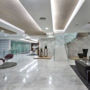
In terms of business presence, a double-height atrium and glass walls allow an open presence. The cafe and electronic banking centres, together with the food court, are located at street level. Public areas are finished in marble and granite the look is formal and contemporary, all in line with the corporate image of the bank.
With regard to business efficiency and the future, the tower presents versatile floor layouts planned on a grid and divided into three sections around the two cores. Each section presents over 550m² of net usable space.
ISG Asia's Malaysian country director Paul Marshall says the bank's goal of being employer of choice saw more was on offer than easily reconfigurable offices.
"Parallel aspects of the project included extensive meeting room facilities, myriad comfortable breakout and cafeteria areas, a multipurpose hall, a library, a gymnasium, a food court and future space allocation for a creche within the facility," says Marshall. "While this tower presents a look forward to a bright future for CIMB, it also addresses the needs and wellbeing of the hundreds of employees who come here each day."
In undertaking the interior design of the podium of the MBC tower, NTribe Chew's task was to interpret and reflect the bank's focus on balancing a local sensibility with an international outlook.
Given an area of 23,225m², including all 38 lift lobbies and six podium floors, the challenge was to implement a unifying, consistent design statement, says project director Huey Chew.

"The design needed to encompass a broad range of uses, including electronic banking, a canteen, cafe, and retail outlets at basement level, a customer service and main lobby reception area and a multipurpose hall on the ground floor," says Chew. "There were also more banking halls, preferred banking and credit card areas on the 3rd floor and financial services and sales on the 4th and 5th floors.
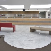
"The ground floor banking hall is the public face of the building and was critical in setting the overall design and feel for the project. Here we introduced key pieces of furniture to give a distinct, fresh dimension to the interior aesthetic helping to move away from the traditional customer-teller divide."
To unify these diverse functions into a seamless design, NTribe Chew used consistent elements in each such as timber veneer, bookmatched marble and strong architectural lines. Colour and finish differences between departments vary only subtly, so as not to interrupt the flowing aesthetic.
"Overall, the interiors highlight horizontal elements, with light wood veneers of soft linear grain, planes of glass and textured walls," says Chew. "The veneers evoke traditional warmth and help humanise the interior spaces, while the generous use of glass results in long lines of visibility and an expansive feel.
"All in all, the elevator lobby, public and podium floor spaces are unified with a sophisticated and modern design theme to communicate an approachable, modern and technologically advanced institution."
The 23 floors of general offices represented the main body of the fit-out work all of differing complexities for iPartnership, says project director Azrina Arshad.
"The main challenge for this project was to work with CIMB's aspirations to be the employer of choice iPartnership looked at various interiors in terms of the bank's desire to empower staff, be forward thinking and adaptable to change.
"In managing the larger, deeper footplates, we created defined circulatory routes to ensure efficient traffic flow," says Arshad. "We wanted to provide improved comfort in all aspects of the work experience, right from the moment of arrival into the office space."
Design parameters pertaining to best office practice and design guidelines were agreed upon with the client from the outset to achieve generic, flexible floor plans that could be tweaked later as required.
In all, the iPartnership focus covers the general office space and enclosed offices, the meeting rooms, breakout spaces and all support spaces and amenities.
"We adapted an open-plan concept for the general office space, with white furniture breaking away from the colour scheme adopted by CIMB prior to this new fit-out," says Arshad. "The interiors relate to the new branding direction, as found in the new banking hall at the podium level and all branches. Red was used sparsely as a reminder of the bank's livery only as highlights in the joinery. Careful application of colour, especially relating to branding, gives the workforce a sense of belonging."
To cater for expansions or contractions of the workforce, the general workstations, enclosed offices and core joinery were designed in modules. Collaboration areas are set at corners dictated by the placement of the floorplates all available space has been effectively utilised in the iPartnership fit-out.
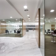
The private, enclosed rooms are glazed on three sides, to admit as much light as possible. These are set around the two cores and main circulatory route to command greater views of the general offices.
iPartnership introduced meeting rooms of various sizes on the office floors, and each level has a meeting room with a capacity for 12 people or more.

"With staff wellbeing highlighted in the interior design, the breakout spaces are centrally located places where people can relax, have a drink or a meal and work at the same time," says Arshad.
Printing areas, storage and prayer rooms were decentralised by iPartnership to allow for more efficient movement and increased productivity.
Contemporary forms overlaid with classic materials give the executive floors of the MBC tower a friendly aesthetic. These floors a 4537m² segment of the project were completed by M Moser Associates.
The design evolved from M Moser's wish to go beyond the banking sector's typical blend of corporate form and function, towards a high-end environment that people feel comfortable coming into.
Design director Adam Mundy says the unusual shape of the floorplates with two separate entrances prompted them to set the reception desk at the centre of the floor, accompanied by an open waiting area.
"The reception introduces one of the most eye-catching features of the executive floor, a songket, the traditional hand-woven silk fabric of Malaysia. This alliance of traditional craft and modern design sums up CIMB as a forward-thinking, people's bank," he says.
The executive floors accommodate a series of meeting rooms for staff and clients, and interconnected staff training rooms.
"On the western side of the building, we pulled all the meeting rooms off the curtain wall, towards the inside, with a corridor circulating around them and the perimeter of the floorplate," says Mundy. "This meant that instead of having columns in the middle of rooms, we could enclose them in glass, as features."
Functionally, the 18th floor flows on from the 19th, the staircase leading to a library and cafe-like pantry area. From here the natural circulation continues through to the staff fitness room.
"The gym is a generous space," Mundy says. "We wanted to provide a facility that people would actually use, rather than a token effort along with the pantry rooms, it is a space that brings people together."
The remaining executive levels are located on the 36th and 37th floors, one containing a 51-seat presentation room and offices for the group chief executive, directors and support staff. These connected floors also share a gleaming white marble staircase.
With its restrained forms providing a modern setting for a palette of locally sourced materials and artworks, the executive floors of CIMB's headquarters are forward-looking, distinctly Malaysian, and welcoming.
"I think one of the most successful results of the project is not how the interiors look, but how well they function. As with the entire tower these are spaces where people feel instantly at home."
Credit list
Owner
Project manager
Main contractor
Interior design general floors
Interior design executive floors
Base build mechanical and electrical engineer
Base build quantity surveyor
Lighting consultant
Operable wall systems
Office furniture
Office furniture
Carpet tiles
Timber veneer
Tenant
Developer
Architect
Interior design podium
Structural consultant
Fitout mechanical and electrical engineer
Cable management system
Carpet tiles
Timber veneer
Architectural products and services
Office seating
Coloured-back glass
Lighting
Story by: Charles Moxham
Home kitchen bathroom commercial design

