This powder room proves small spaces can feel powerful
The materials used in this powder room make it feel bulletproof. Discover how a moody material palette and thoughtful lighting design has taken this small space to the next level
If the aim of a powder room design is to make an impact, then this one certainly succeeds.
Designed by Angelique Armstrong of Armstrong Interiors, this space raises the bar for what a powder room can be.
Located in the impressive home of a successful businessman, this powder room is part of a wider project that Armstrong was also involved in.
“There was no limit or budget that I needed to work under,” she says. “So this made it the perfect job for the creator in me.”
The extent of the brief that Armstrong was given was to design a dark and masculine space. Armed with creative free rein, Armstrong designed a small but powerful space.
Every detail is carefully executed to the highest degree. The balance of moody materials and a very deliberate use of lighting have resulted in a bathroom that exudes quality and restraint.
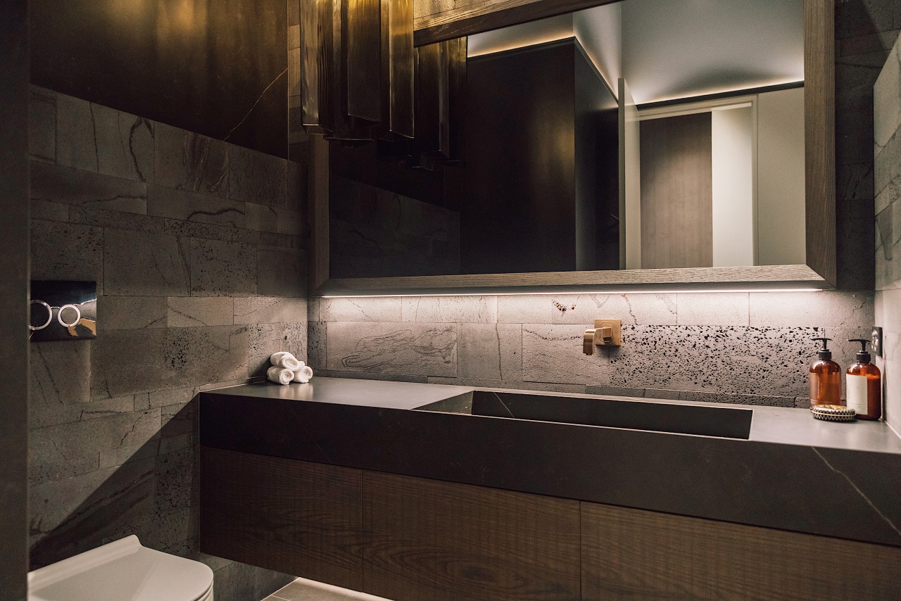
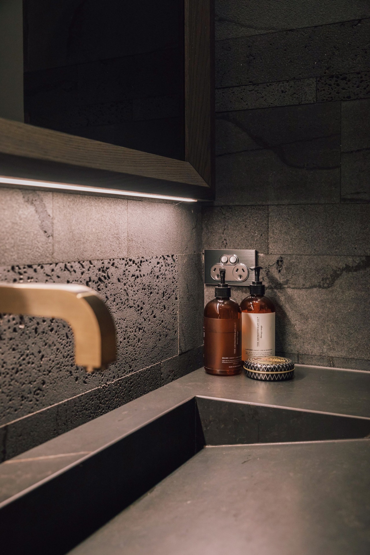
The materiality feels bulletproof. Natural elements like the bluestone feature walls, Neolith trough sink, and rough sawn timber cabinetry bring a solid and tactile feeling to the space. “I was trying to create an organic look,” explains Armstrong. The addition of the hand-blown glass pendant light and high-end fixtures complement the design.
“There was no limit or budget that I needed to work under, so this made it the perfect job for the creator in me”
A dark space with such heavy materiality could end up feeling oppressive were it not for the expert eye for detail that Armstrong brings to her projects. Her use of lighting in particular is what takes this powder room to the next level. The thoughtful placement of lights in this space is a lesson on how to create ambience and intrigue.
With a soaring stud height of 3.5m Armstrong creates balance in the space by adding a dado line and running lighting along it. The light-washed walls above help to create a more intimate space. “A modern dado line was designed to bring the wall height down – having a different colour brings balance and interest,” she explains.
Sitting the vanity 60mm back from the back wall also means this light washes down the bluestone wall behind the vanity to increase the floating effect. Further LED lighting behind the custom mirror adds to the mood.
The overall design proves you can make big design statements in a smaller space.
Credit list
Vanity cabinetry
Basin
Toilet
Flooring
Tiles
Ventilation
Benchtop
Taps
Accessories
Wallcoverings
Lighting
Awards
Designed by: Angelique Armstrong
Story by: Lakshmi Krishnasamy
Photography by: Eddison Te Reo
Home kitchen bathroom commercial design
Small space, big impact
Classic dovetails contemporary
Tranquil waters
