Photogenic
Bold colour and clean lines mean this photographic studio and retail store stands out from the crowd in a busy mall environment

Creating a brand image for a well-respected photographer can be a juggling act. On one hand, the look has to grab attention and translate easily through the signage, the store design and ultimately the product packaging and website. On the other hand, the theme has to frame and not overwhelm the photographer's works.
The brief for Mark Landini was to create an approachable brand and total packaging concept for top-end photographer Mark Morffew, who specialises in both child and family portraiture.
"We wanted to create a brand image that would stand out in a crowded mall and provide distinctive branding for a follow-on chain of similar stores," says Landini. "Most importantly it had to showcase the photographer's work."

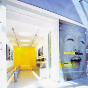
A larger than life image by the photographer fills the shop's front window this is changed from time to time to keep the interest of passers-by. The large image, lacquered yellow wall and simple lines constitute the store's striking appearance.
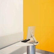
"Clean, simple lines accentuate the airy space," says Landini. " Materials such as vinyl upholstery, stainless steel podium legs and corrian surfaces are well-suited to the high traffic of children and parents visiting the shop. "
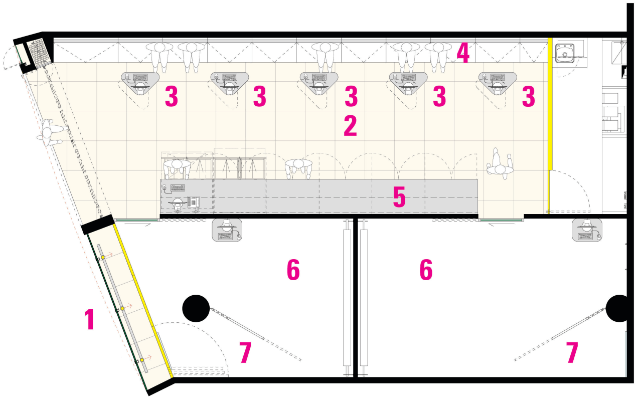
The space is divided between two glass-walled studios and a central retail area. First a subject's photo is taken in one of the studios. Back in the retail area, images are viewed, cropped and tried with various virtual frame options. The screen podiums and bench seating are both chic and hard wearing.
The shop counter is a sleek wall cabinet beneath shelves displaying framing options, and storage is tucked away behind the bright yellow feature wall.
"From the retail area, the camera's flash is visible through the frosted glass studio walls," says Landini. "It is a bustling, friendly space that signals an up-market yet approachable brand image."
Story by: Trendsideas
Home kitchen bathroom commercial design
Marvellous in marble
Thrice as nice
The beauty of understatement


