Peaceful, easy feeling
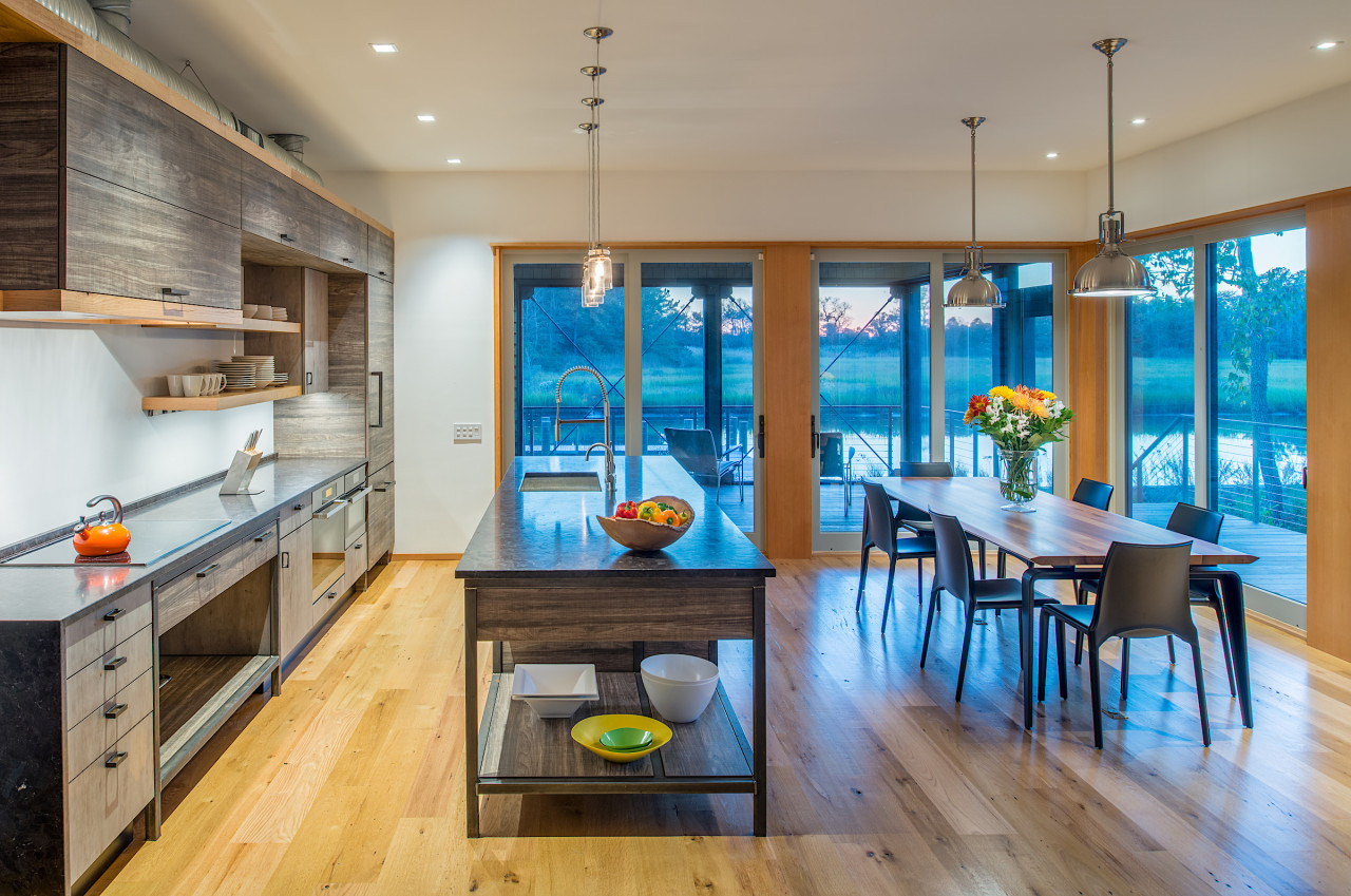
In this airy kitchen, everything is designed that way for a reason – depth of cabinetry, surface finishes, canal views and even duct integration were all key
Designed by Jennifer Gilmer Kitchen & Bath.
Co-designer: Amy Gardner, FAIA, Gardner Mohr Architects
From the designer:
The existing home house on this lot was old and tired and didn’t take the best advantage of the view of the canal.
So the owners hired an architect to design a new house for them that is modern, but still fits in nicely with the neighbourhood.
Because it’s modern, we were able to create a warm, contemporary kitchen that fulfilled their sustainably-minded agenda with a 'modern farmhouse' aesthetic.
Although this doesn’t pop out at you, there were many different materials used in this kitchen.
The refrigerator, deeper wall cabinets, cooktop console and the island are all made of a horizontal grain barn wood high pressure melamine, which has a wood texture to the eye and to the touch.
Other cabinets, including the standard depth wall cabinet, are in a calmer, vertical grey wood high pressure melamine which has a smooth texture.
We incorporated hot rolled steel in the island and for the cooktop console.
The wood is a natural fir which was used in the architecture for the doors, windows and floors.
This is a large family that gets together a lot at the beach.
So the owner wanted to have her sink facing the breakfast table and living area, which allows the cook to socialise while prepping meals and while cleaning up – but most of all, allows for enjoyment of the canal view.
This left the back wall for the cooktop and hood.
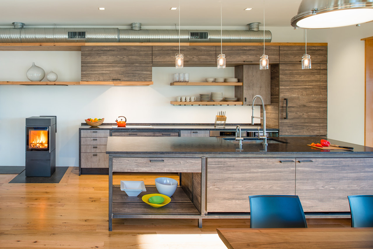
A small, modern wood stove helped to set the parameters of the kitchen.
Since there is no strong axis line on which to centre the kitchen, we used a creative composition which would span the entire back wall.
It made sense to put the refrigerator to the far right, nestled up against the wall, so we used this as the spring board for the design.
An exposed duct needed to go across the ceiling of this wall, so, we took this into consideration as we designed the cabinetry to the left of the refrigerator.
We decided to have 61cm deep upper wall cabinets, which is the same depth as the refrigerator.
We then topped these cabinets off with a fir flyover shelf which extended past the kitchen toward the far left wall, ending in a tall box whose finish matches the horizontal kitchen cabinets.
This helped to contain the exposed duct and created continuity.
Since the rangehood is also on the refrigerator wall, it was made out of the same horizontal grain cabinet material and also at the same 61cm depth.
This created a niche between the refrigerator and the rangehood where we placed a standard depth wall cabinet in the vertical grey cabinet finish and floating shelves in the wood finish.
The line of the top floating shelf was continued on the bottom of the hood and as this detail moves to the left, it reduces in depth, and continuing on, becomes the top of the television cabinet.
There is a sliding door below this shelf, sandwiched by the floating shelves, which conceals the television when it’s not in use.
Hot rolled steel used to frame out the island and the cooktop console makes these cabinets feel more like furniture, adding a level sophistication that makes this kitchen even more unique.
This same material was used under the wood stove and to the left along the wall where the owner can stack fire wood.
Steel was also used within the architecture of the house in various areas.
The honed dark stone countertop blends well with the entire kitchen, completing the serene and pleasing feeling in this one-of-a kind kitchen.
Home kitchen bathroom commercial design


