Open to view - The Auckland Art Gallery engages with the urban landscape
The Auckland Art Gallery engages with the urban landscape
Over the past decade there has been a sea change in the way public art galleries operate. Today, the focus is firmly on the accessibility of art and the provision of inviting civic spaces that are not only culturally significant, but also designed to enhance the urban fabric of the city.
It's a philosophy the Auckland Art Gallery Toi o Ta-maki took to heart when planning its new multi-million dollar extension. As gallery director Chris Saines says, the project was not just about creating more dynamic and flexible spaces for art, but was also about programming those spaces in ways that will ultimately expand the audience for art.
For the two architecture firms that won the international design competition to design the extension, Sydney-based Francis-Jones Morehen Thorp (FJMT) and Archimedia of Auckland, the project was all about transparency.
Architect Richard Francis-Jones of FJMT says it was important to create a strong connection and an interaction between the gallery space and the public outside in particular, the people moving past in the street.
"There is often a threshold anxiety associated with civic buildings. To make art more accessible it is best if this can be blurred, so the public sees it as a very public space a place to meet friends, have coffee, attend events and functions. As such, the gallery needed to be inviting and transparent."
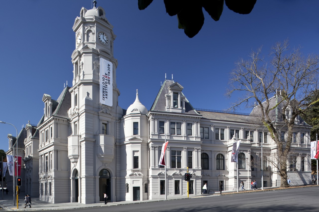
Francis-Jones says the gallery extension also had to relate to the existing heritage building; to Khartoum Place, which is a narrow lane on a direct axis with the entry; to the city itself and to Albert Park on the northern and eastern boundaries.
"Architecturally, the relationship between the building and the immediate surroundings was the most challenging aspect. The site was constrained, with the existing building occupying a large percentage of the footprint. It was also a very sensitive site, with a lot of heritage aspects."
The architect says the project provided a unique opportunity to reveal and interpret the history of the site. At the same time the gallery needed to be able to accommodate a world-class art museum, host prestigious travelling shows, provide a full range of technical and administrative support facilities, and meet a raft of practical requirements.
"Our approach was quite intuitive it was inspired by the landscape and topography of the park and its volcanic origins. We perceived the new building as an extension of the park, with soaring canopies that reference the pohutukawa trees."
Francis-Jones says the team also manipulated terracing elements, which are another feature of the park, so the gallery would negotiate the sloping site gently and have a dialogue with the park.
"With large expanses of glazing allowing views right through the gallery to the park, this is essentially a gallery without walls. And while that sounds like a paradox, because a gallery needs a lot of walls to display art, the architectural expression is not about the walls. It is about the spaces in between, the transparency and the sense of shelter and enclosure created by the large canopies."
For this reason, also, the forecourt is seen as an important element. It addresses Khartoum Place directly opposite, and with its large overhangs, provides a sheltered and shaded gathering place that can be used to exhibit artworks outdoors.
"The generous shading of the facade provided by the canopies allows passers-by to see right through the glass and out the other side, enhancing the sense of connection," says the architect.
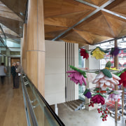
The canopies feature New Zealand kauri, a native timber with cultural and symbolic significance for both Maori and European settlers. The majority of the bush kauri was sourced from fallen logs on the forest floor, originally milled in the 1930s.
"We wanted to use an honorific material for this prominent and significant part of the gallery," says Francis-Jones. "Kauri has a great beauty it is also a very warm, natural material."
The architect says the organic character of the kauri and steel canopies was made possible by a complex geometry evolved from extensive testing.
"A series of interlocking fans radiate from the corners, creating a three-dimensional form. Tapered boards overlay the curvilinear geometry on a radius that gives a soft, interlocking curve."
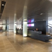
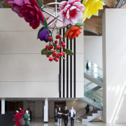
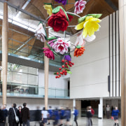
In the vast atrium alongside the entry to the gallery, slender, tapered wood columns support a canopied wood ceiling. Francis-Jones says these columns also involved significant technical challenges to accommodate the seismic loads.
"We didn't want very robust steel connections interfering with the feeling of lightness. We wanted the roof element to appear to be just balancing on the columns. Consequently, the entire structure was engineered so the loading is referred laterally, away from the columns themselves."
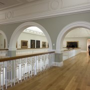
Inside the gallery, the sense of transparency continues, with an enfilade of spaces opening up to each other, both horizontally and vertically.
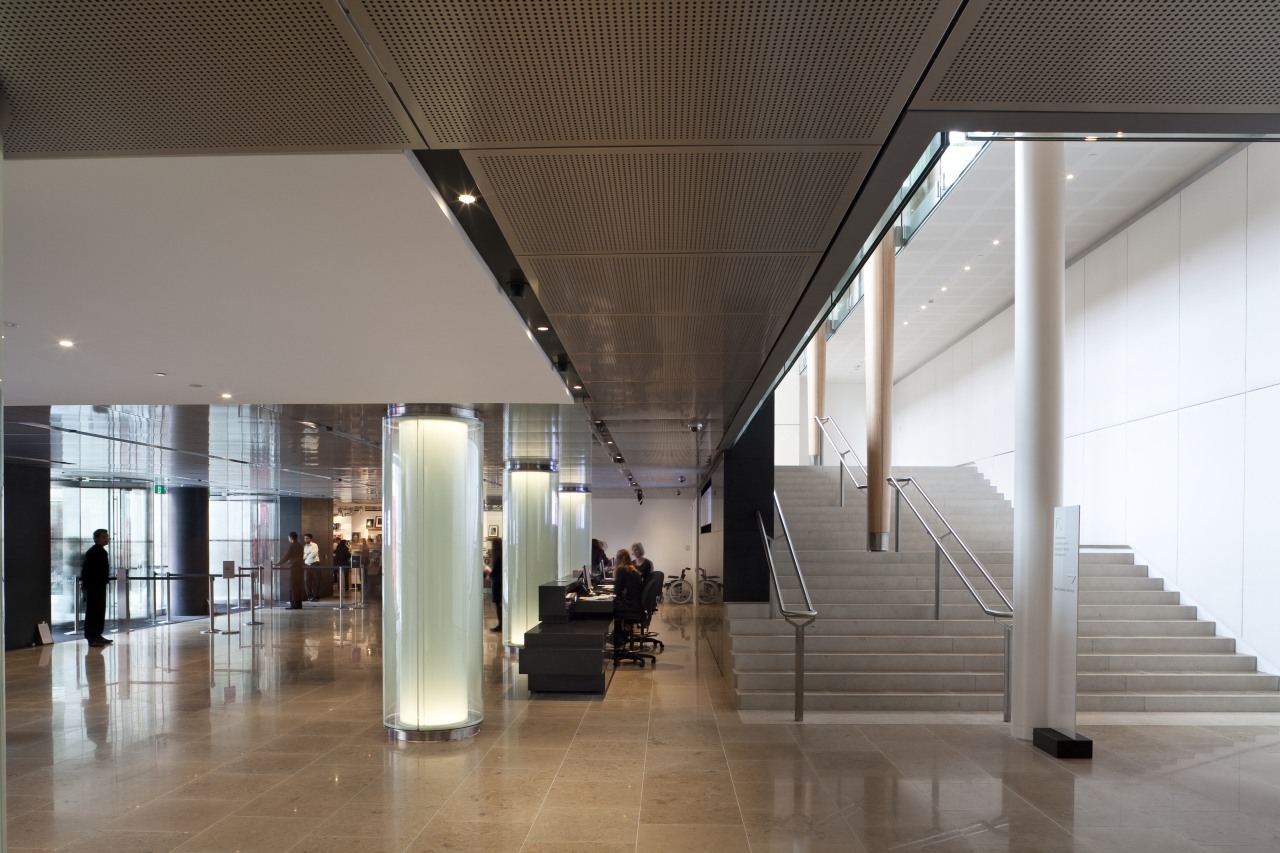
"We wanted to weave the spaces together, so there is always a strong connection to the natural light and the view outside," says the architect. "Viewing art can be quite intense. The complex interlayering allows viewers some relief they can look through to other gallery spaces. Being able to see beyond the immediate foreground actually enhances the view up close. And it helps to relate the art to the wider world.
"The architecture is just as much a part of the overall gallery experience as the art, particularly when it is animated. People moving across the bridges and on the stairs create a certain theatre."
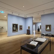
The design team provided a variety of gallery spaces, each with a different character and a different connection to the light. These allow greater choice and flexibility for the curators. Spaces in the heritage part of the building can be used to display contemporary works and vice versa, says the architect. The architecture and art can work off each other to enhance the art experience.
In planning the gallery spaces, the team took its cue from the existing heritage building.
"We wanted the new spaces to have the same simple clarity of organisation and planning as the beautifully laid-out rooms in the original building. The atrium also needed to relate to these spaces in terms of its proportions," says Francis-Jones.
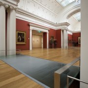
The decorative detailing of the old gallery was retained. Cornice profiles, reveals and pilasters were restored or framed, and suspended ceilings were held back from the existing walls so the public can appreciate these original features.
"We wanted people to experience this aspect of the gallery in slightly surprising and unexpected ways," says Francis-Jones. "They can get right up close to these elements, which are almost like artworks themselves. Considerable research was also undertaken to ensure colours in key areas are historically correct."
The architect says the project was significant for the extensive collaboration between the architects, curators, engineers, local iwi and contractors. Construction tolerances, for example, were far more exacting than standard.
"Everyone was united in ensuring this would be a building that would endure beyond the next century a building that belongs to Auckland and New Zealand. Everyone involved in the project has added something to it in some way, to make it better be it the facade systems, timber detailing or permanent artwork installations. The passion is evident in every detail, which is what makes it such a remarkable project."
Credit list
Client
Heritage architect
Facade engineer
Project manager
Security consultant
Fire engineering consultant
Geotechnical engineer
Heritage consultant
Main contractor
Carpentry for kauri canopy and columns
Stonework
Handrails and glass balustrades
Flooring installation and management
Adhesive flooring supply
Commercial kitchen and bar
Waterproof membranes
Architect
Structural engineer
Quantity surveyor
Services engineer
Specialist lighting consultant
Acoustic engineer
Archeologist and heritage consultant
Visual and landscaping consultant
Contractors facade consultant
Zinc roof and internal gutters
Glass pillars
Acoustic ceiling panels
Ceiling and facade panels
Timber flooring supply
Flooring polyurethane
Air conditioning grilles and diffusers
Security system
Story by: Colleen Hawkes
Home kitchen bathroom commercial design
Curvaceous and connected
Radical yet respectful
Sculptural centrepiece

