New offices for Treasury offices emphasise cultural inclusivity through the individualistic fit-out
With a strong emphasis on cultural elements and all-inclusive facilities, Treasury’s new offices come alive with dramatic elements that celebrate a welcoming atmosphere for all
When your address is No 1 The Terrace, just around the corner from The Beehive, you’re not likely to let that go in a hurry – particularly when you’re lead advisor to the Government on economic and financial policy. Cue the Treasury’s cost-saving and work process-invigorating consolidation of its staff from the tower of No 1 The Terrace to the building’s sprawling four-level podium.
The customised, fully reconsidered interiors for the podium were undertaken by Workspace Architects, with Claire Deacon as project architect.
“When we first addressed this project, the podium floors were a jumble of corridors and rooms, which we stripped out completely. This revealed the full advantage of the under-utilised, light-bringing central atrium which divides the 2200m² plates in two,” says Deacon.
“Making the most of the open space and the natural light, we organised staff areas around the atrium, and optimised any long lines of sight made possible by the open volume.”
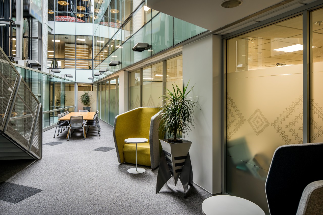
Workspace Architects created a modern design solution with a look that embraces all the people that Treasury serves. The architects also developed a specialised flexible workplace solution that took on board the principles of activity-based working to create a bespoke solution for Treasury.
“Treasury undertook space-measuring exercises and utilisation studies to ensure that the appropriate amount of space was allocated to work space and collaborative spaces,” says Deacon. “And, importantly, we spent the time with key Treasury staff developing touchstone principles into a visual design brief.
This brief underpinned all design decisions, and Workspace Architects worked closely with cultural advisors to ensure that the design embraces Tikanga Māori, the right way of doing things. As part of this, the wharenui or meeting house – Ngā Mokopuna a Tāne – which has been part of the Treasury since the early 1990s, is the centrepiece of the design, from which other areas flow.
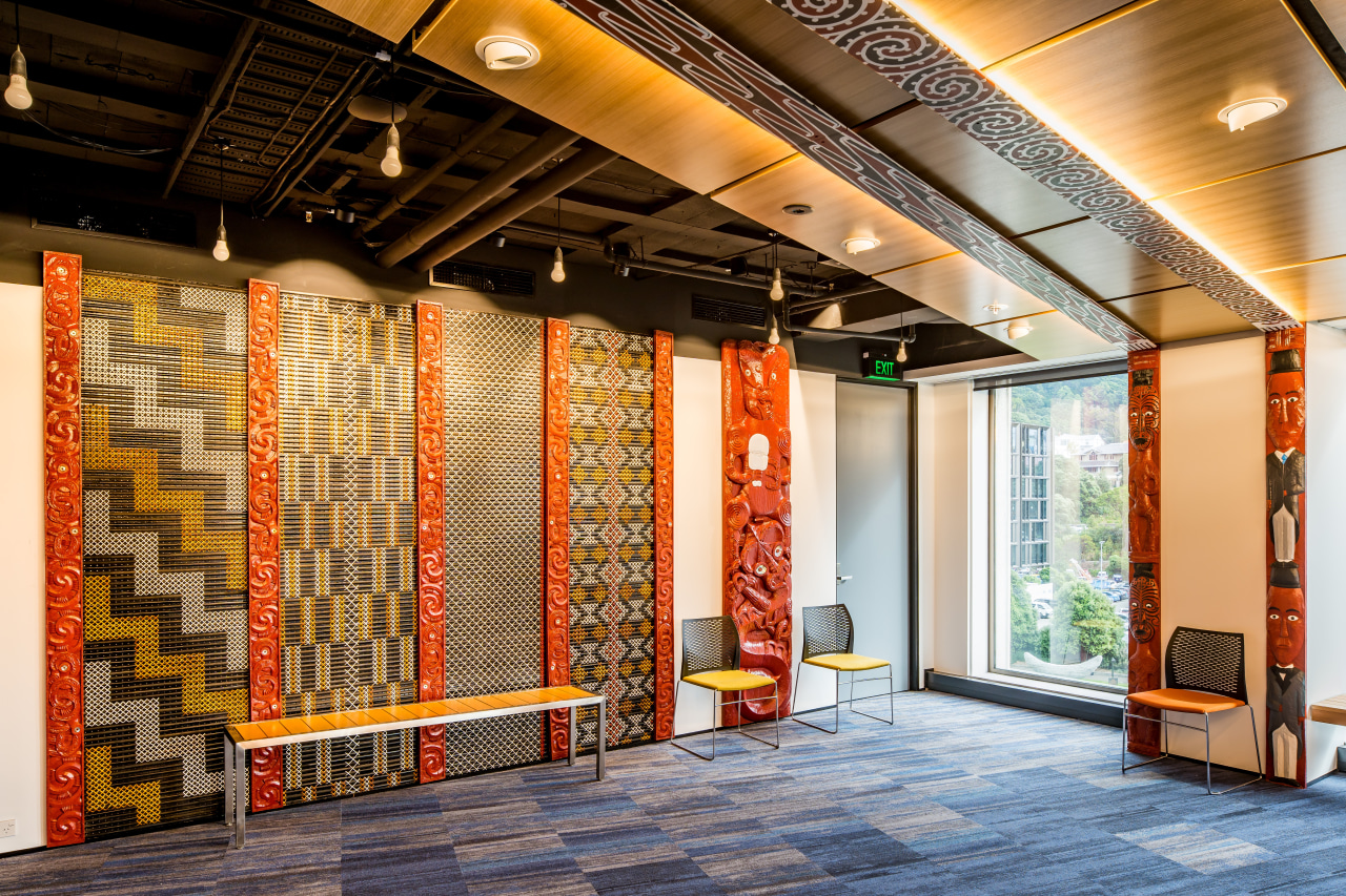
Essentially, all stakeholders’ ideas were woven together into an environment that’s recognised as an appropriate aesthetic for the new Treasury offices. One key aspect of this – along with agile workspaces – was to ensure a relaxed inclusivity to all who walk through the Treasury’s doors.
Boxes ticked by the culturally respectful, human-centric design include: family-friendly spaces that make feeding a baby or looking after a small child easy; gender neutral bathroom and shower areas; neighbourhood kitchens that facilitate independent coffee or meal making for a person in a wheelchair.
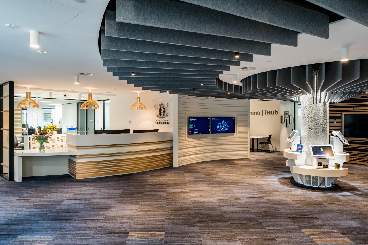
“Reception was developed to flow between a range of `welcoming activities’ – from the typical standing interactions, to lowered counters and check-in areas, to more informal coffee table and soft seat relaxation and chatting spaces,” says Deacon. “In addition, the gender neutral bathrooms are located alongside a family room and wellness room in the reception area.”
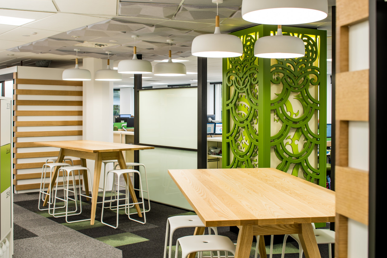
The Treasury wharenui dictated the wider design for the fit-out, including the level three meeting spaces. Choices about its position were based around tikanga and consideration of the gathering of manuhiri, or visitors, and tangata whenua, or Treasury people.
“This space is for staff use as much as for formal meetings and it was a big call to let its position drive the position of all the meeting rooms on the floor. We worked with master carvers and kaumātua to ensure that old and new elements are blended seamlessly together and to use technology to make it a truly multi-purpose space.”
“One challenge was the column in the middle of the reception,” says Deacon. “To address this, we created a koru ceiling feature that emanates from the centre of the space and guides visitors past a feature wall, through the lounge space and towards the wharenui.'
“We designed the dramatic ceiling using light-weight felt fins held inside a curve, all based on a set of 3D digital templates.”
One idea from a workshop participant was to connect the four levels of the space with a pou that came from the ground and continued up through the colour-themed floors. Treasury engaged with Māori artists to commission contemporary carvings to realise this concept.
In fact, the design went further, with the large 2200m² floors each taking their design from the earth to the land and sea, sky, and stars.
“As Tāne has his roots in the earth and his head in the heavens, the four colours used throughout the fit-out follow the journey from the earth to land and sea, sky and stars,” says the project architect. “All elements of the fit-out, from floor tiles, lighting, kitchen splashbacks, to meeting rooms and soft furnishings are colour-themed across each floor.”
Contemporary, flexible workspace dynamics and the prioritisation of human-centric and culturally inclusive thinking have together created a friendly and highly efficient Government destination.
Credit list
Project
Architect
Civil Engineer
Quantity surveyor
Master carver
Ceiling treatments
Vinyl flooring
Wall treatments
Lighting
Lockers
Joinery and reception
Under-bench boilers
Building owner
Construction
Mechanical and electrical engineer:
Fire consulting
Partitioning systems
Hardware
Carpet tiles
Veneers
Paints
Workstations
Reception furniture
Frosting and graphics
Bins
Story by: Charles Moxham
Photography by: Chris Burks Photography
Home kitchen bathroom commercial design
'Hygge' in the highlands
Playing with blocks
Holidaying at home
Commercial Design Trends 35-2C
The world of hotel design is changing, with a move away from bland repetition of a chain’s design template to giving gue...
Read More
