Journey through time
Restored formal rooms lead through to to a modern heart in this renovation by architect Nicholas Murray
The wish list for a renovation may not always tell the whole story. In an urban context, near neighbours and heritage-protection agencies can play pivotal roles in the final outcome.
This project by architect Nicholas Murray involved restoring, renovating and extending a grand old residence and adding a new pool, guest house and garage to the rear. The house was sourced for the owner by the architect, who pointed out its good bones and potential for development. The site is narrow, but at 50m deep, it offered more than enough space for a modern upgrade, says Murray.
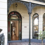
"Heritage constraints meant the facade had to be retained in its original form and no new-build elements could be visible from the street. That the house was one of a tight-knit row of protected buildings worked for us there were no vistas to the rear of the property where the new guest house and garage were planned."
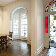
The frontage was already in good condition, just requiring patching and painting. Similarly, the formal front rooms needed only minor work the pine floor was stained dark to contrast the white walls and an upstairs bedroom was turned into a generous ensuite.
"However, from halfway back, the house has been completely transformed," says Murray. "We gutted this part of the interior, which had been renovated in the 1980s. In its place we opened up the volume and extended the rear creating a long, open-plan space, comprising an expansive kitchen, and an informal dining room and living area."
The step forward in style is denoted simply by a doorway and change in flooring material. Murray says he preferred to create a clean line between past and present.
The architect designed the extension at the rear of the new volume as a tall single storey. This allowed for a high ceiling but was also a response to the proximity of neighbours at this juncture of the property. A two-level add-on would have thrown the adjacent houses into shadow and given intrusive views down into their back yards.
"The new area opens to the rear of the site via glass doors and a clerestory window. Large eaves help manage the northern sun, ensuring the space stays cool over summer," says Murray. "The limestone floor is hydronically heated for year-round comfort."
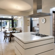
In terms of layout, the new kitchen's central position was dictated by existing plumbing and access to the formal dining room at the front and the informal eating area to the rear. The living room has pride of place next to the rear outlook.
"Homes set close to each other can be dark through their core. Here, we repurposed an outdoor area as a light courtyard and made a glass connecting wall a feature of the interior," the architect says. "This modern element complements the clean-lined decor of the new space. A rangehood above the island that retracts out of the line of sight contributes to this effect."
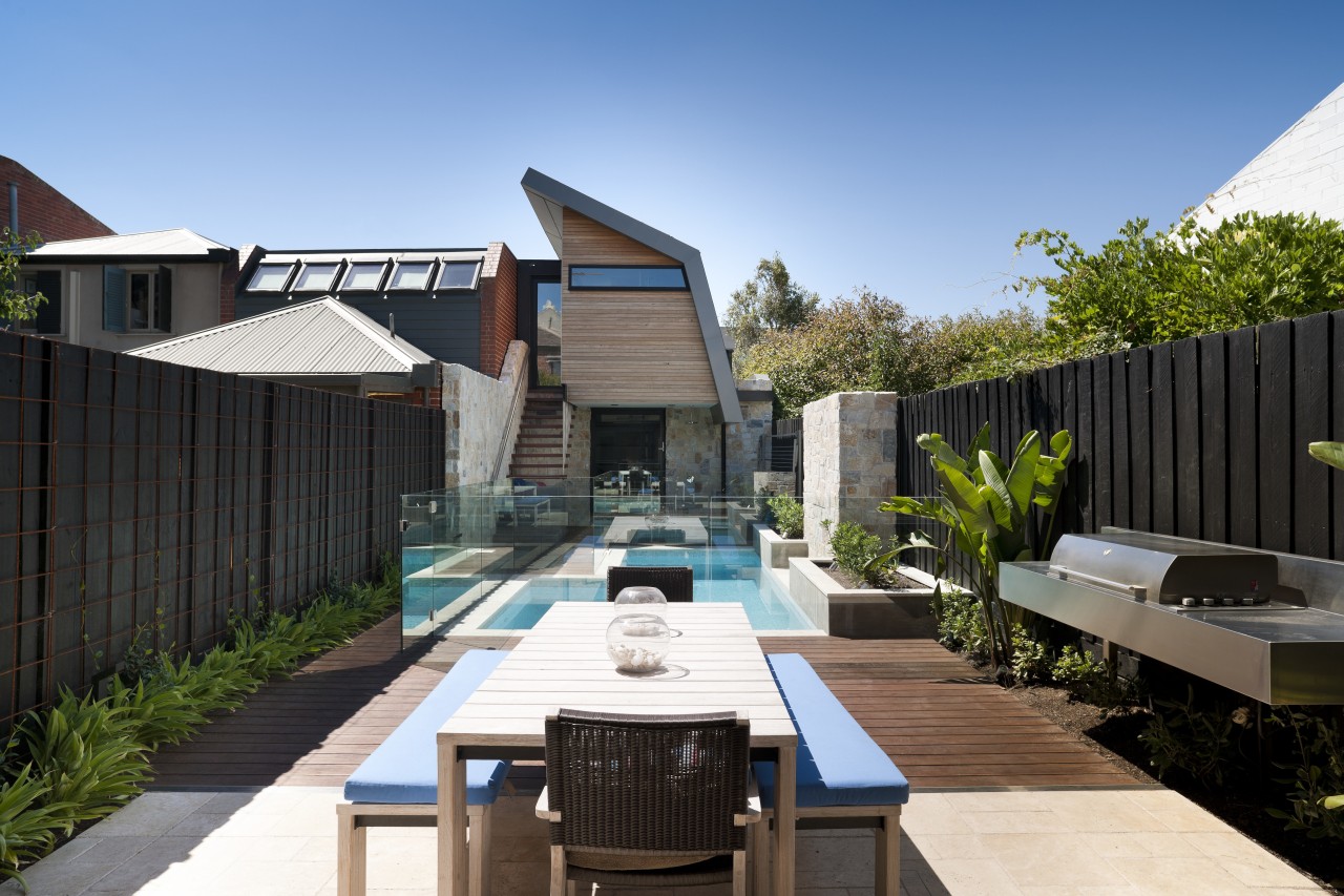
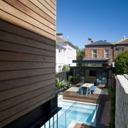
The site has two street frontages, so the garage could be positioned at the rear. A new building, comprising the garage with guest house above, offers a strong, contemporary note beyond the pool. Again, this area of the project was influenced by proximity to neighbours.
"The zinc-clad roof and raking wall of the new structure were designed to allow maximum light penetration to the neighbouring property on one side," says Murray. "On the other side, the high point of the roof was not an issue, because a double-height building was already in existence."
The facade of the guest house is clad in stone and wood, the former helping to ground the structure visually. This material is repeated beside the steps and on a water feature by the pool for continuity and for visual effect.
"Another aspect of this project was that the entire site becomes slightly narrower from front to back. This means all angles are by necessity not quite true but this is not something that is readily apparent."
Story by: Charles Moxham
Photography by: Andrew Ashton Journey through time Restored formal rooms lead through to
Home kitchen bathroom commercial design
Radical yet respectful
Sculptural centrepiece
Curvaceous and connected
