It's a wrap
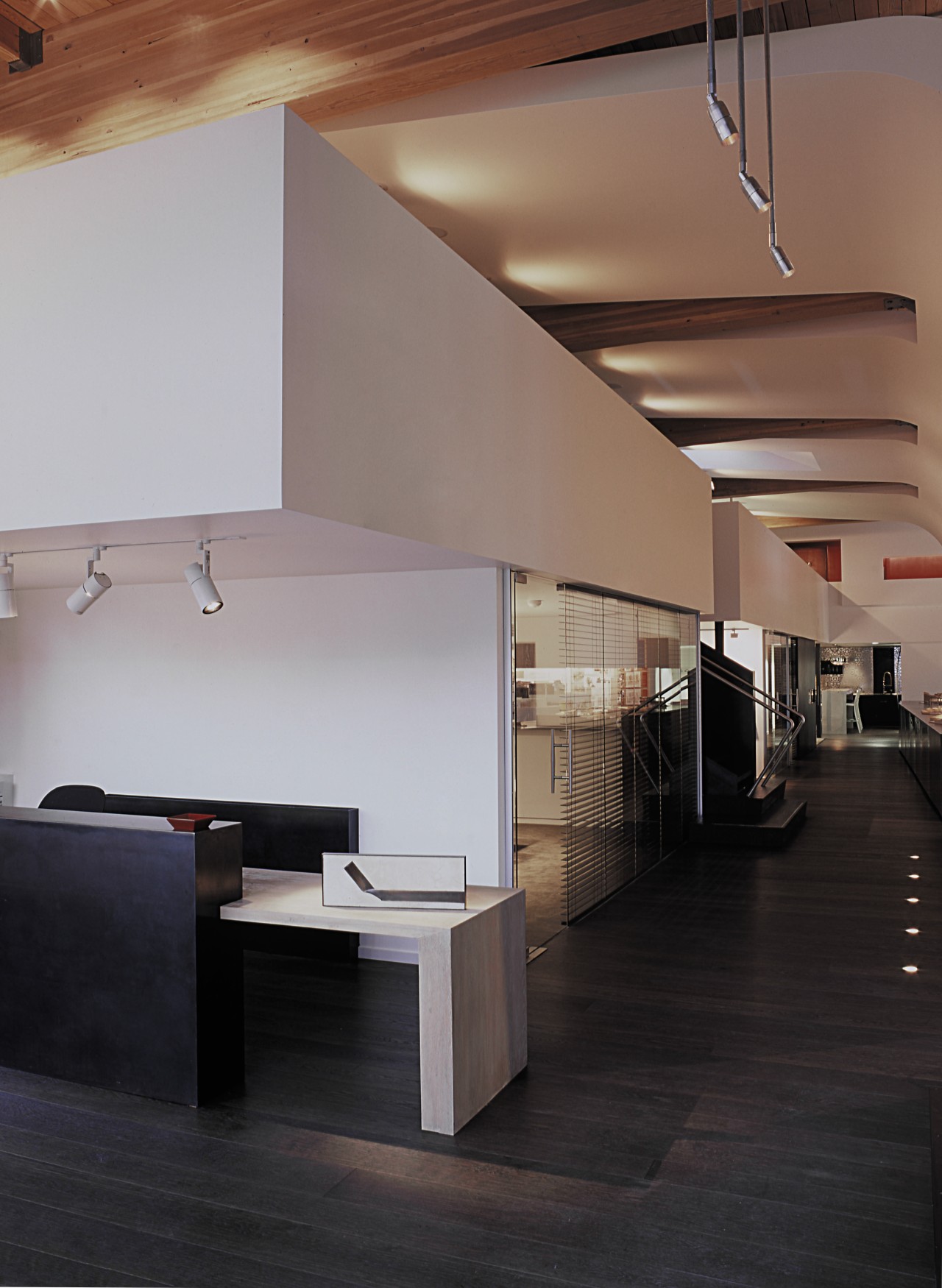
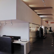
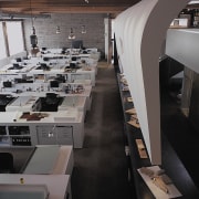
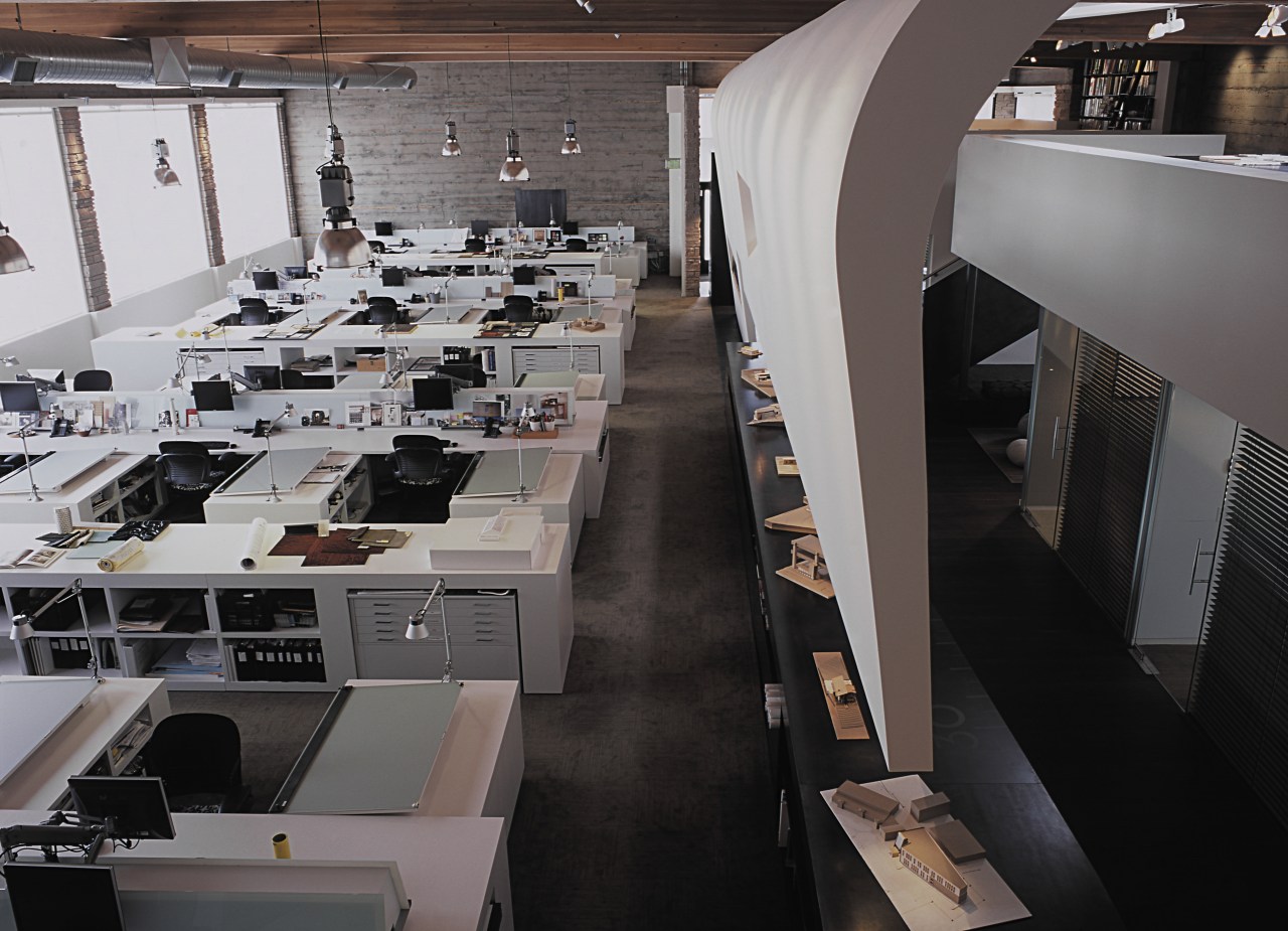
A large curved wall envelopes the public spaces within this architectural office, but still allows a strong visual connection to the studio


For many architects looking to stamp their identity on a new office, it's a case of first find your building. When Seattle-based company SkB Architects went looking for new premises, it headed out of town to a transitional area, renowned for its low-rise buildings and Bohemian roots.
Architect Brian Collins-Friedrichs says the company wanted to veer away from the generic office space that characterises a typical downtown high-rise.
"We wanted a space with volume and character a place with soul," he says. "Occupying an entire building was a way to cement our identity. The solid, 1950s Mid-Century Modern building we found provided 700m² of floor space. And although we chose to leave the exterior as it was, we were able to make our imprint on the interior."
Collins-Friedrichs says the one-and-a-half-storey building was gutted, and walls and ceilings stripped back and sandblasted to expose the original raw concrete and wood beams.
"We took our cues from the building we wanted to let it shine," he says. "Consequently, we retained the original volume in the studio, but created a mezzanine library above the other half of the office."
To create a separation between the private and public spaces, the designers wrapped a large, curved, sculptural element across the ceiling above the mezzanine floor and entrance gallery. The wall curves down on one side of the circulation space, effectively hovering half a metre above a long, blackened steel-plate table.

Architect Kyle Gaffney says the team wanted to expose the creativity and buzz of the studio, but in a controlled way.
"With its cut-outs and long, open slot, the wall provides a way for people to feel the energy of the studio without being a distraction to the staff. It is a physical barrier but it still provides a visual connection."
In the mezzanine library, the curved ceiling splits to accommodate the large, existing wood beams. The ceiling is also shaped around a large skylight that allows natural light to penetrate the interior. Cut-outs in the wall are positioned to provide direct views into the studio.
"The cut-outs provide a way to link the upper level with the studio, ensuring there is still a spatial connection between the two levels," says Gaffney.
Limiting the material palette also helps provide continuity. The reception desk has a hand-raked finish that matches the waxed oak flooring.
"It is not a pristine finish, but one that raises the grain of the wood, creating visual depth," says Collins-Friedrichs. "Although new, it has the warmth and character of an older old piece of wood."
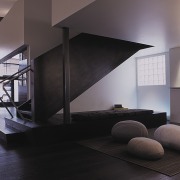
Further textural elements have been introduced in a casual meeting space that features a textured rug and upholstered ottomans reminiscent of large boulders. The space also incorporates a whiteboard.
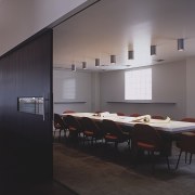
Other rooms on this side of the gallery include a room with a sectional sofa for small group meetings, and two conference rooms. Sliding doors on two sides of one conference room open up to the kitchen, creating one large space suitable for entertaining staff or guests.
The studio was deliberately placed on the side of the office with the least amount of direct sunlight. Large windows along the length of the room ensure there is plenty of natural light, however.
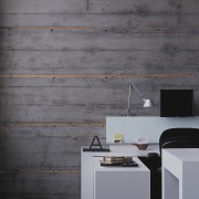
The workstations were all custom designed to cater to the specific needs of the architects and designers.
"We wanted to maintain an open environment, so the fixtures are all low," says Collins-Friedrichs. "The back-painted glass dividing panels can be used as a whiteboard. These panels also support the monitor arms, freeing up space as the computers have smaller footprints. Long islands between the desks can be used by project teams or individuals."
To abide with strict energy codes, the studio is not overly lit by artificial light. Instead, each worker has a task light so they can focus on the job at hand.
Credit list
Architect
General contractor
Lighting
Workstation and islands
Task lighting
Wood flooring
Railing
Conference and sharing tables
Carpet
Area rug
Structural engineer
Millwork
Wall product
Monitor arms
Task chairs
Wood blinds
Long steel table
Conference chairs
Conference room wall covering
Ottomans
Story by: Colleen Hawkes
Home kitchen bathroom commercial design
At home in the country
Best of both worlds
Eclectic meets elan
