Interiors inspiration – Milan's Salone del Mobile returns
Salone del Mobile was back as the industry's biggest event of the year. Award-winning interior designer Penny del Castillo gives her picks for best in show
The week most loved by designers around the world returned to Milan this June ‘22 for the first time since April 2019. The feast after the famine was a welcomed overload for all senses….inspiration saturation, which had us addicted to the point of exhaustion and gluttony: filling and fuelling starving creative souls with everything from technology to decorative accessories.
Penny del Castillo, creative director and founder of award-winning interior architecture and interior design studio Studio del Castillo undertakes the tricky task of narrowing down all she saw to present her top 13 trendsetting exhibits in the show.
A lot of Brazil
Under Construction super size me upholstered basket weave sofa designed by Pedro Franco (in 2016), aptly dubbed as an Italian Floor Supermodel, was a massive hit. @alotofbrazil
Not made in Italy
Surprise! Surprise! Not everything at Salone is Italian!
My next great discovery is London-based lighting designer Marc Wood, whose studio finds product strength through international partnerships.
His work is fostered with artisans such as stonemasons from Portugal, metal engineers from the United Kingdom and glass blowers from the Czech Republic
And he still to this day produces his range in the village next to his grandparents’ farmhouse!
Woods luxury lighting collection and statement installation diversity are interior showstoppers.
Contemporary art meets Venetian renaissance

Four talented artisans banded together after many years in the design industry to form a new meeting place to get creative!
Vetralia, is an atelier which combines contemporary artistic forms with multiple Venetian craftsmanships.
Theirs is an expression of cultural excellence deeply rooted in a renaissance workshop tradition.
In this exquisite piece, the silver-backed slumped glass tabletop drapes over the console structure like a tablecloth, with a viewing section cleared to reveal a lathe-engraved floating glass plate depicting an erotic Roman marble relief designed from 50CE.
Impressive centuries old Venetian skill in manufacturing.
Edra outstanding outdoors
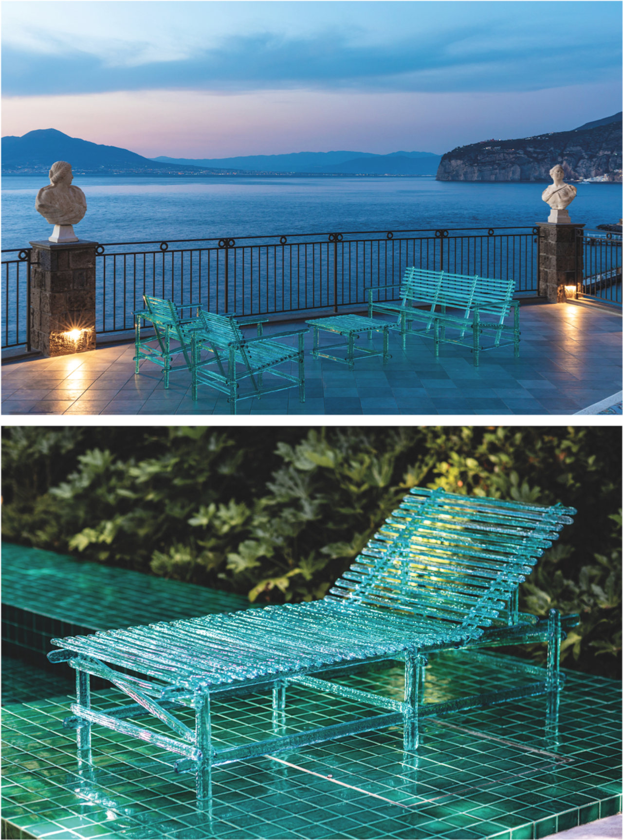
A’mare, is a play on words that expresses the love for designing together with the idea of solidifying water into precious objects.
Edra has produced a relaxing collection of outdoor furniture pieces realised with pure polycarbonate handmade sticks.
What do I love about this simple design?
The structure is elementary but at the same time refined.
The characteristic transparency and the reflectance of the polycarbonate material are such that if immersed in water it disappears, but if hit by sunlight or artificial light from certain angles a kaleidoscope of colours will appear.
Edra is renowned for playful re-interpretations of furniture and objects of desire ... and this one is no exception.
Privacy please… I am in the bathroom
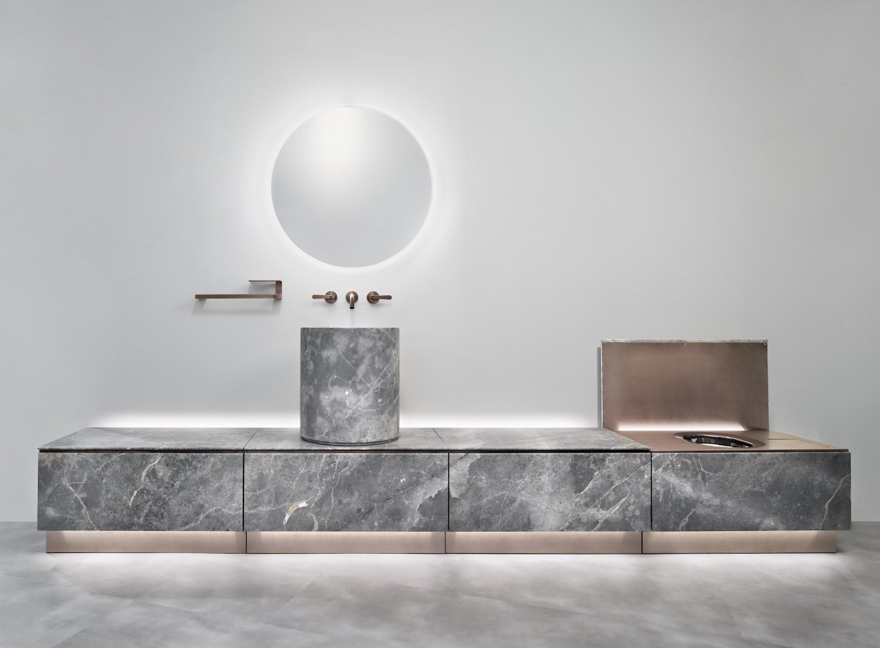
There's a disco in the bathroom?
CEA brand’s evolution is based on the culture of steel combining innovation, product quality, sustainability & production efficiency.
This years’ launch of ABACO in bronze finished toilet suits was an outstanding edition of juxtaposed design.
The discrete lid closure completely camouflages the products intended purpose, yet the interior has a uniquely textured bowl reminiscent of a 1970’s disco ball.
Every household needs one of these to get the guests chatting!
Metal is the new black!
You may have noticed that several pieces I've selected from Design Week Milano are made from metal.
Well, yes, I must confess I do have an affinity with this material ... however, in this design scenario “Metal is the new Black”.
The design industry is lapping it up and I predict it will be here to stay for a while yet.
de Castelli are Italian royalty when it comes to perfecting what others only dream of being possible in pure metals.
Their pieces are not coated or sprayed – they are the real deal solid or sheet.
To choose only one image to represent the collection is practically criminal. But, this large ovoid shape in brass designed by architect Roberto Nicoletti stopped me in my tracks.
It embodies the tireless effort that goes into crafting curved surfaces.
This technique creates soft, organic forms and generates the magical reflection of light along the brass surface, offering an almost metaphysical vision of the object.
Ambrosia is designed for the hospitality industry: what you cannot see in this image is a cut in its ovoid format the rear which introduces a table top, defining its role as a desk.
Design energy explodes
Cooped up energy explodes at CC Tapis after 2 years in lockdown.
The Fuga collection (designed by Christian Mohaded) explores the visual displacement of volume, rugs which shift, push and pull their own boundaries, breaking traditional shapes and responding to the objects around them.
So much textural variation and just so much fun on the floor… or walls??
Figure of light
Designed by Ryuichi Kozeki , and named after, and inspired by, the sun shining through the skylight of the Pantheon in Rome.
The direction of the lamp's light coincides with the direction of the light seen when the sun rises in the morning inside the Pantheon.
When surrounded by rocks or architecture, human senses of light are sharpened, our emotional status changes.
Ryuichi Kozeki's Figure of Light project shows the beautiful relationship between light and place, as seen in caves and ravines created by nature or in elaborate architecture.
After its first presentation when it was awarded Best Performance in Greenhouse at the Stockholm Furniture Fair in 2018, this lighting has been refreshed and shown for the first time at Milan 2022.
Eli Ca
How to stand out in a crowd!?
I would be fairly confident that 99% of participants, exhibitors, guests and ground crew staff would agree our feet were completely tortured by the end of 6 days and 6 nights of Salone!
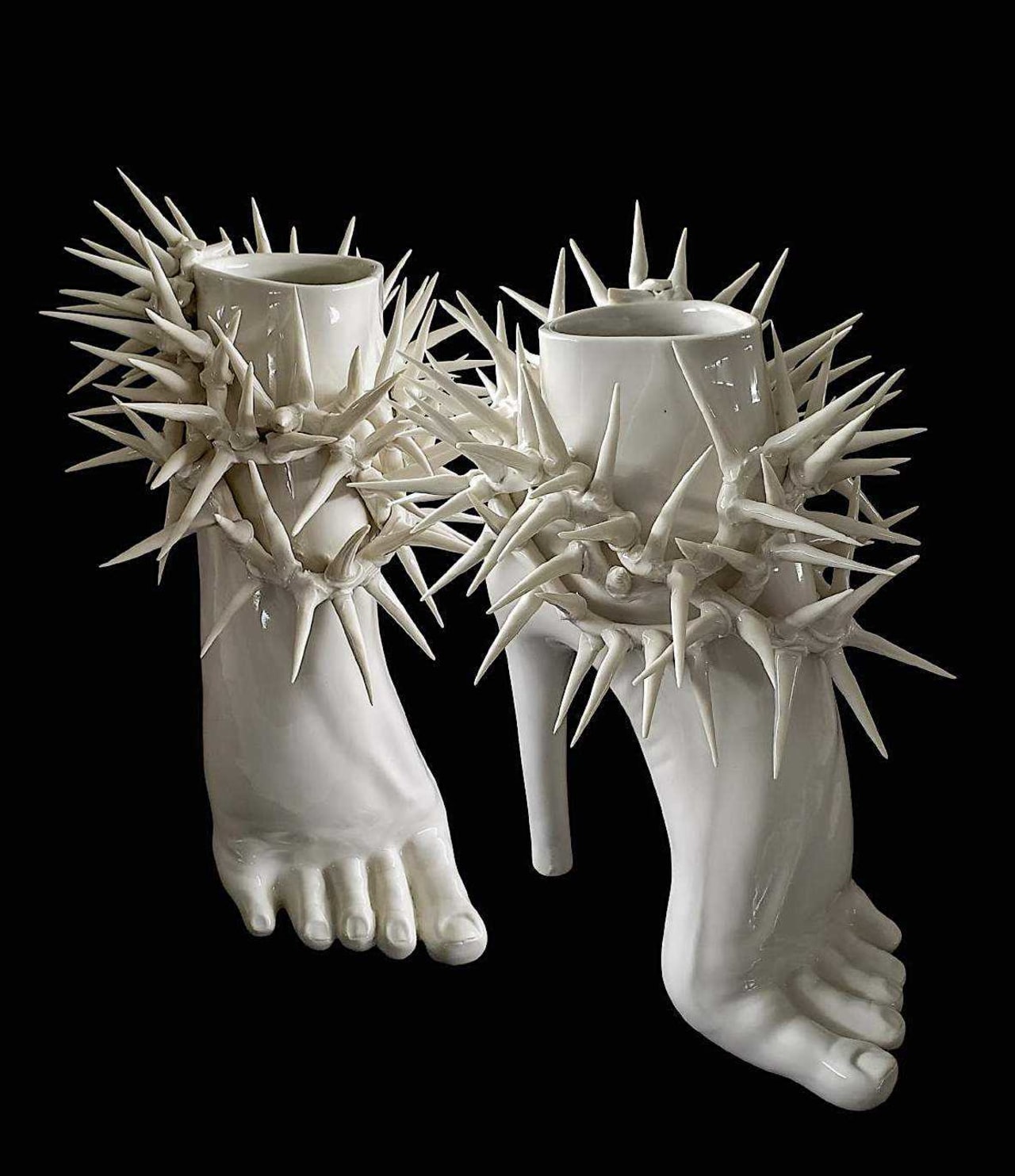
Anotomica by Eli Ca has unintentionally captured this moment in time superbly.
The human body as a great system of signs and symbols.
Celebrating it by dissecting it beyond words or gestures, parts become containers.
These containers are intended for ideas and messages, not merely to represent the flesh blood and bone that is the obvious.
Osis – A Pinch of Salt
Osis is the name given by German design studio, Llot Llov to an experimental process by transferring the effects of osmosis caused by salt onto wood.
The stunning stained finishes are like nothing seen before.
And now with flexible support materials these wood finishes can be implemented onto round shapes.
The Osis range sideboard Brutal uses formal elements from brutalist architecture.
The monumental piece of furniture has shapely over-scaled parts which emphasise the detail of round undercuts in a cuboid.
Archaeological Avant garde
Imperfettolab’s new io collection displays a musical, statuesque and poetic geometry – cones, cylinders and parallelepipeds.
Perfect shapes with contours that change, pending on the observer's perspective.
Unmistakably, the sanded fibreglass gives an almost archaeological finish, interweaving an ancient charm over an avant-garde sculpture.
Surprising & enchanting!
Gallotti & Radice
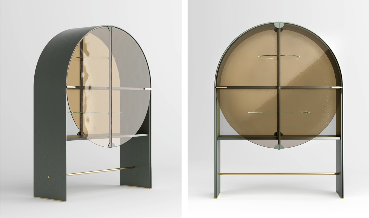
Amidst the 400m² of display space occupied at the show by Italian brand Gallotti & Radice’s collection, I found the Soda sideboard.
t marks the debut collaboration between the manufacturing company and Italian designers, famous all over the world for their unmistakable style and craftsmanship.
The soda project stems from an in-depth research into glass processing.
The circular glass has been poured, texturised and pigmented with an ancient artisan technique, then rested like a work of art on an easel for the artist to admire.
Yes, indeed I feel the need for a scotch and soda now thanks!
We design your silence
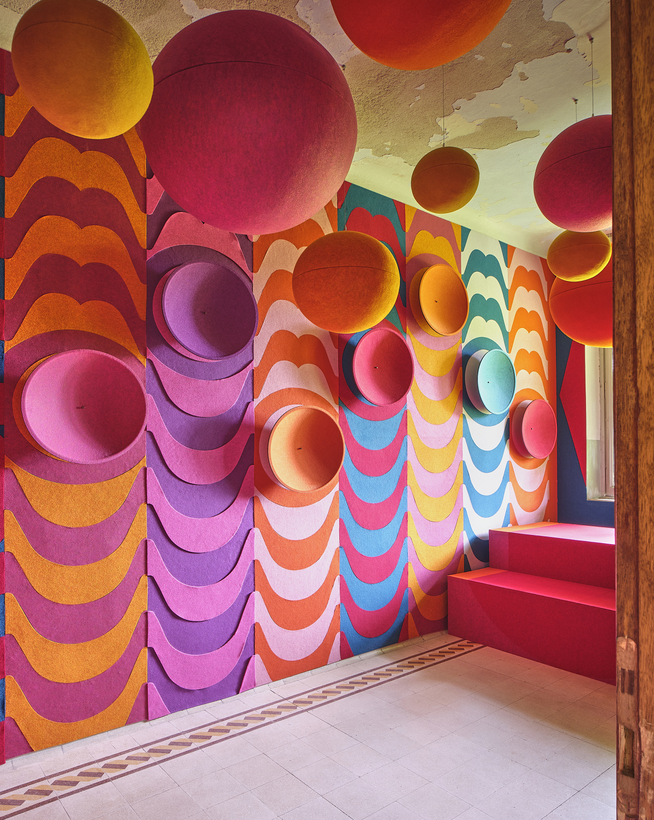
Materials and finishes shout out loud in colour because you wont hear anything inside these acoustic panels!
Slalom – we design your silence.
Australian-based, award-winning interior designer Penny del Castillo is privileged to have had 25+ years industry experience.
She leads a dedicated team with a strong concentration on boutique resorts and residential interiors.
Her passion for global travel and multiple cultures strongly influences her understanding of spatial planning and human behaviour, resulting in versatile, distinctive, eclectic and very personalised interiors.
Story by: Trendsideas
Home kitchen bathroom commercial design


