History repeats
Clean lines, classic materials and textured surfaces ensure this master bath will age gracefully
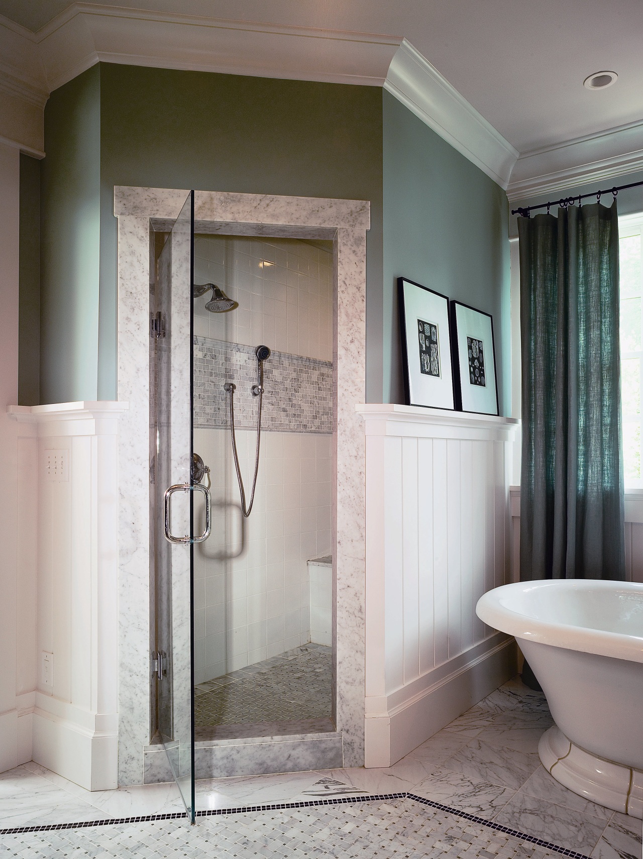

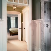

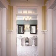
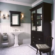
There are some building styles that just don’t become outdated. Usually, they are expressed with classic materials, are well built, and often finished with a level of detail that requires both craftsmanship and finesse. A case in point is this master bath, which despite its classic styling, was completed just recently. The home was designed and built by its owners, William and Kate Bartlett, using the architectural, building and interior design resources of their company, Home ReBuilders. A goal of the design, says Kate Bartlett, was to achieve a classic, cottage-style look. “Our staff architects came up with the overall spatial design, but in general, one of our primary motivations was symmetry,” says Bartlett. The suite is comprised of three spaces. From the bedroom, one passes through a small vestibule – which illustrates the balance of the design by branching off on the left and right to walk-in closets – before entering the master bath. Entering this area, further symmetry is demonstrated – the toilet and shower stalls which flank each side of the door share the same footprint, and two pedestal basins sit with wall-mounted black wooden medicine cabinets above them. In terms of material selection, Bartlett says they wanted objects that would still be fashionable in 10 or 15 years time. “For something more fun, we went for the black medicine cabinets, which are bolder and more spirited. Our previous house was very traditional, with double vanity cabinetry. This design is more open. The placement of the pedestal sinks, which free up the room, and the traditional-style tub were more like furniture placements.” Entering the bathroom, it is immediately apparent that considerable attention has been given to the tiling of the floors and shower stall. The floor comprises a border of 12x12-inch Carrara marble tiles, an accent of dark mosaic tiles and an inset basketweave mosaic, to create texture. “Overall, the color palette is clean and light, but the blue and gray tones create a strong contrast between the wainscoting and the upper walls. The painted wainscoting has a very simple profile, it’s clean and not too fussy,” she says. “The ceiling is framed by white-painted crown moldings and painted a lighter tone of the same color. The chosen light fittings would more typically grace a living space, but in this instance they are an effective way of warming up the room.”
Credit list
Interior designers
Wall coverings
Cabinetry
Shower tiles
Tub
Faucets
Accessories
Builder
Lighting
Tile flooring
Shower fittings
Basins
Ventilation
Story by: Trendsideas
Home kitchen bathroom commercial design