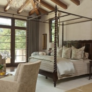
Height of charm interiors by Alison Whittaker
Santa Barbara-Meditteranean-style interior by Alison Whittaker
The architecture and the interiors of a home work best when they reflect their surroundings. In a blue-sky setting, a light, generous aesthetic seems appropriate, with tall windows and doors that open to engage with the environment.
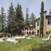
Such was the feel requested by the owners of this 12,000sq ft Californian home. Interior designer Alison Whittaker was involved in the project from the outset, working with architect William Maston on a home where architectural forms, window styles and ceilings all played a prominent part in the final aesthetic.
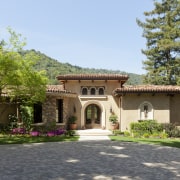
The owners had asked for a Santa Barbara Mediterranean style home, a translation of the classic Southern European look, with arches, pale tones and easy connections to the warm outdoor environment, says Whittaker.
"However, the Californian interpretation is simpler and larger in scale. Here grand 10ft-high Palladian French doors reach nearly to the gabled ceiling in the great room and the archways are more relaxed. The result is an airy, open-plan feeling, with entry into each space subtly framed by a soft curve."
Ceilings are a feature of this home, with each room having an individualistic treatment.
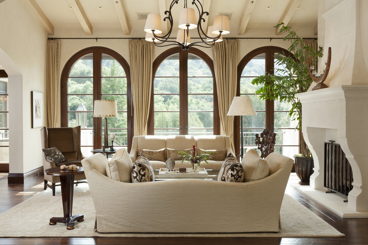
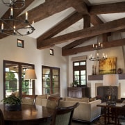
"In the living room we decided on French white oak beams with a ceruse finish and an aged patina. This lightens the formal space and allows the darker door frames to pop."

Light, low furnishings accentuate the room's height and don't draw attention away from the views over the Saratoga valley. An open-backed Donghia sofa at the entry to the room offers a graceful echo of the Palladian arches. Soft Rodolph fabric drapes lead the eye up, again accentuating the height.
"In an interior design that favors a neutral, sandy colorway, texture becomes important," says Whittaker. "As the walls are hand-finished in smooth Venetian plaster, furniture fabrics were chosen in part for their textural interest."
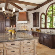
"In this area hand-scraped walnut floors ground the spaces and add touch of rusticity, as do the hand-treated ceiling beams. In the kitchen and hallways, the floors are in antique limestone tiles, recycled from French floor slabs 12 inches thick."
The dining room opens to the formal living room but has an almost Italianate accent, with its Panache dining chairs. The ceiling here is lower and has a rectilinear pattern in dark walnut, set off by a colorful mica mosaic pendant lamp, which further increases the feeling of intimacy.
While the living room is light yet formal, the family room features slightly darker tones and has a more relaxed appeal. The ceiling beams are in a dark finish here, too, as is the furniture.
"Texture is as important in this room as it is throughout the home," says Whittaker. "For example, the fireplace is in a mix of materials concrete, scraped limestone tile, a wood mantel and darker Venetian plaster hood."
In the kitchen, the floors and a copper-patina range hood designed by Whittaker build on the tactile emphasis. The unusual ceiling in the kitchen has a beam layout like a quarter wagon wheel, in response to the room's shape a modern take on a classic design element.
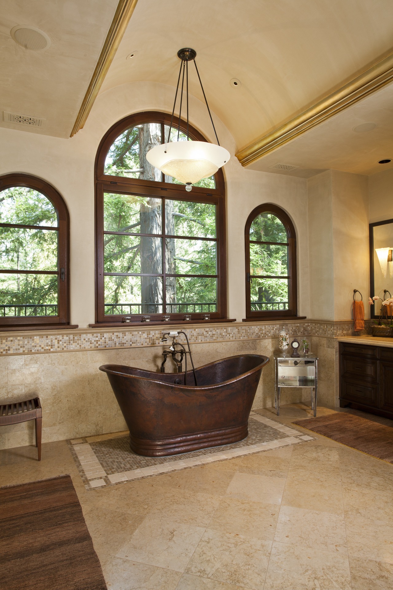
The master bathroom by contrast has a barrel-vault ceiling, accentuated with rope lighting. This adds to the height and drama in this room and leads the eye up to the large, central Palladian window while also showcasing the freestanding tub beneath.
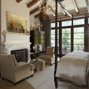
"Scale and weight were considered when selecting the furniture as well. For example, the presence of the dresser in the master bedroom is lightened by its slender legs," Whittaker says.
"Touches of modernity juxtapose the classic throughout, in the form of abstract paintings or the custom-designed Tibetan rug and delicate wire chandelier in the master bedroom."
Story by: Trendsideas
Home kitchen bathroom commercial design
Trends Vol 29 No 7
Interior Trends highlights great residential architecture. This book provides prospective home builders and designers wi...
Read More