From the top down
To maximise great views and natural light, the designer of this new house upended the floor plan the main living area is on the top level

Just as big oak trees from small acorns grow, so can an initial idea for a renovation expand to become an entirely new house one that turns the original concept on its ear.
Architect Brian Meyerson of BMA says the owners of this new house had initially approached him to design an additional floor for their existing house.
"Such renovations are not always cost effective," he says. "This project would have put the bedrooms on the top floor, and would have compromised the overall layout."
To make the most of an expansive view back to the city, Meyerson suggested replacing the existing building with a new house that would have the main living area at the top rather than on the lower level.
"It's an unconventional concept, but there are many benefits," he says. "The views are maximised, and it is easier to introduce natural light into the top floor."
Meyerson says the inverted layout did pose challenges, however, including the need to provide easy access. This was helped by the steep slope of the site the street level entrance is just slightly lower than the top floor of the house.
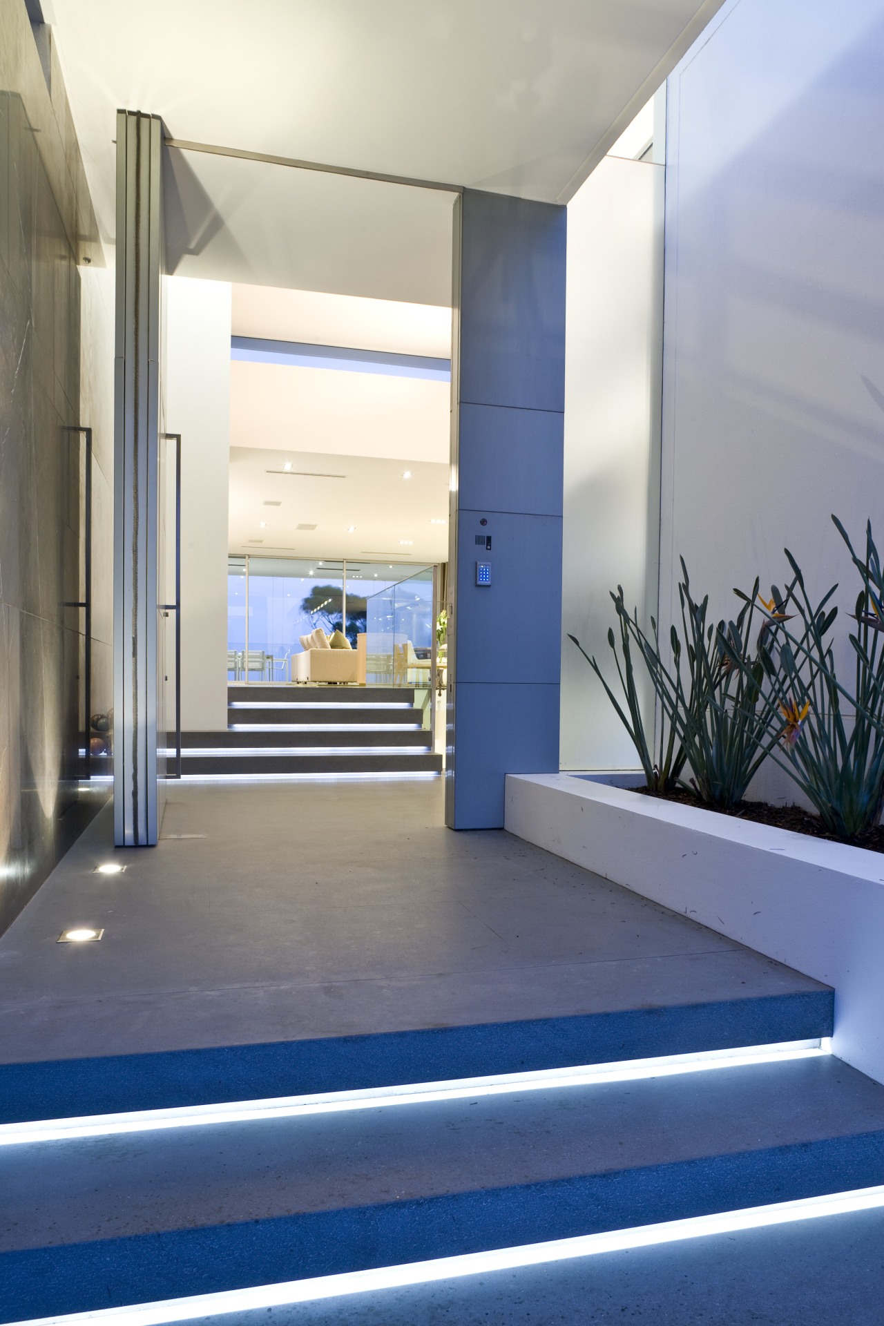
"By introducing a sequence of short flights of stairs, it was possible to provide a terraced progression to the front door," he says. "The stairs are generously sized to ensure the entrance is open and inviting."

Similarly, at 3m high, the front door has a large scale. It opens to reveal the open-plan living area and the spectacular view beyond, which draws guests up the final few stairs.
Meyerson says maximising the natural light was a priority. In addition to a large skylight above the main circulation area, which lets light into the stairwell, there is a band of glazing around the top of the walls that makes the roof appear to float.
"The house was designed to present an understated linear structure," says the architect. "Essentially, it is composed of a series of planes, with large, 12m spans designed to free up the view. It has a wide frontage to the harbour, and a large overhang to reduce heat load and glare. A terrace beneath this roof extends the living space, providing an extra outdoor dining and seating area."
Working with interior designer Shellee Gordoun of Shellee Gordoun Interiors, Meyerson introduced several large asymmetric volumes to the interior.
"The house is defined by asymmetry," the architect says. "From unevenly spaced fence posts at the front of the house, which are reminiscent of a barcode, to the shapes of the interior volumes, there is a sense of the unexpected and a strong focus on detailing."
A large unit helps screen the dining area from the entry.
"This volume was not designed to be a wall that separates," says Meyerson. "With its recessed toekicks, it is more of a floating element that doubles as a bar."
A large Pietra Grey marble wall, which accommodates an extra-long gas fireplace, is another defining feature. The wall screens a neighbouring property, yet stops short of the ceiling to ensure the light and views of the tree canopy are not compromised. It also extends out through the glass wall onto the terrace, enhancing the visual connection between inside and out.
The Leicht kitchen presents another solid volume, in the form of a Calacatta marble island. This provides a casual dining area and additional work space.
Suspended soffits above the island, and the marble wall, feature halogen lighting, and help break up the expanse of ceiling.
The middle level of the house accommodates garaging and bedrooms, including the master suite, which opens onto a smaller terrace.
"This balcony is stepped back on all sides, so it takes second place to the main terrace," says Meyerson. "This also ensures it is a little more private, befitting its status."
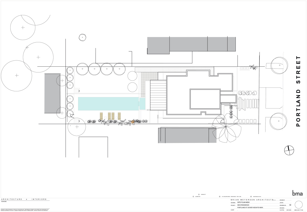
The lower basement level was designed with entertaining in mind. A spacious second living area incorporating a home theatre opens directly onto a new pool.
"The original house did not have a strong connection to the pool," says the architect. "This design provides a completely seamless link."
Credit list
Interior designer
Builder
Kitchen designer
Cladding
Paints and varnishes
Blinds
Gas fireplace
Audiovisual and home automation supplier
Televisions
Kitchen cabinetry
Bathroom vanity basins
Tub
Bedroom rug
Structural engineer
Pool builder
Kitchen manufacturer
Flooring
Wood veneers
Lighting
Dining suite and coffee table
Home automation system
Speakers
Benchtops and splashback
Ventilation
Bathroom taps
Walls
Story by: Colleen Hawkes
Home kitchen bathroom commercial design
Curvaceous and connected
Silver moons rising
Vibrant spiral stairs improve penthouse connections


